
Project Summary
Franchisee Ace Jiffy Lube, LLC had been managing five separate regional websites that shared nearly identical designs — creating maintenance overhead for the business and confusion for users trying to find and redeem coupons across locations. A redesigned, consolidated website launched in Q4 2019 to address this, but it introduced a new problem: coupon retrieval had become non-intuitive, and conversion rates dropped as a result.
Project Background
The new website launched with a more search-friendly design that successfully increased organic traffic. However, coupon download conversion rates declined compared to the previous year. Users were landing on the coupons page and spending an average of three minutes there — but very few coupons were actually being redeemed at stores. The retrieval process had become a friction point that was costing the client measurable business results.
The Challenge
Redesign the coupon retrieval flow within the newly launched responsive website — making it faster and more intuitive for users to find, open, and save coupons. A redesigned email template also needed to be incorporated as part of the new workflow, including modern features like Add to Wallet to support mobile-first users.
My role
Working within the UX team at Zimmerman Advertising, I was responsible for aligning the research goals, synthesizing user and analytics data, defining the information architecture, sketching and producing wireframes, and prototyping the new coupon retrieval workflow across both the website and responsive email template. I also facilitated in-person usability testing of the email prototype with participants across a range of ages and device types.
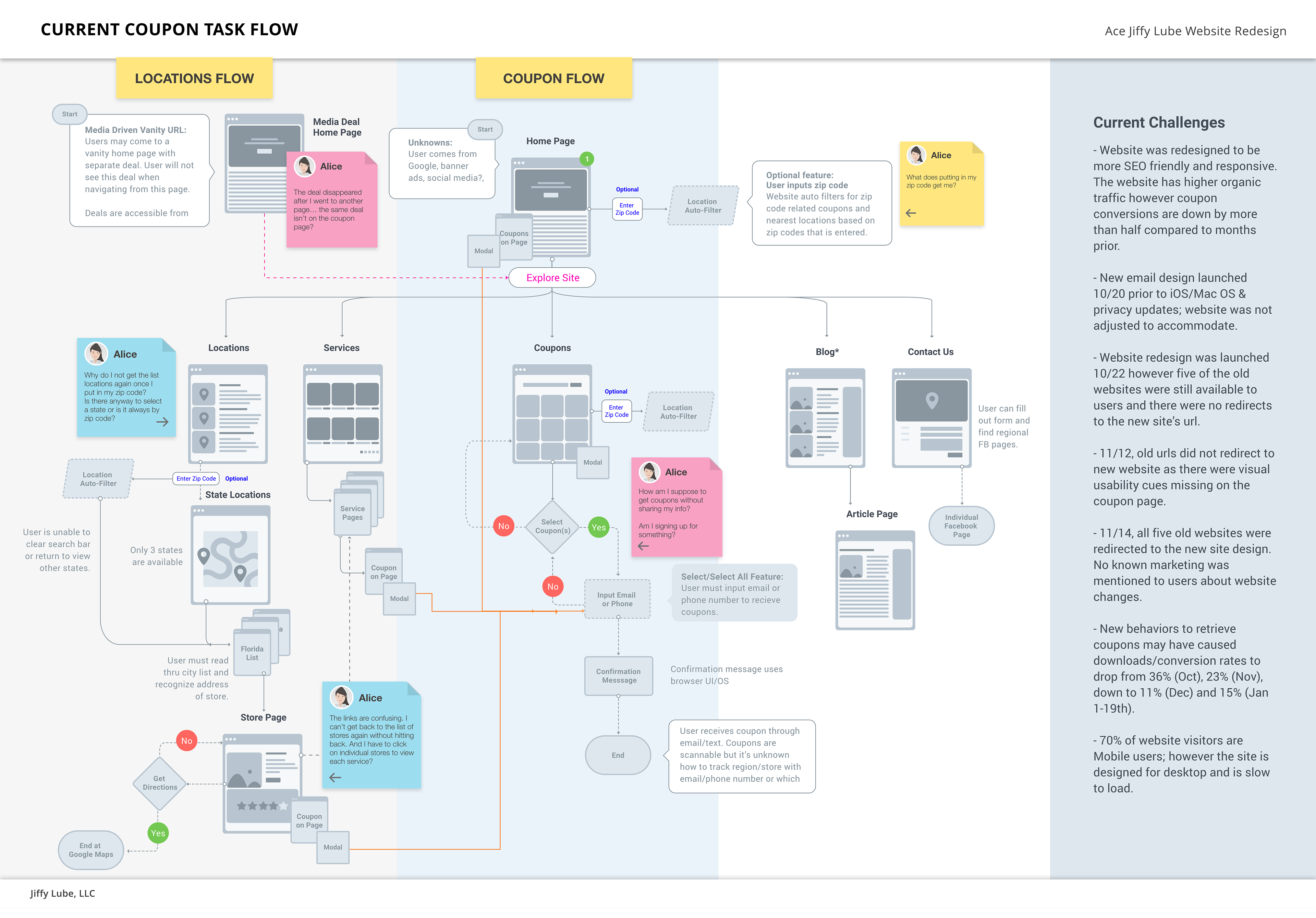
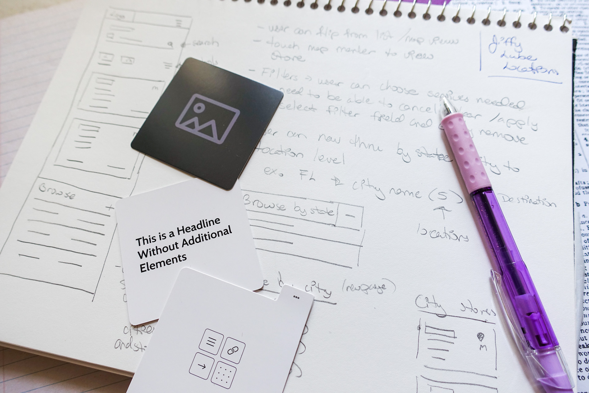
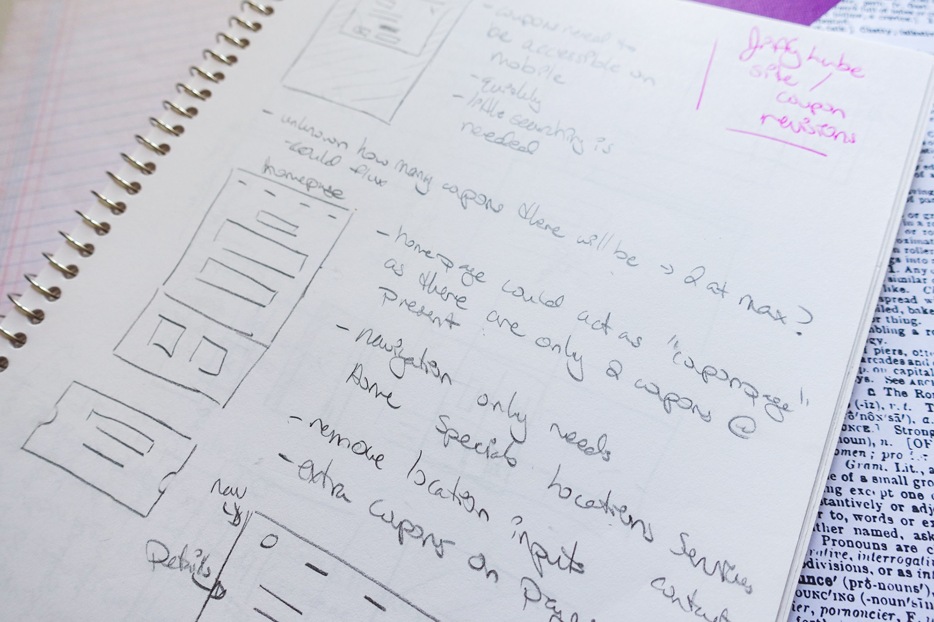
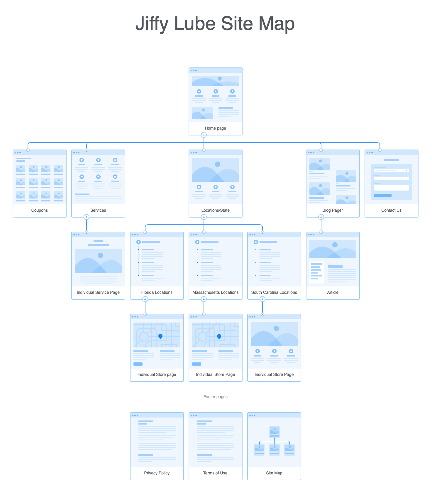
Defining the Architecture
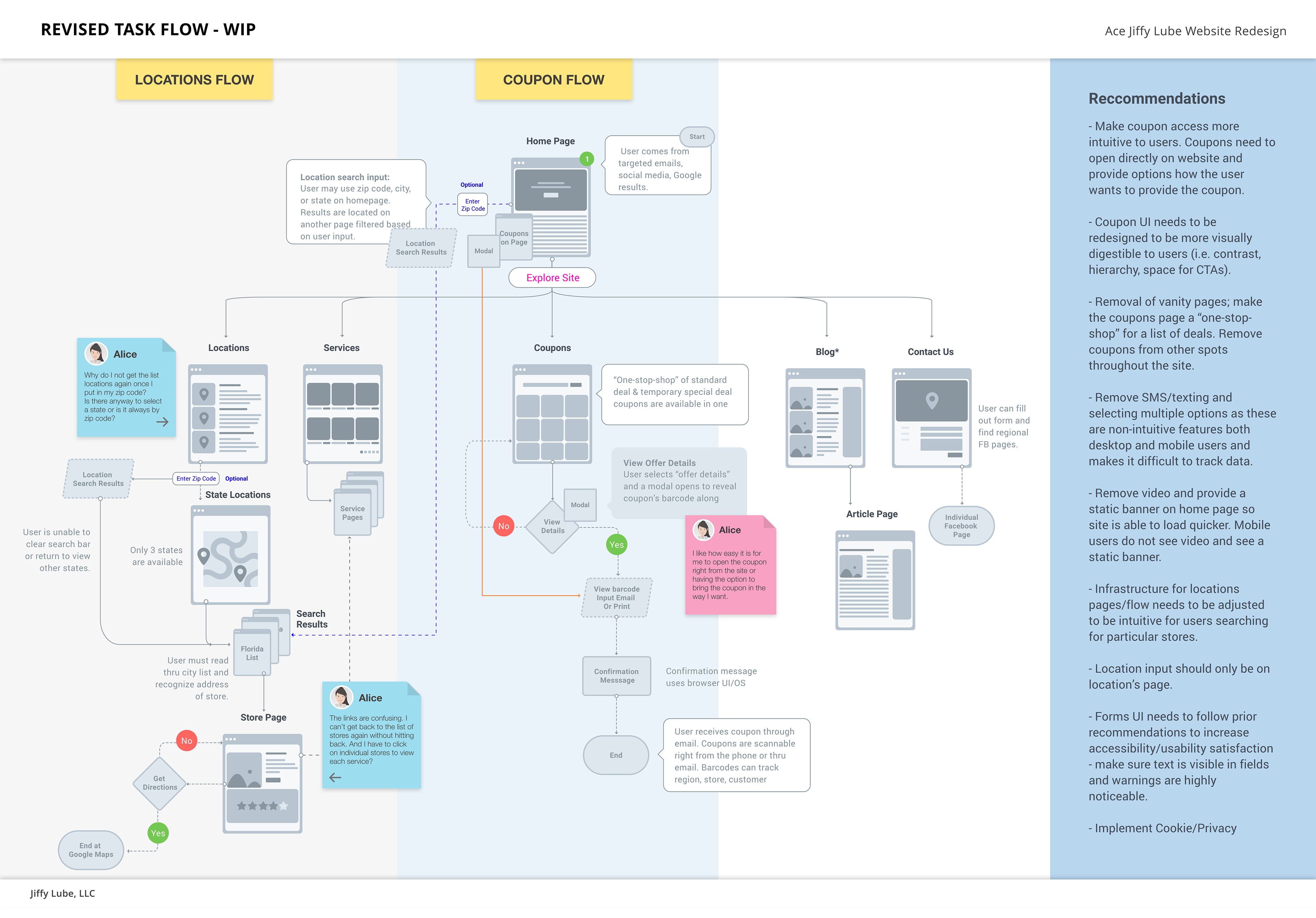
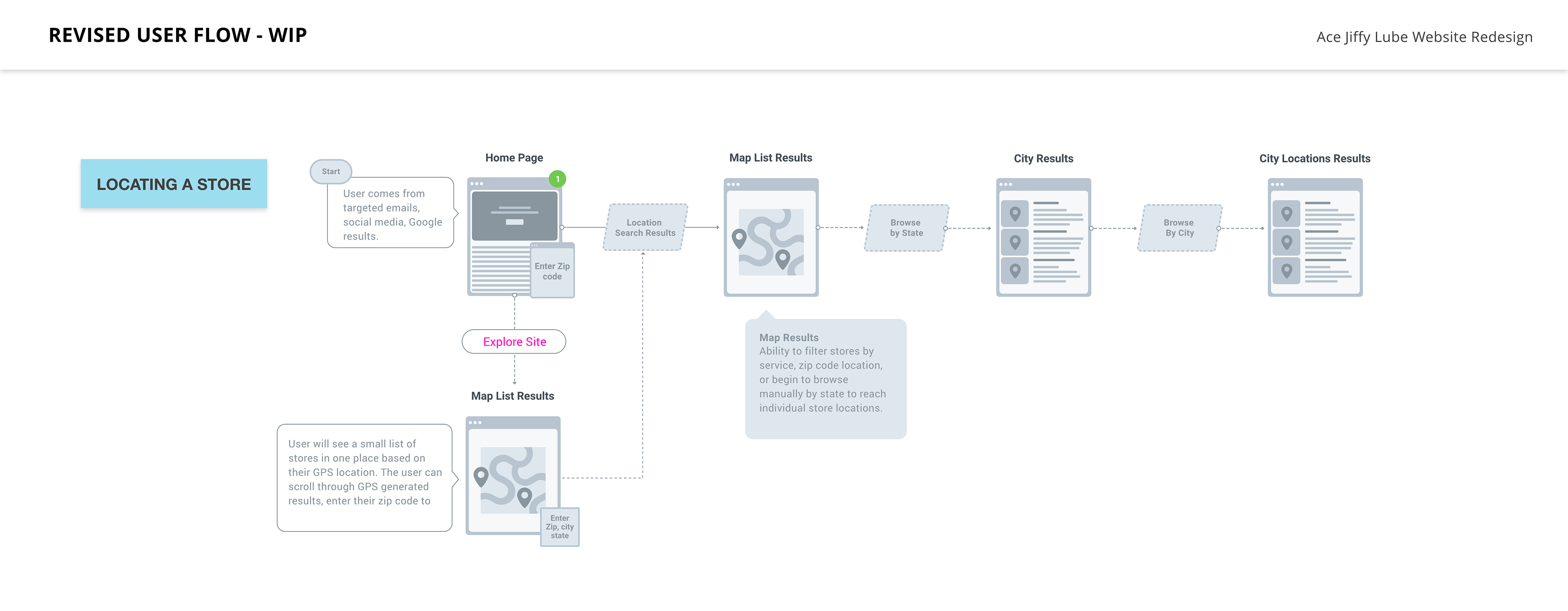
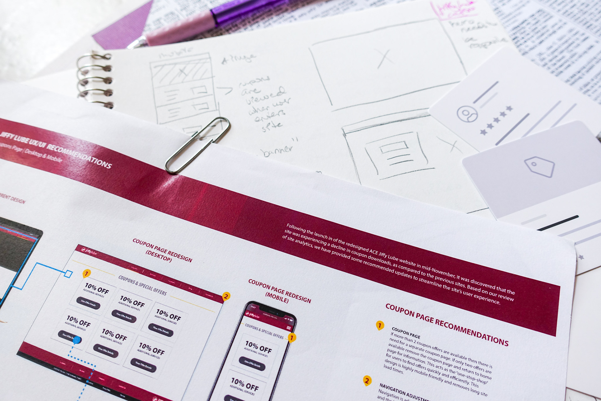
Before redesigning any screens, a site map and task flow were developed to identify the major gaps in the current coupon retrieval journey and establish where users were falling off.
Key decisions that shaped the new architecture:
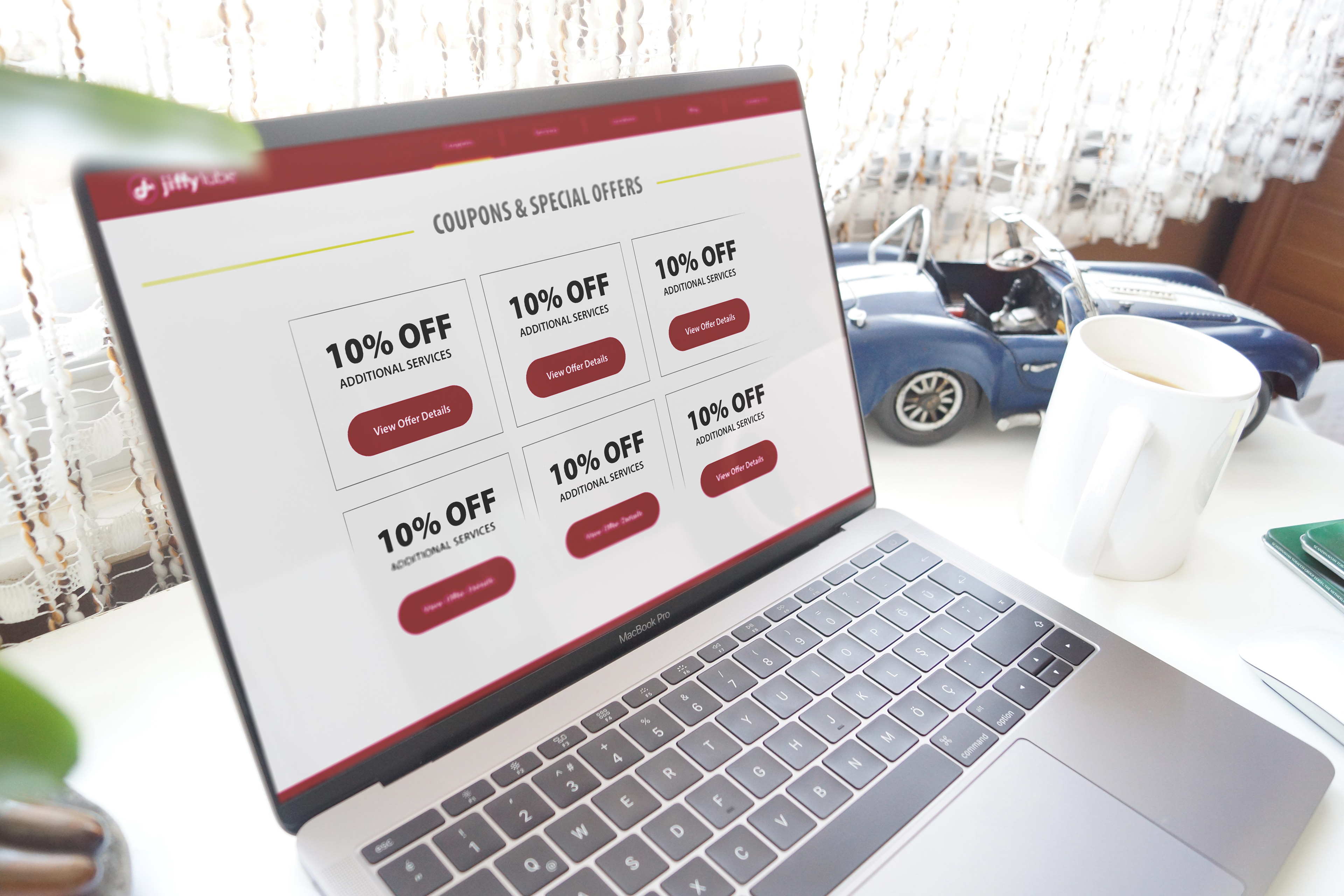
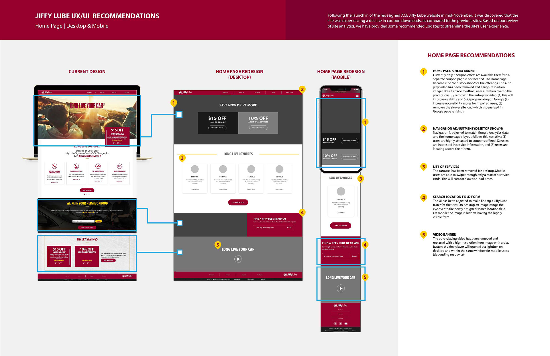
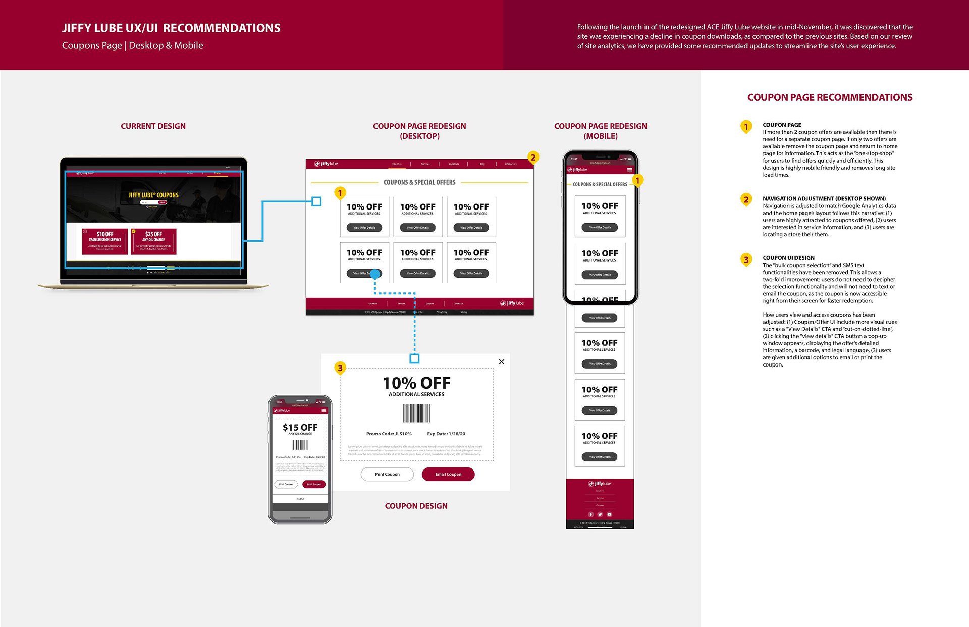
• Coupons as the focal point: Removed coupon placements scattered throughout the site and consolidated everything into a single dedicated coupons page — a true one-stop-shop for deals.
• Mobile-first structure: With nearly 70% of users on mobile devices, the flow was designed to open coupons directly on the user's phone without additional steps.
• Simplified options: Removed SMS/texting and multi-select features that were non-intuitive on both mobile and desktop and made conversion tracking difficult.
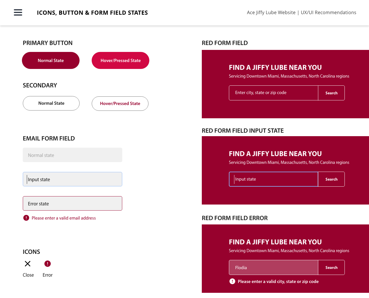
• Redesigned coupon UI: Updated visual hierarchy, contrast, and CTA placement to make individual coupons easier to scan and act on quickly.

Defining Goals & Learnings
The website redesign had prioritized SEO improvements, but several contributing factors were identified in the analytics data that explained the decline in coupon conversions. After synthesizing Google Analytics data, four key takeaways shaped the direction of the redesign:
• Nearly 70% of site traffic came from users on smartphones.
• Over 61% of visitors were returning users — meaning the audience was familiar but the tool was failing them.
• Users ranged from ages 24–65+, requiring the solution to be universally accessible across age groups and comfort levels with technology.
• Users were spending an average of 3 minutes on the coupons page with very few redemptions— confirming the problem was retrieval friction, not the lack of interest.
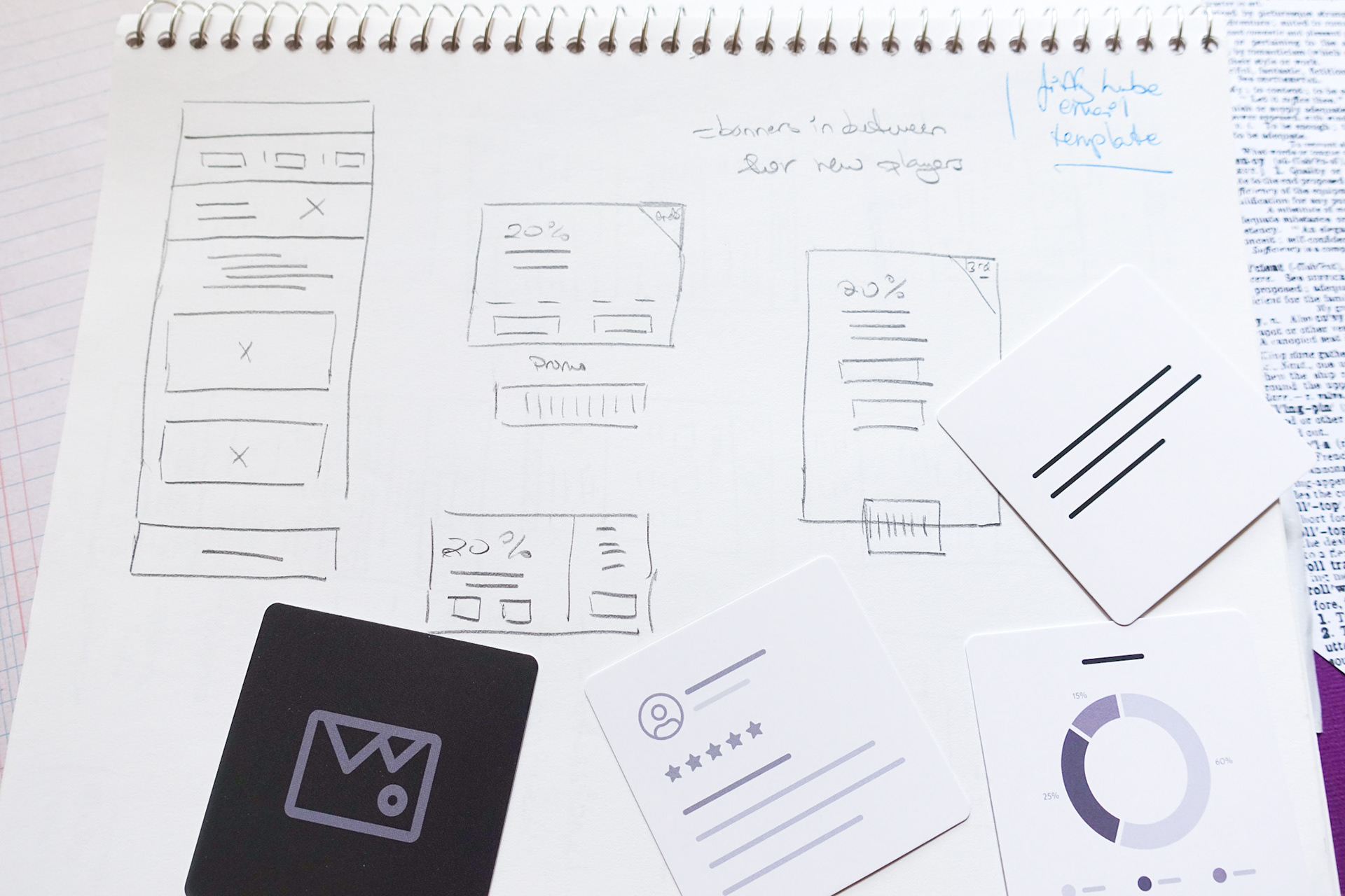
RECOMMENDATIONS, WIREFRAMES and UI Design
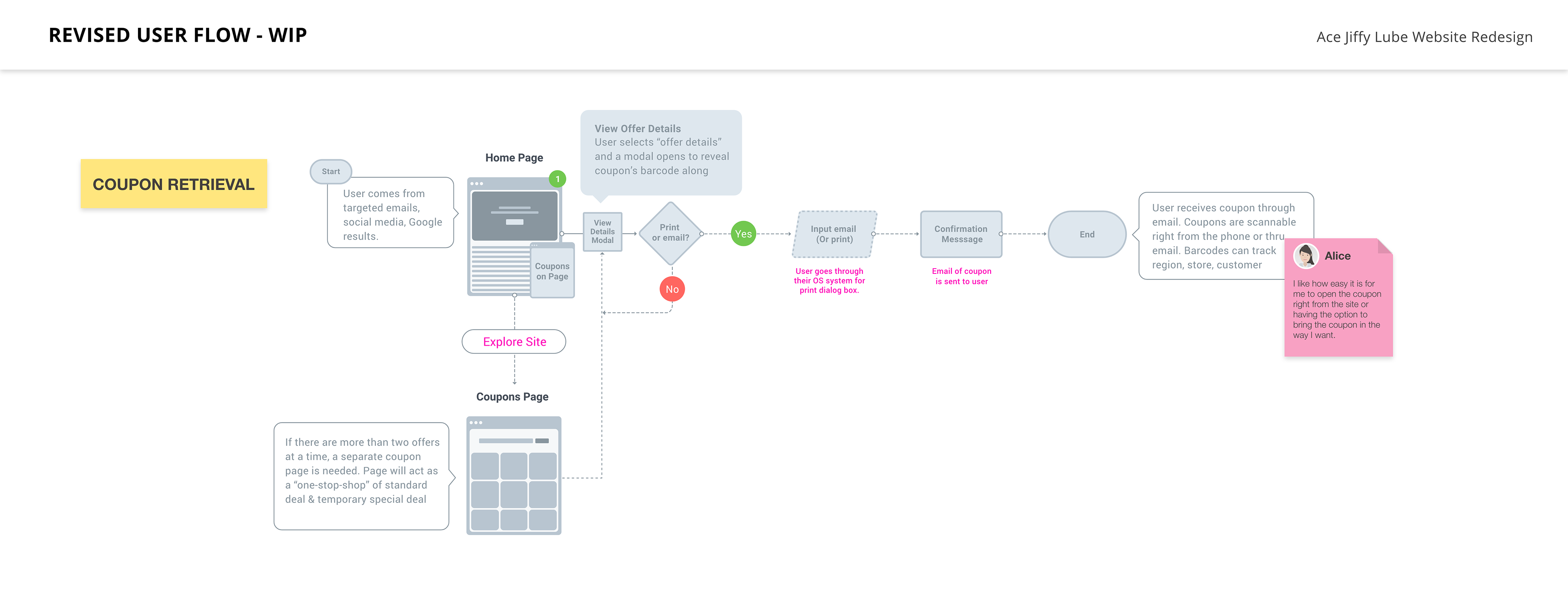
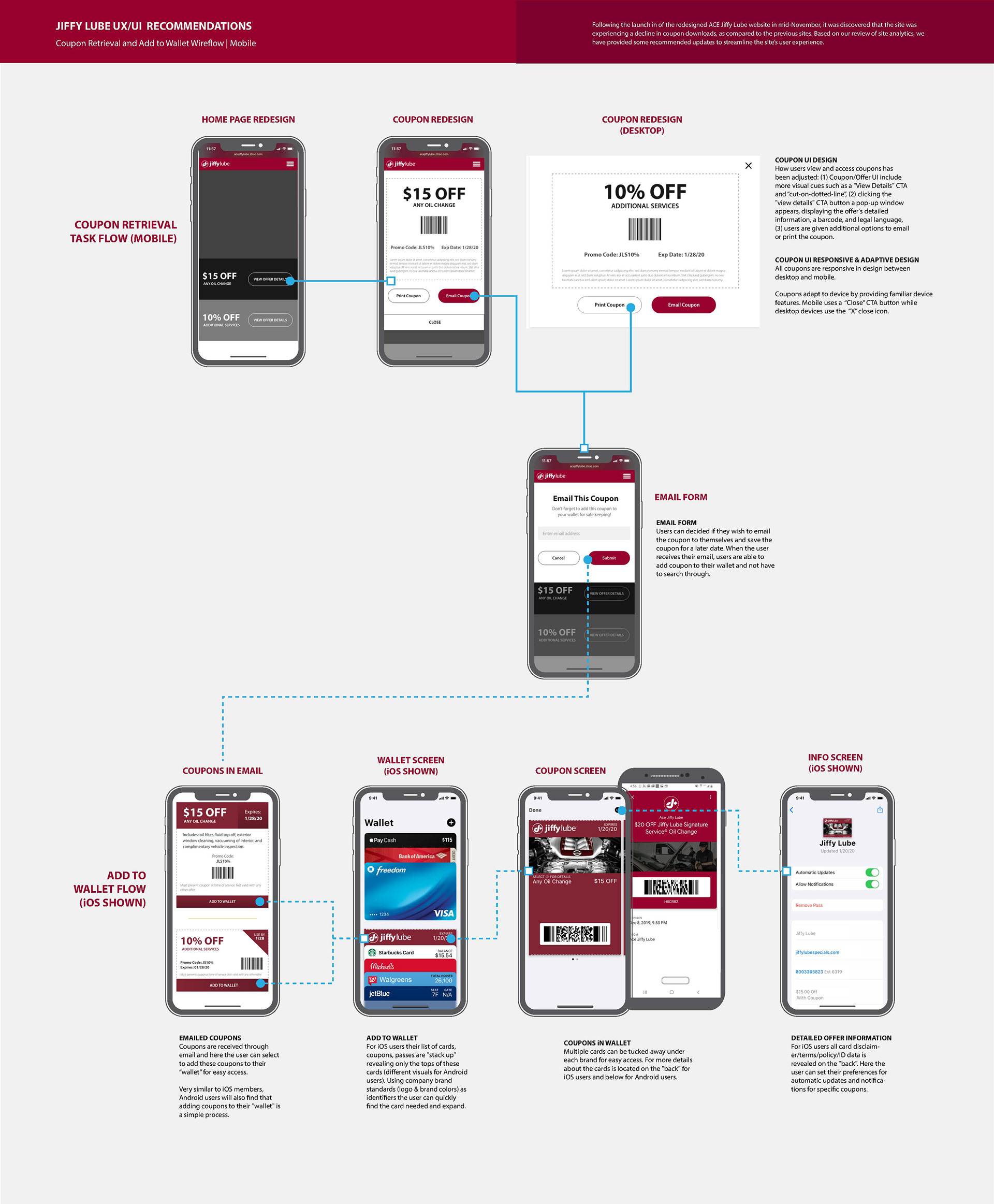
Taking these learnings into wireframes and prototypes, the redesigned experience focused on reducing friction at every step of the coupon journey — from landing on the page to presenting a coupon at the store.
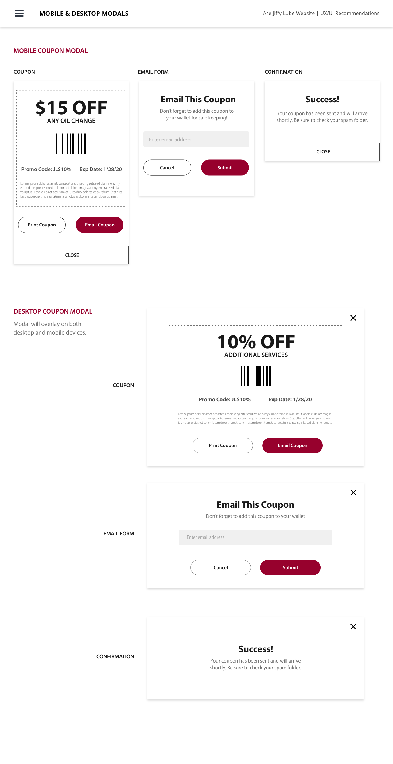
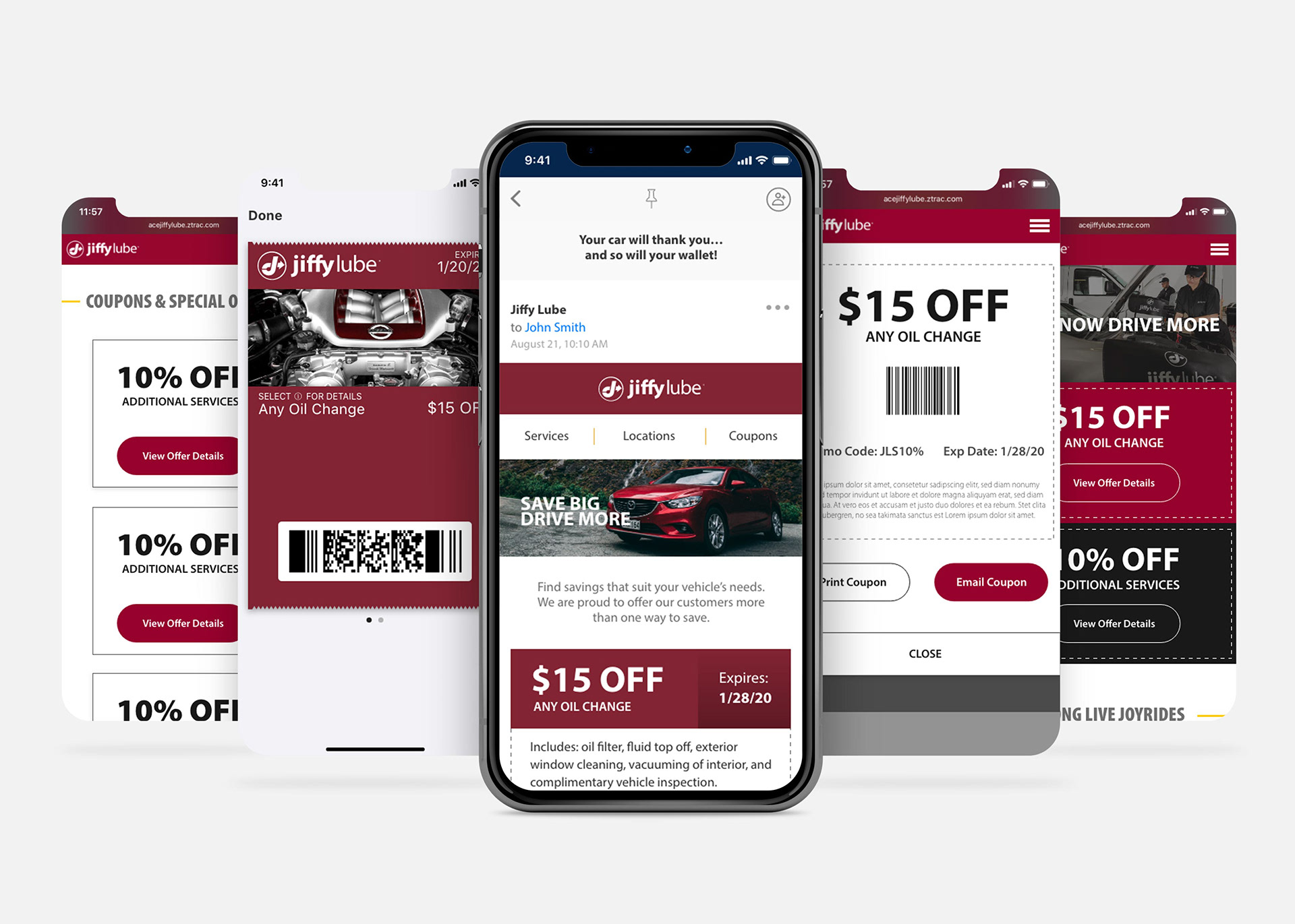
The redesigned user interface introduced cleaner coupon cards with stronger visual hierarchy, prominent CTAs, and a streamlined form for retrieval. Options were simplified to three clear paths: open directly on mobile, email for later use, or print from home.
The Add to Wallet Feature
The most significant addition to the new workflow was the Add to Wallet feature for smartphone users — designed to solve a problem the existing SMS/text method couldn't fully address.
The goal was threefold: save users time searching for coupons in their inbox, provide offline access to coupons in areas with weak cellular signals at service locations, and reduce the friction of having to dig through text messages at the point of service. By saving directly to Apple Wallet or Google Wallet, coupons became as easy to access as a boarding pass — immediately visible, no internet connection required.
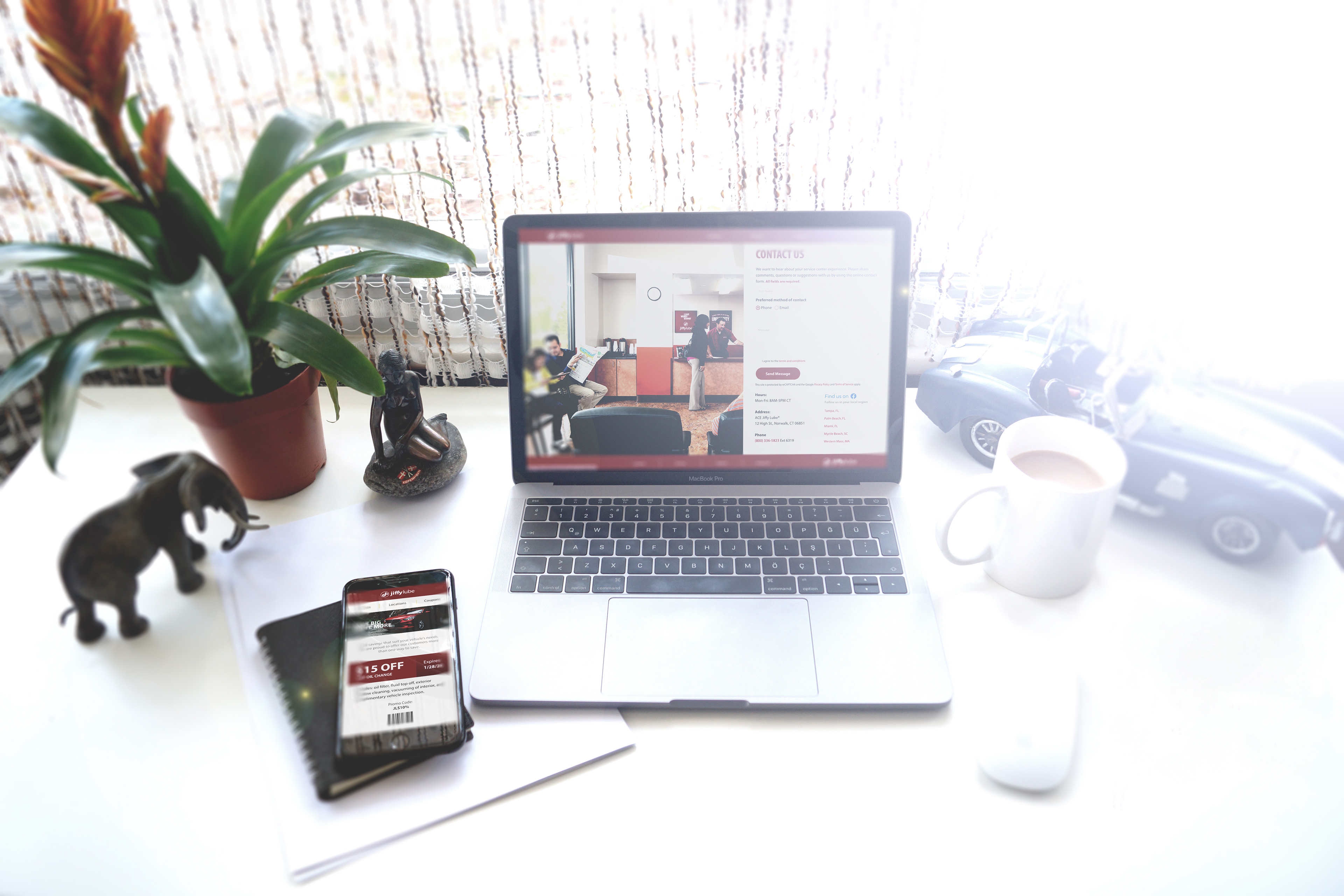
The client retained the option to email coupons for users who preferred that method, along with the ability to print from home — ensuring the solution was accessible to users across the full 24–65+ age range.

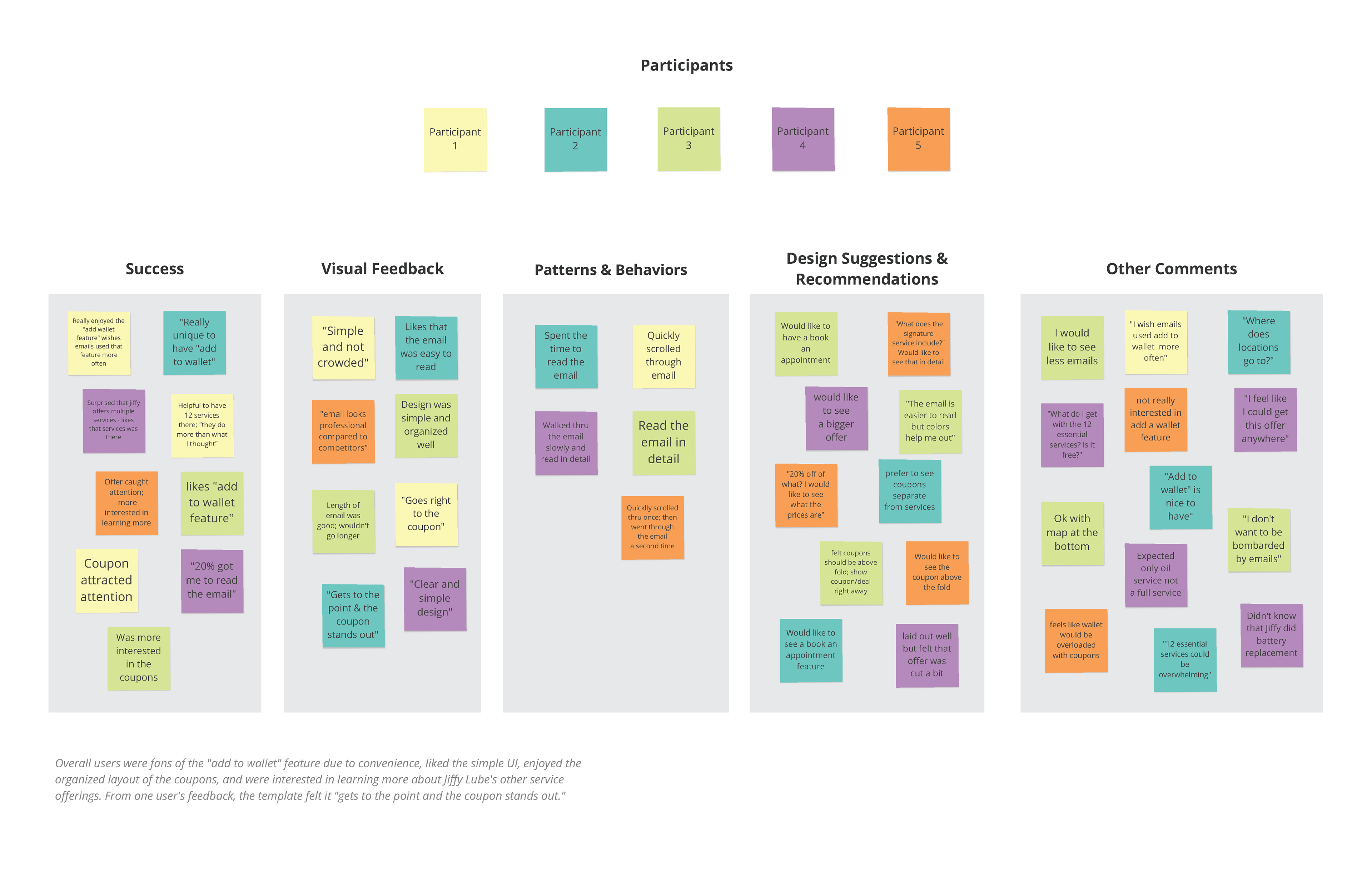
Usability Testing FOR EMAIL RETRIEVAL
To validate the new email template design before finalizing, in-person usability testing was conducted with five participants using a mid/high-fidelity prototype on an iPhone.
PARTICIPANTS
4 male, 1 female | Ages 25–50+ | All tested in person
Scenario
Participants were asked to role-play as a user who had just received a Jiffy Lube promotional email on their mobile device and needed to find and use a coupon.
TEST GOALS
• Identify pain-points in navigating the email template prototype.
• Gather feedback ranging from users navigating through the email to visual impacts.
• Observe how users moved from opening the email to locating and acting on a deal.
• Discover what features and visuals drew the most attention and engagement.