
Project Background
The Merge Marketing intranet page was to be the bridge between the Sales Team and the Marketing Department to share and reach important sales/marketing resources (i.e. logos, product sale sheets, white papers, and more). Over the years from after multiple company acquisitions and internal restructurings the marketing page became no more than a "dumping ground" of hyperlinks. This resulted in the page becoming difficult to maintain, left Marketing struggling to communicate useful tools, and lacked organization for users to find resources quickly and effectively.
The Challenge
Redesign the Merge Marketing Intranet page so that it was easier to maintain its assets, have a more modern and cleaner design, and include intuitive searching.
My Role
To design a new marketing page that would combat pain-points that it was difficult to maintain, insufficient has a communication tool between departments, and would help users find resources effectively and quickly. My overall goal was to build a central hub for users to access an organized space to locate resources by telling a “story” of the Merge brand.
MY PROCESS
Using UX methodologies I defined research goals, collected and synthesized user research, developed a persona and scenario, provided the information architecture as the foundation, sketched and generated wireframes, and directed the brand center's final design.
DEFINING THE RESEARCH GOALS
• Learn how a users use the Marketing intranet page and its resources.
• Understand the pain-points and limitations to the Marketing intranet page, access to its product assets, and communication methods from the Marketing team.
• Discover what features are attractive to users who are traveling, are on-site at client locations, and how internal staff members find company product assets.
THE METHODOLOGIES USED
Secondary Research: Learn about different communication and tools that other companies use to maintain their intranet pages and gain the knowledge how a typical user navigates to find company marketing resources.
Individual Interviews: Conduct one-on-one interviews to talk in detail about topics related to how a Sales Representative typically shares information with their clients along with probing an individual’s beliefs, attitudes, and experiences to get a better understanding of how a user accesses and shares Merge branded product resources.
Questionnaires/Surveys: Using a short survey, discover the demographic trends that may reveal how might a user interacts with the Marketing intranet page and Merge branded resources. This may include data on the public corporate site, interactions with different asset file types, and more.
USER RESEARCH
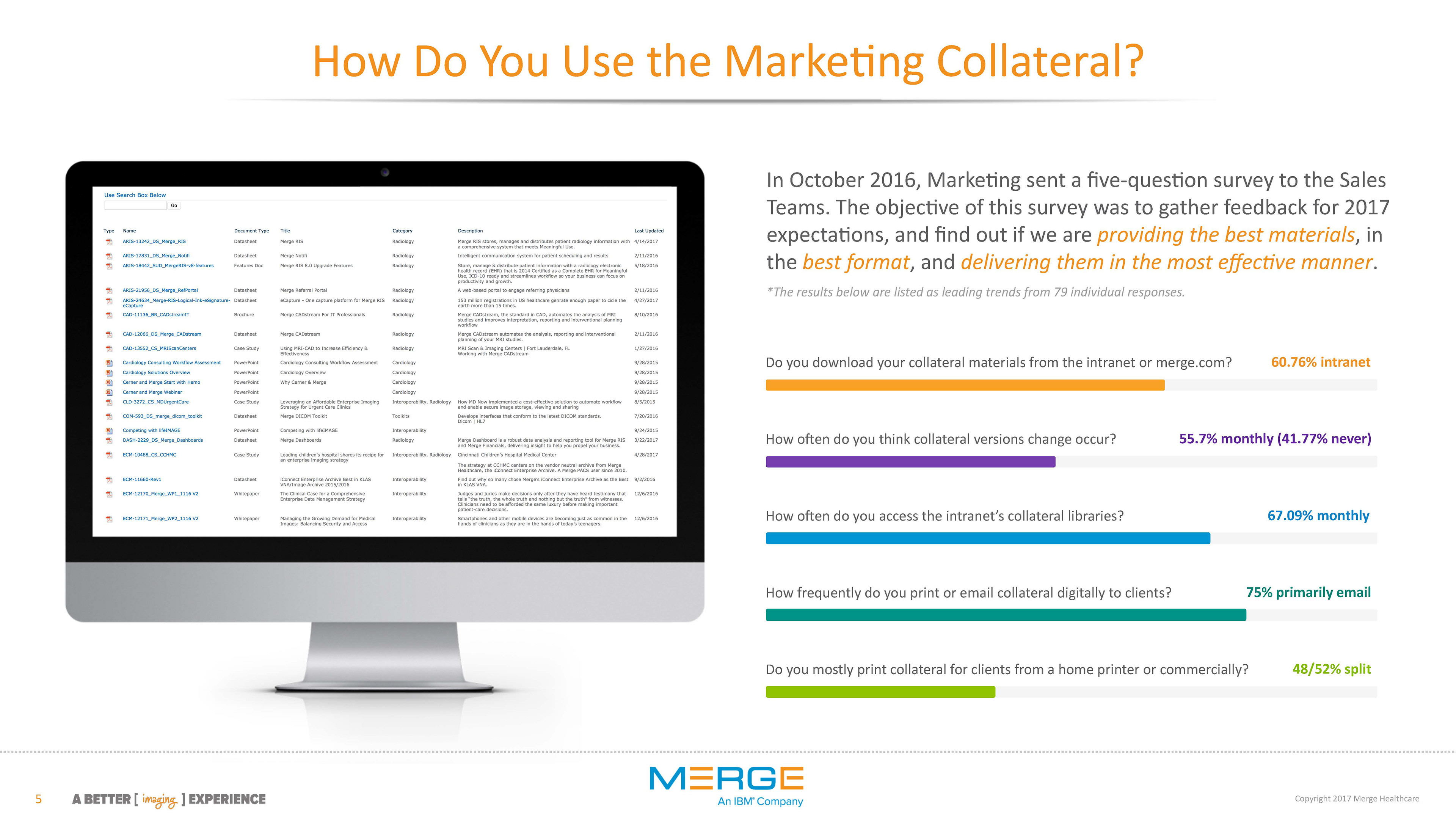
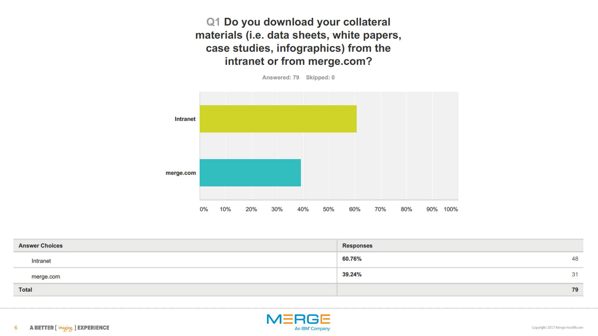
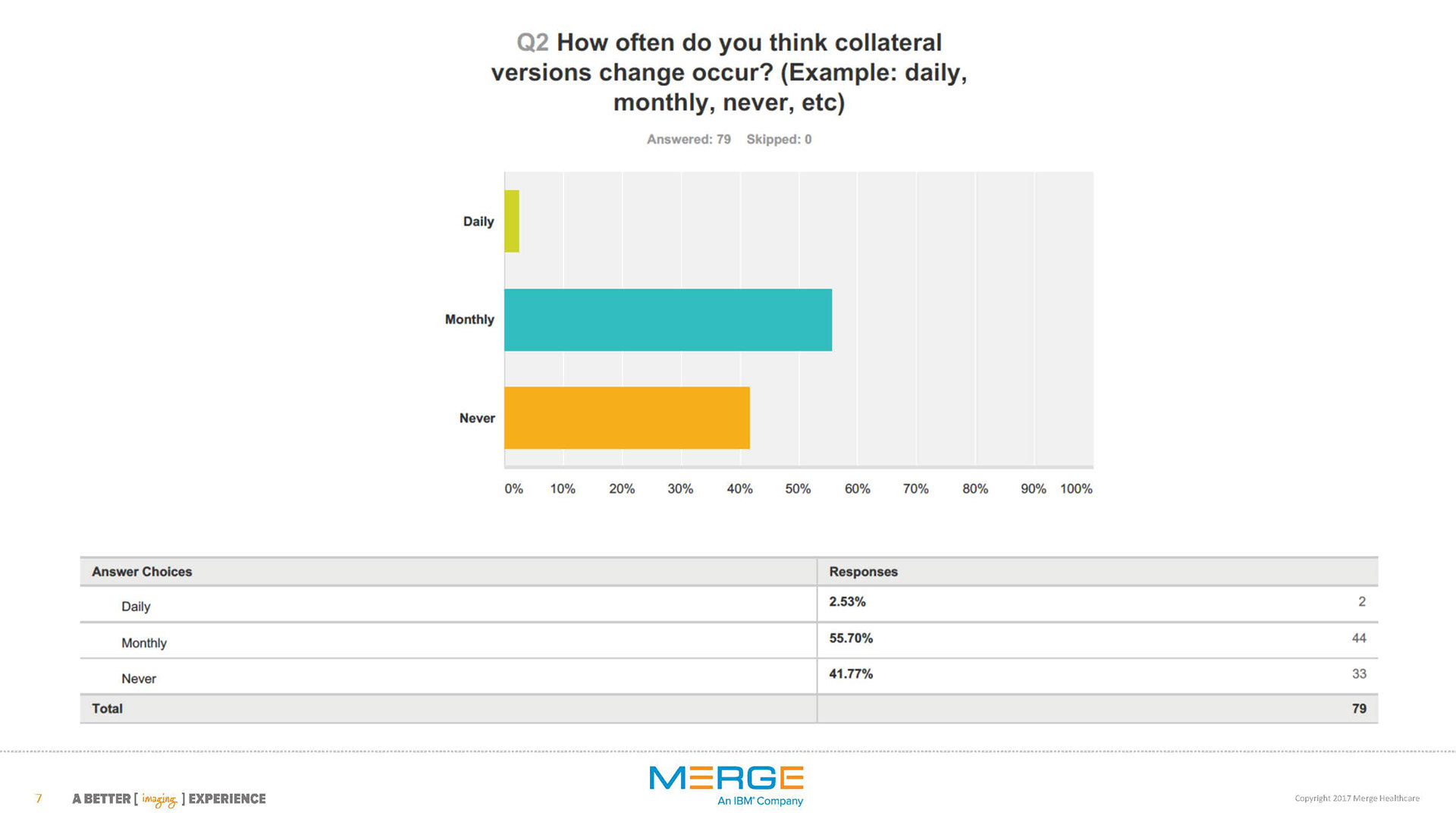
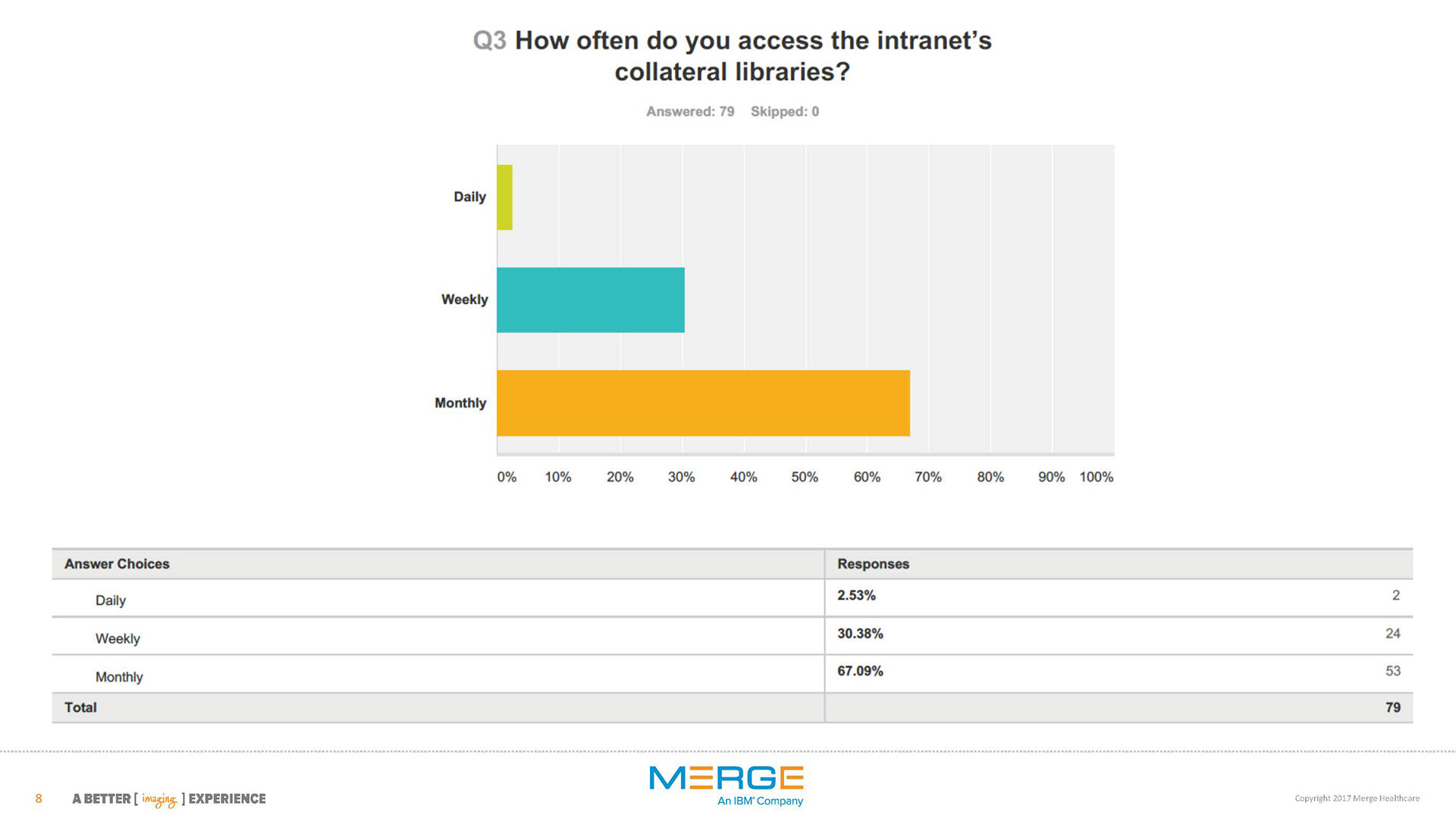
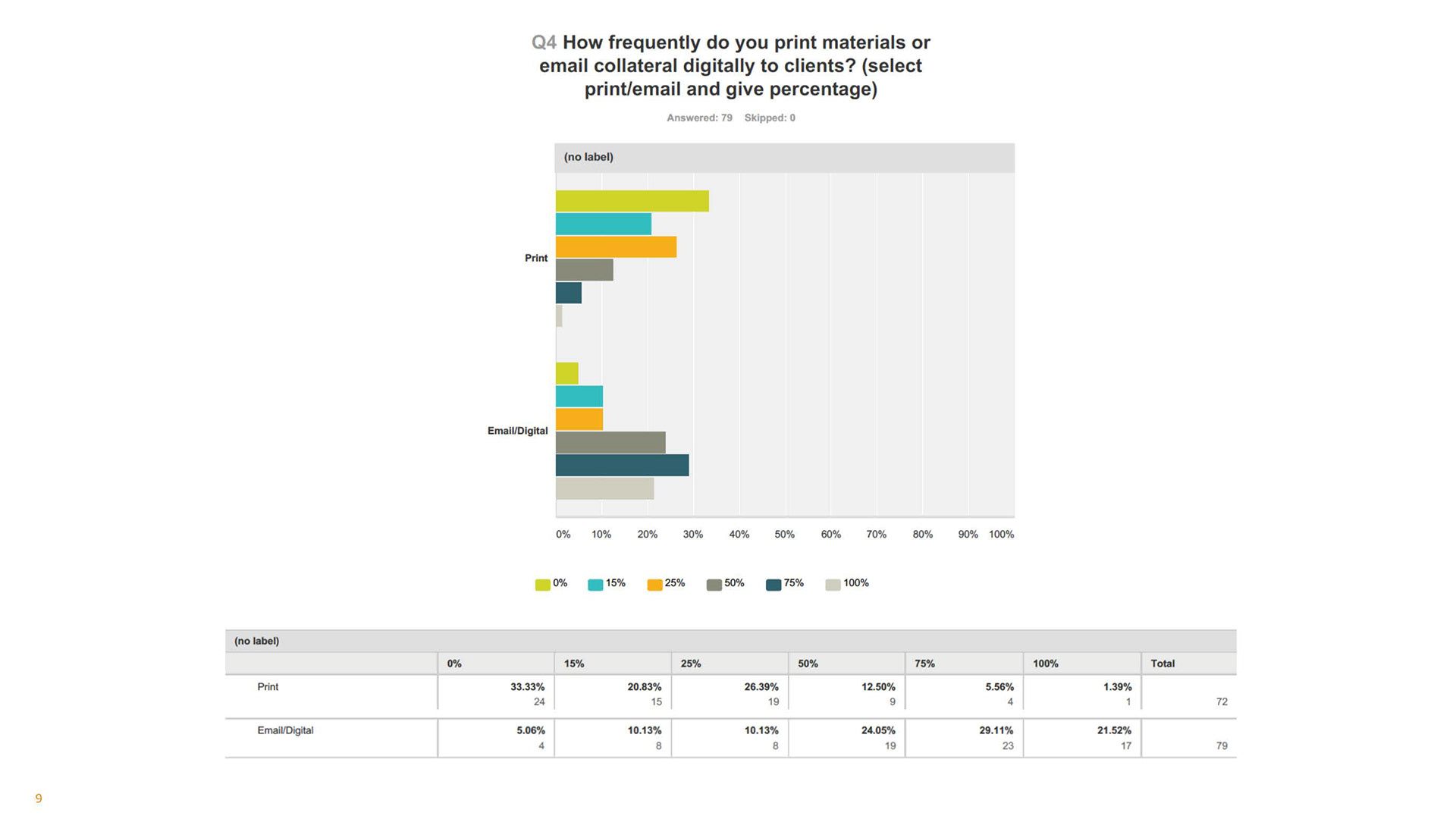
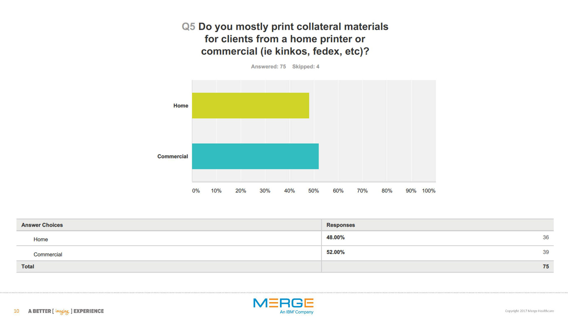
We needed information on how our Sales Teams interacted with the Marketing page along with its resources, so I took the lead in the user research. In October 2016, Marketing sent a five-question survey to the Sales Teams. The objective of this survey was to gather feedback for 2017 expectations, and find out if we are providing the best materials, in the best format, and delivering them in the most effective manner.
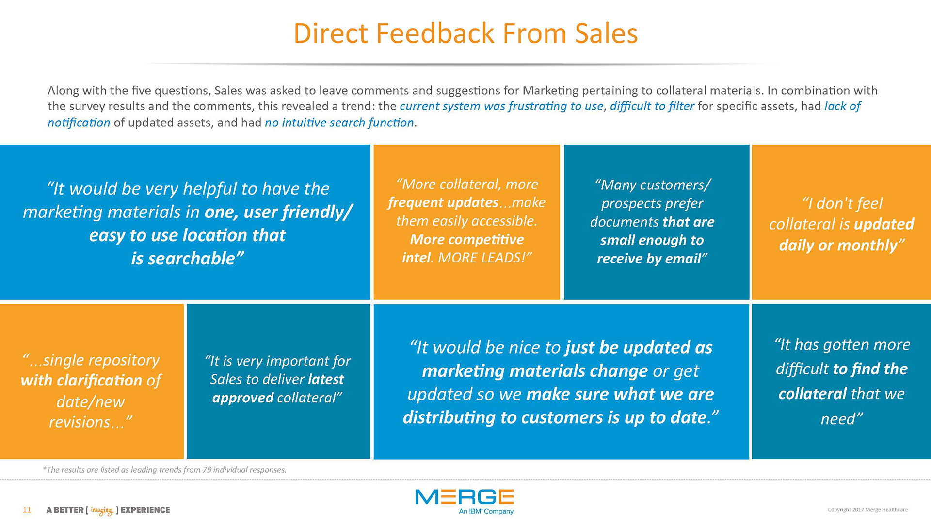
The Direct feedback
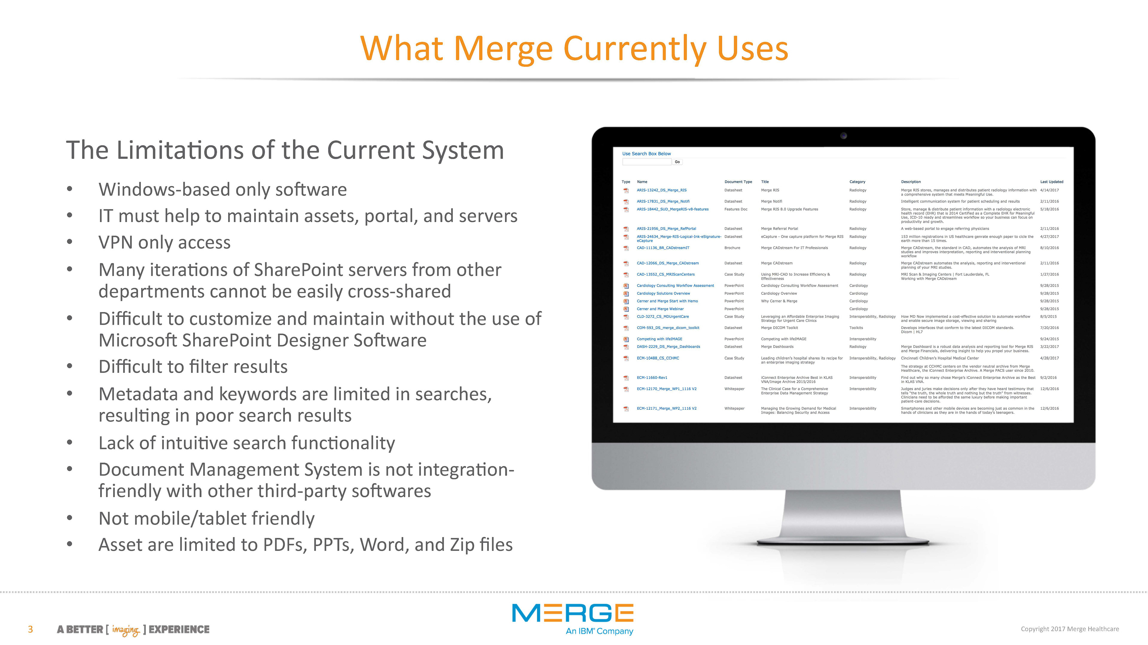
Along with the five questions, Sales was asked to leave comments and suggestions for Marketing pertaining to collateral materials. In combination with the survey results and the comments, this revealed a trend: the current system was frustrating to use, difficult to filter for specific assets, had lack of notification of updated assets, and had no intuitive search function.
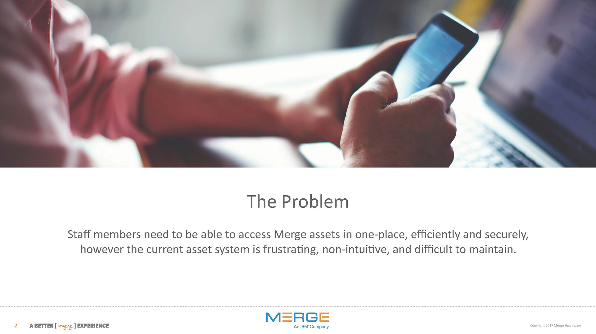
The Unforeseen Problem
Staff members needed to be able to access Merge assets in one-place, efficiently and securely, however the current asset system behind the Marketing page was frustrating, non-intuitive, and difficult to maintain. This meant that the old asset system would need to be addressed first before designing the new Marketing intranet page.
THE PERSONA
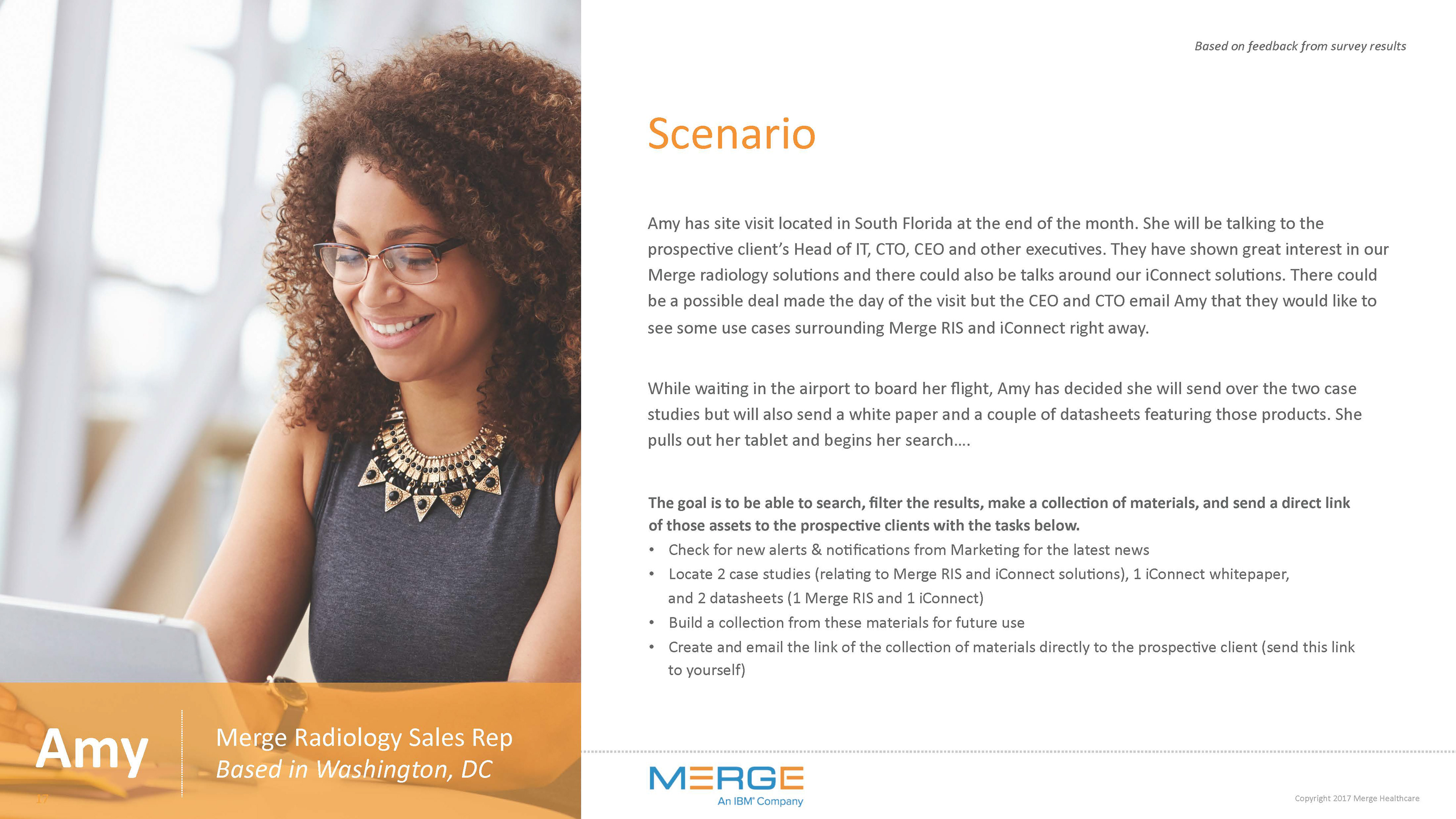
After synthesizing the feedback from our survey participants, a persona was developed to represent a typical user’s personality allowing the Marketing team to understand a Sale's Representative problems when traveling or at a client-site, and how a new asset management system could fill in those pain-points by becoming a strong tool for success in communication and easy access to product resource materials.
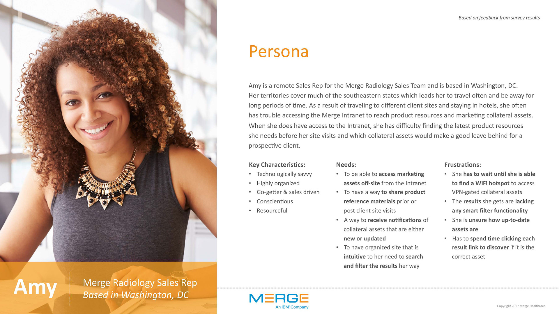
Initial Feedback and Takeaways
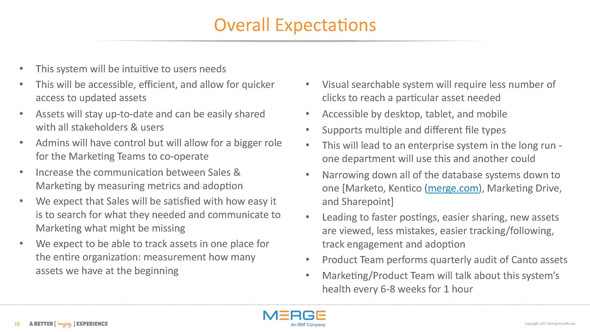
Overall members of the Sales team wanted the ability to access marketing collateral, product resources, and corporate branding assets in one streamline system, that was easily accessible, intuitive, and highly searchable. Whereas the Marketing team wanted to the ability to communicate new assets with individual teams, gather marketing data/logistics, and have a seamless control of updating product sales tools.
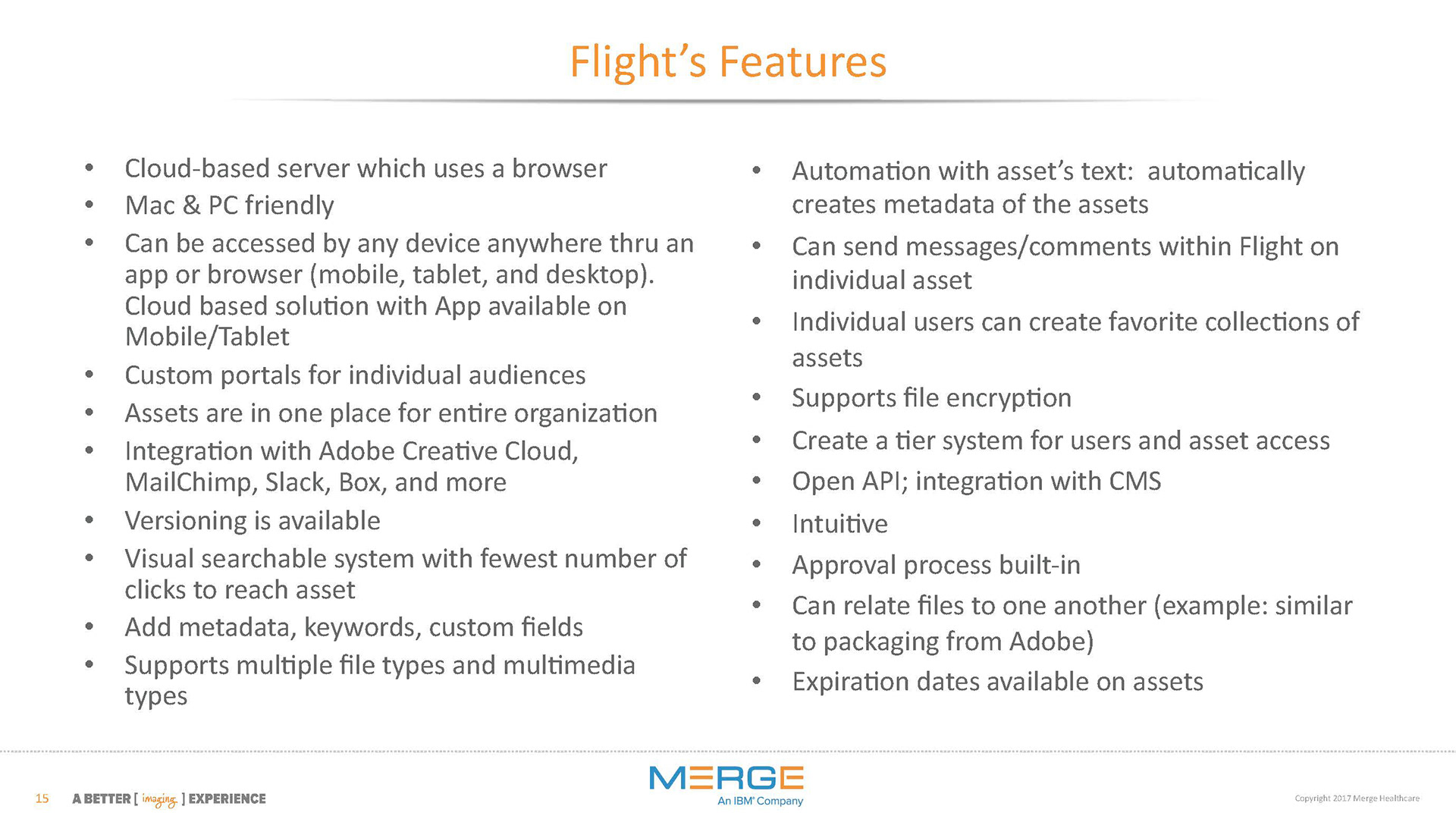
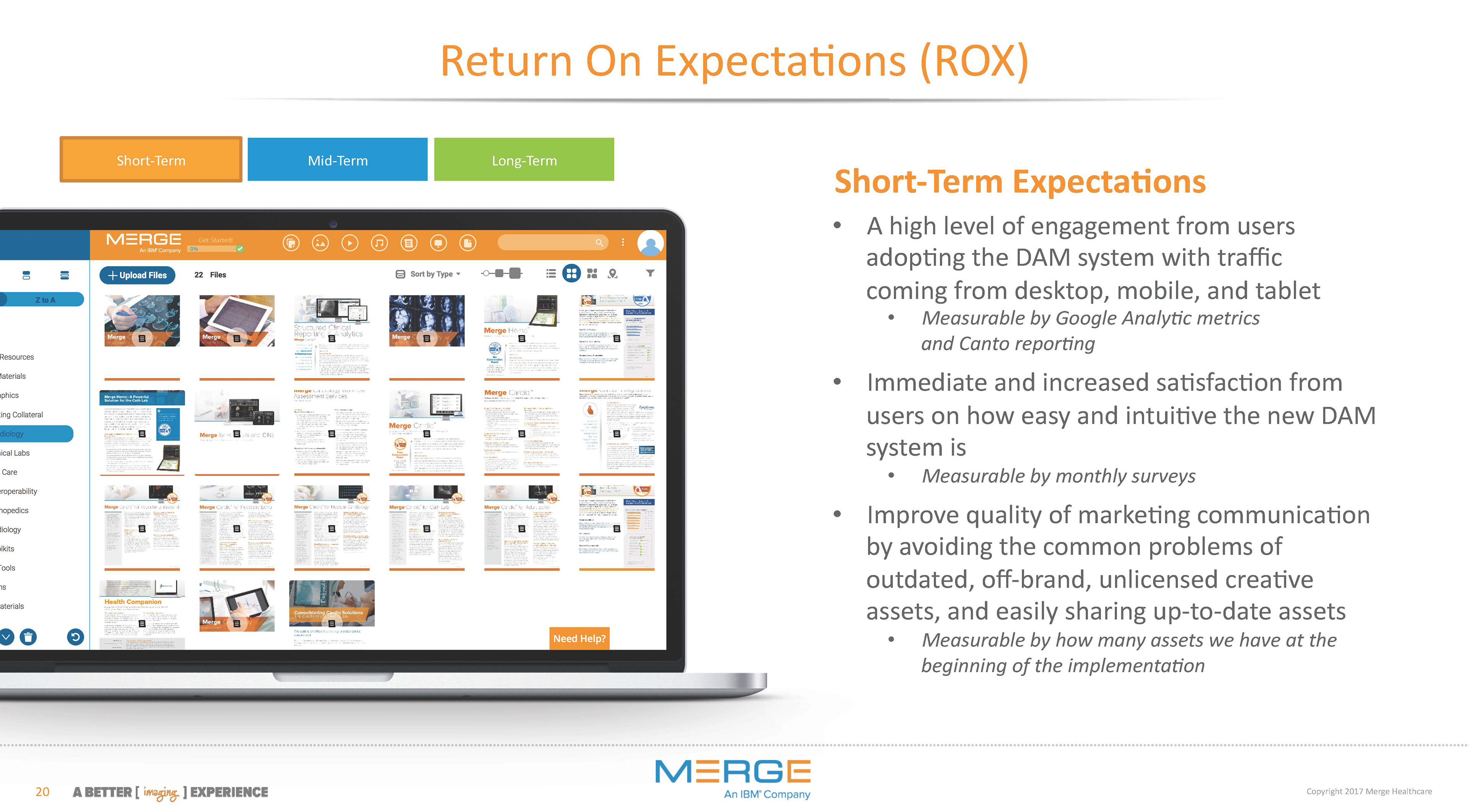
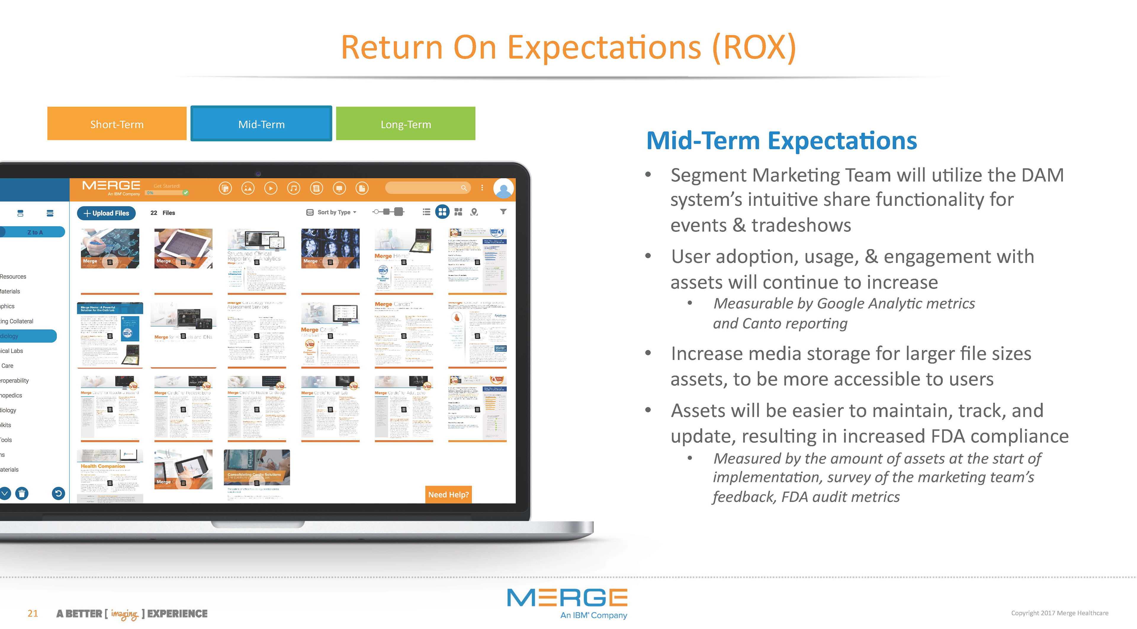
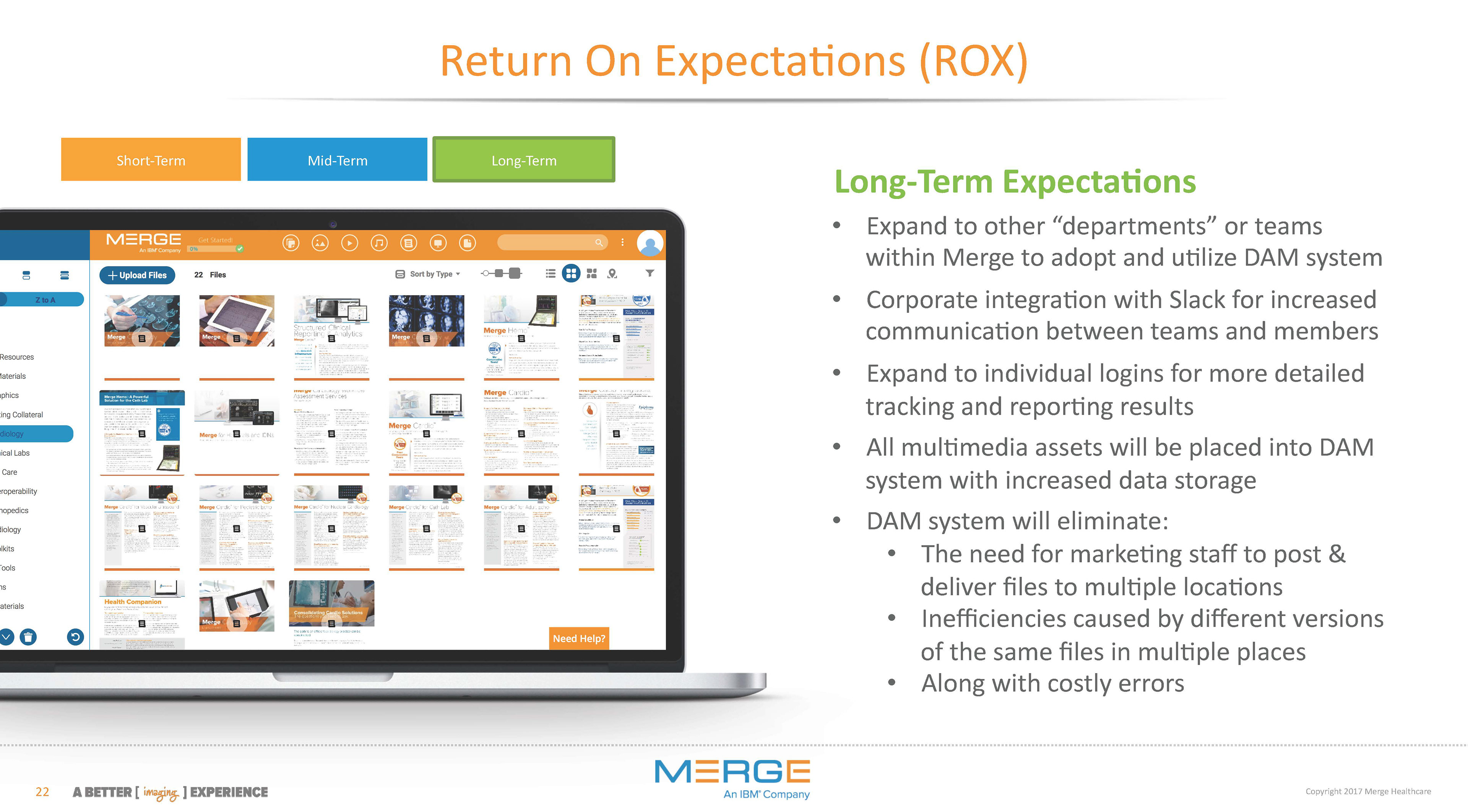
Based on Persona, I developed a scenario (which was used in usability testing with internal staff) to help to find a solution that worked for all teams... a need to purchase and implement a new cloud-based digital asset management (DAM) system as a tool to standardize asset filing structure, help Marketing control assets, works with the corporate intranet security structure, and be the central hub for users to find product resources efficiently. I wore many hats during this system's implementation phase as the — researcher, team training facilitator, project leader, UX designer, information architect, and developer of the Return On Expectations (ROX) plan.
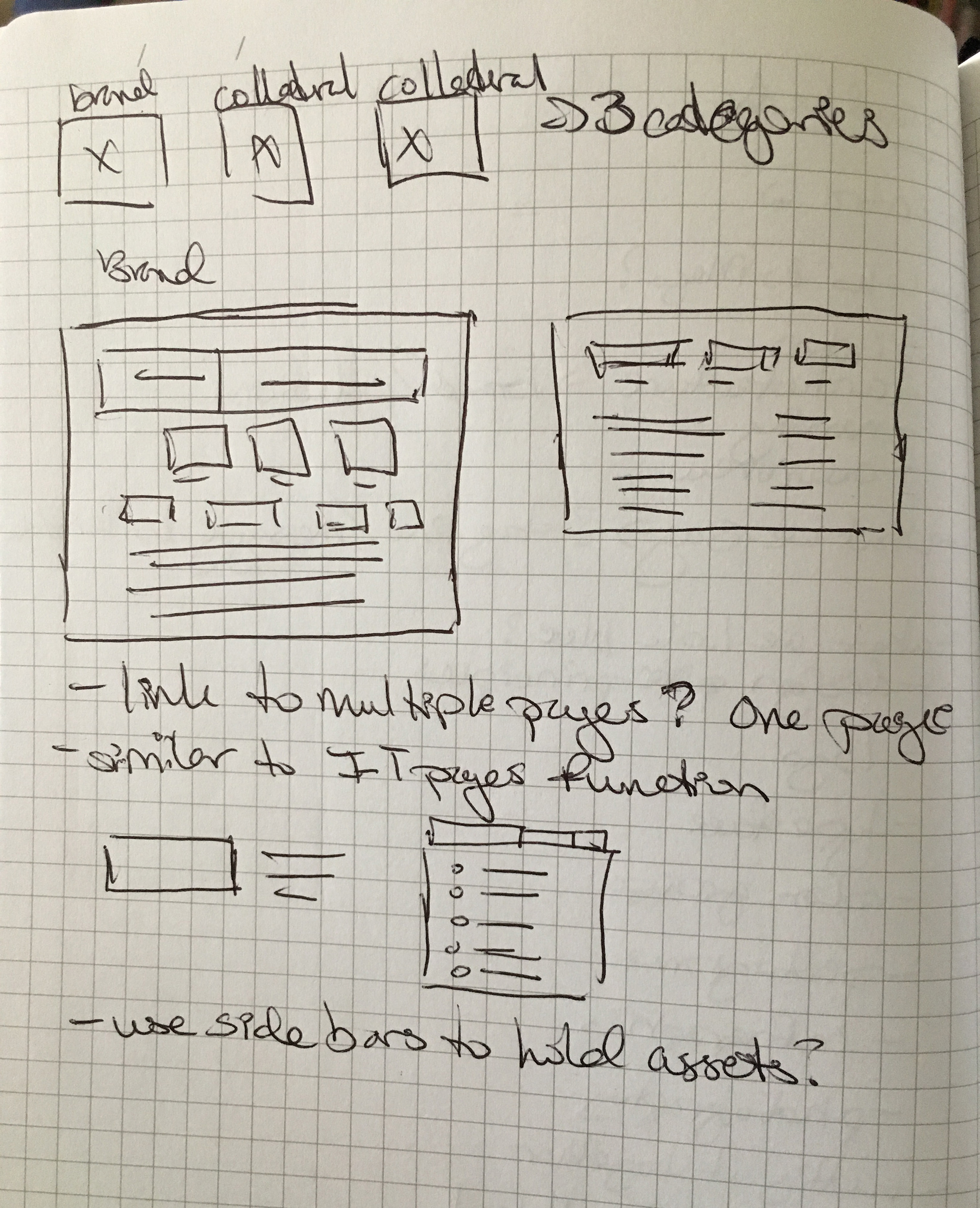
DEFINING THE ARCHITECTURE • SKETCHES LOW-FIDELITY WIREFRAMES
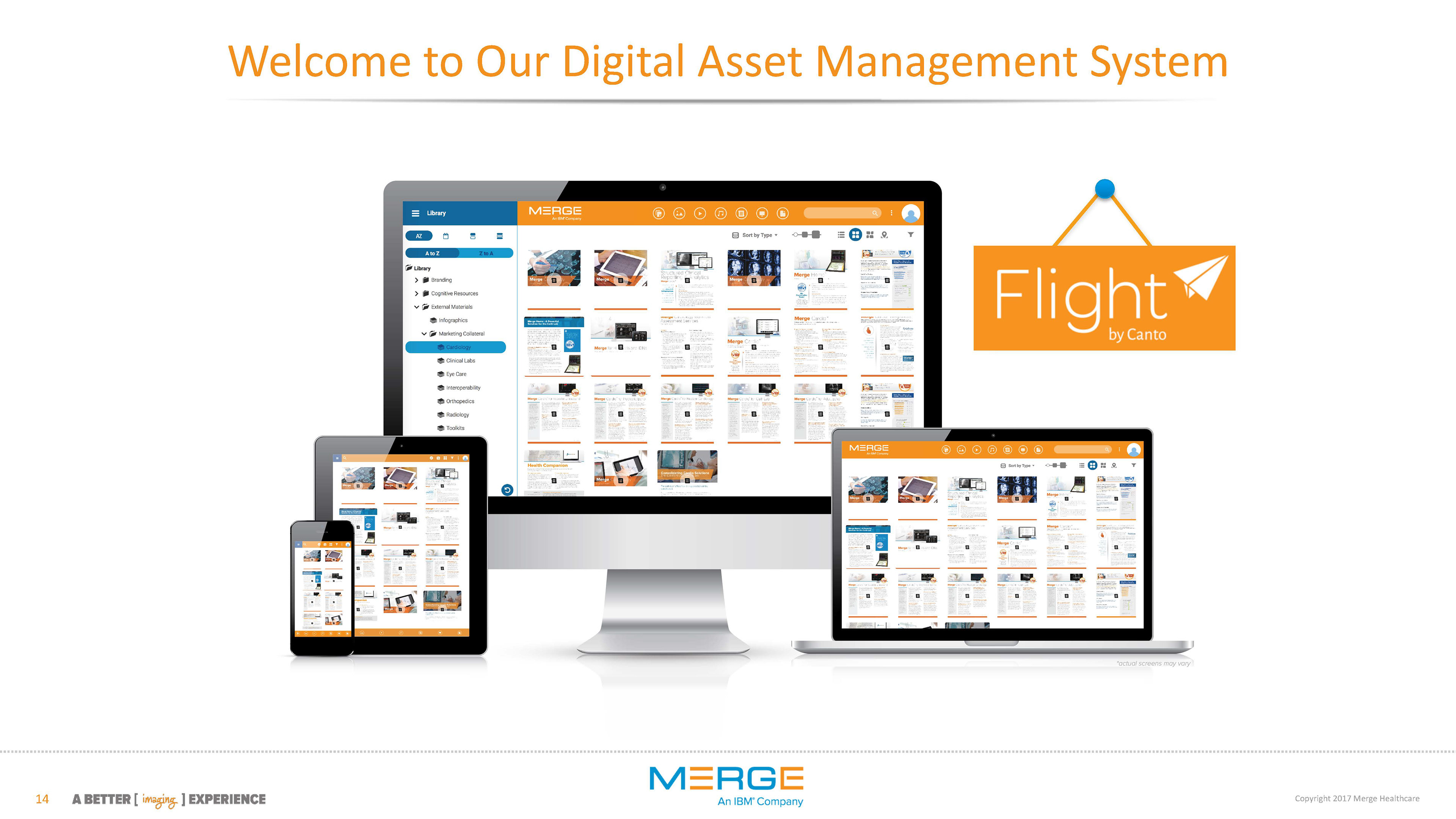
After the new digital asset management system had been implemented, it was time to define the information architecture of the new marketing page.
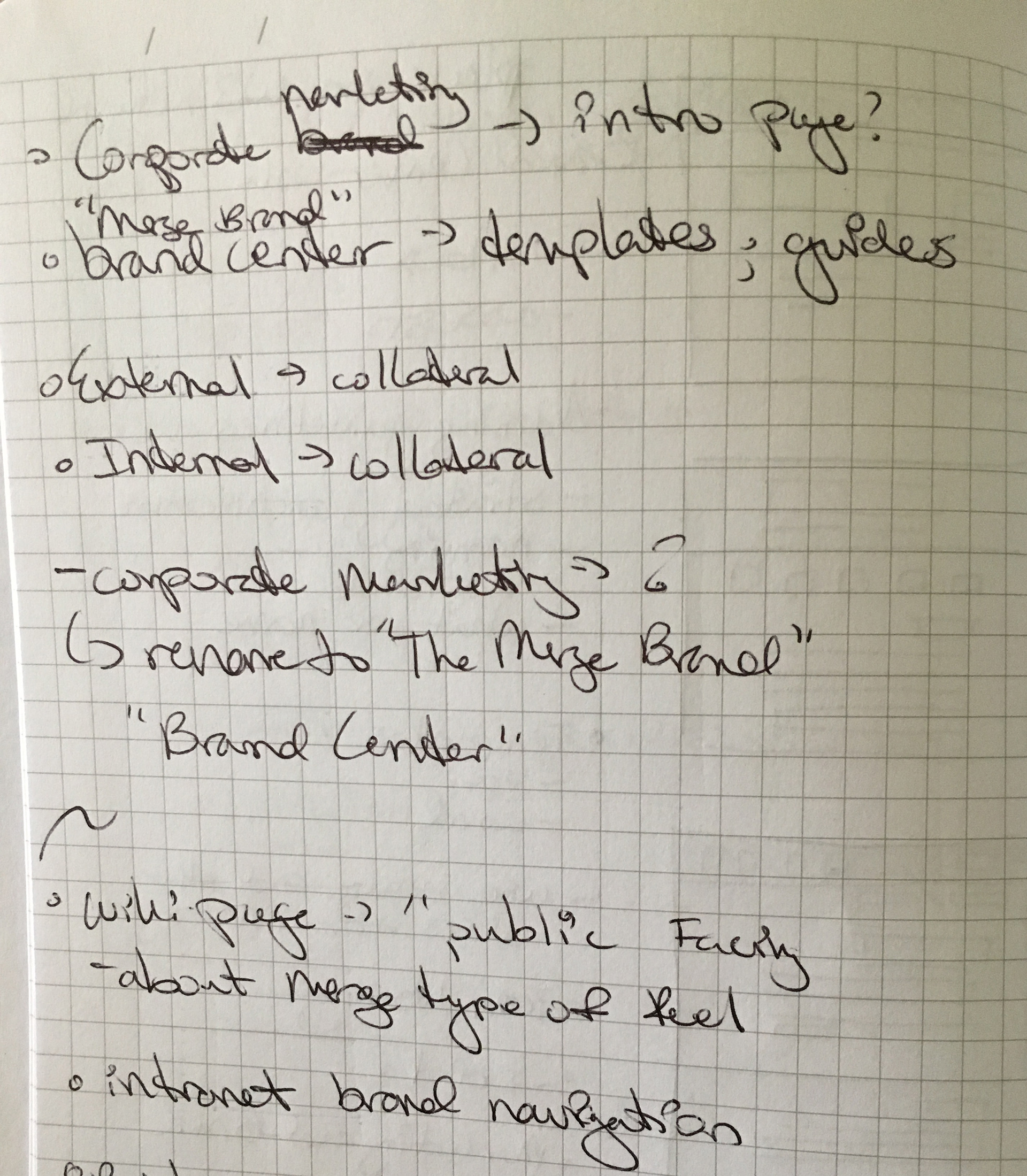
After chatting with the Product and Marketing teams about the marketing page, I synthesized their feedback and one ultimate goal became clear, the Marketing page needed to be “one-stop-hub” access point for assets and resources about the Merge brand to internal staff members beyond just the Sales teams.
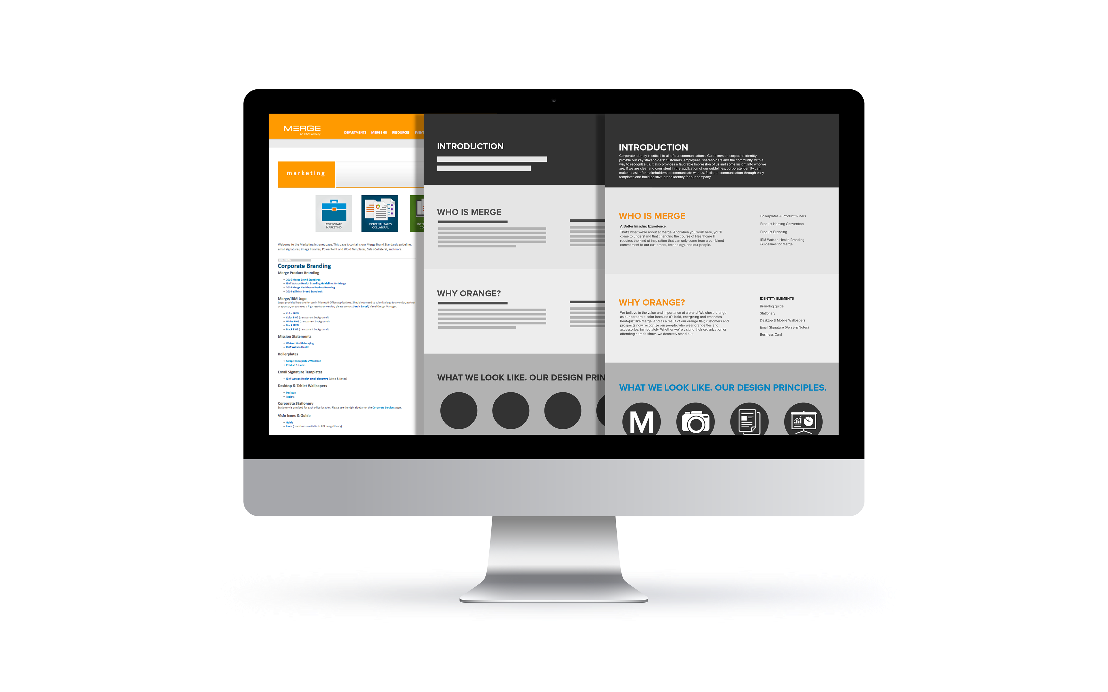
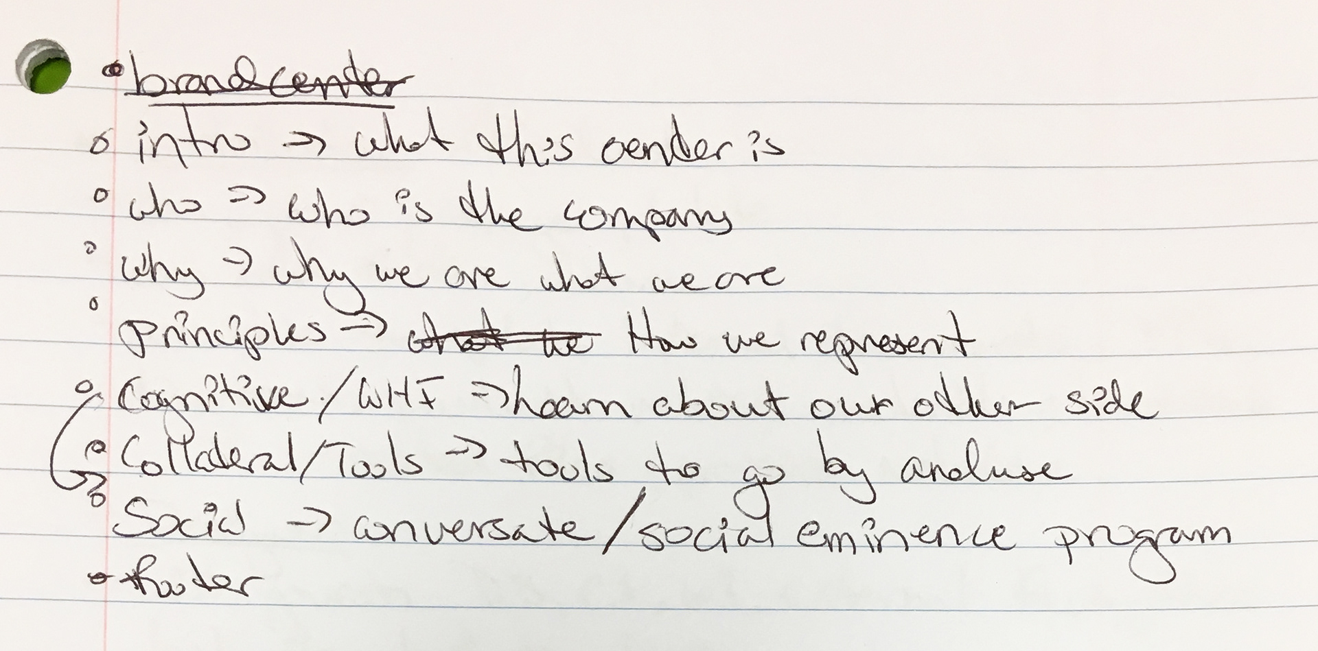
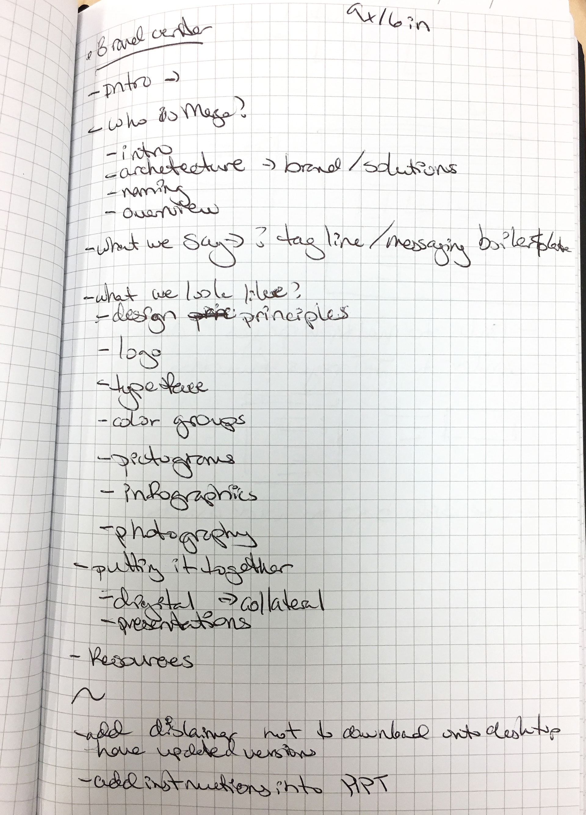
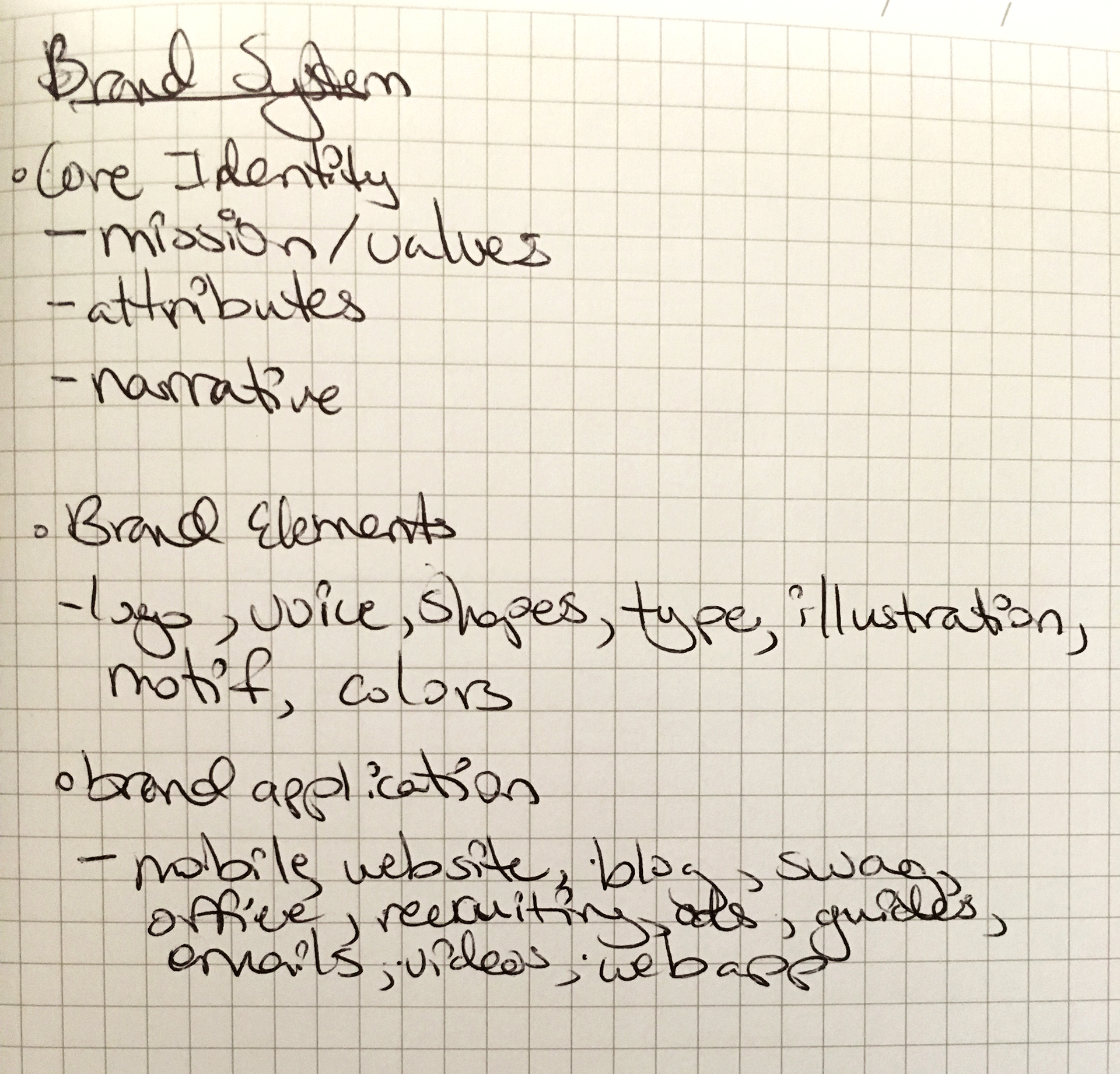
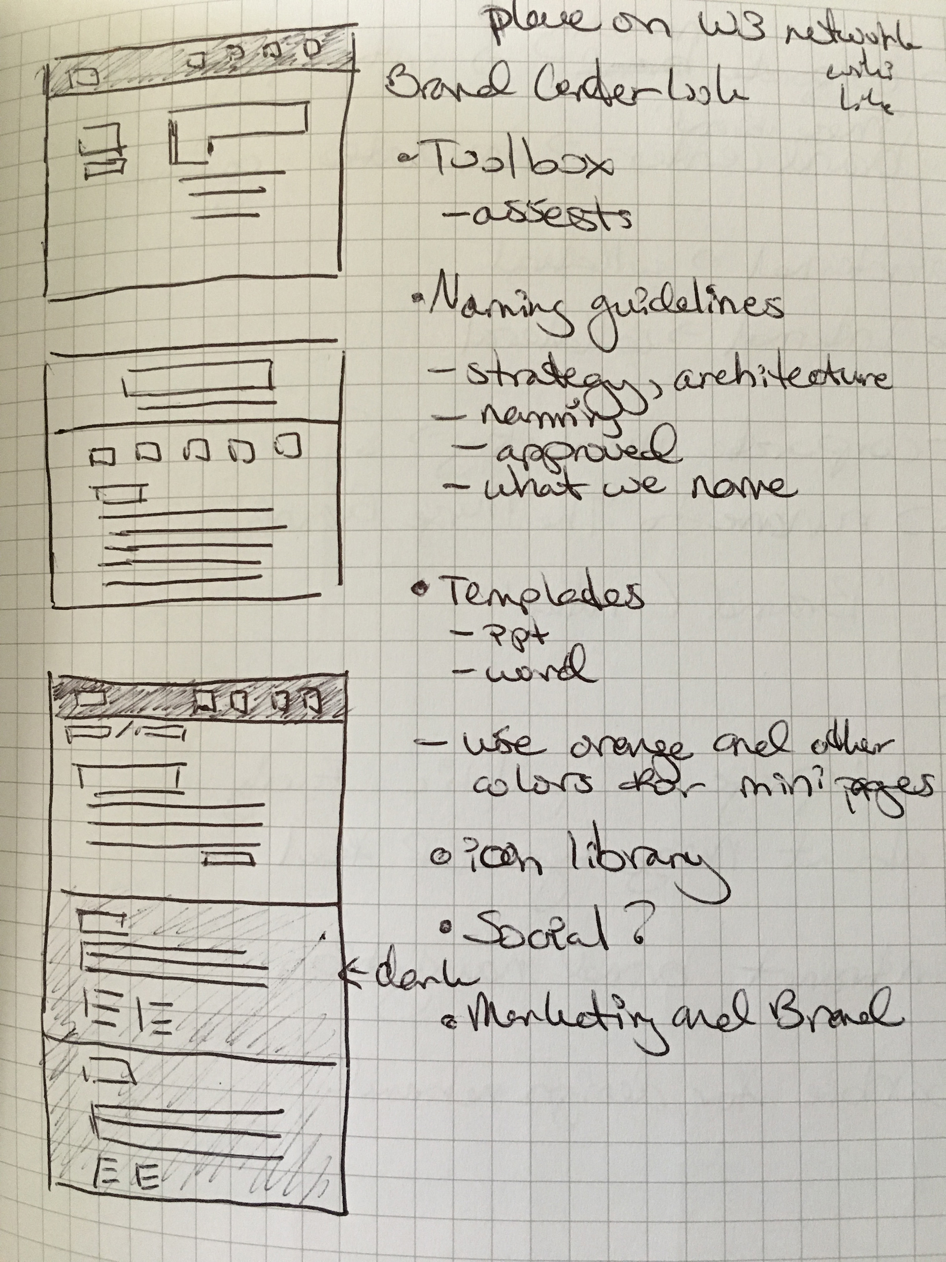
I found what the page was lacking was a foundation, so I focused on an idea to design the page as a "brand center" that would teach Merge brand standards, communicate how to use these branded resources effectively, by telling a story: (1) introduce users to the brand center, (2) who is Merge, (3) what is the Merge brand, (4) the design principles, (5) tools to use, (6) information about partners and affiliations, and (7) how to join in on social media discussions.
structure and HIGH-FIDELITY DESIGNS
The brand center's design used this final "story" as a foundation:
1) Introducing the Merge brand by providing a summary of the brand center's function.
2) Explain why the Merge brand is what it is by providing various style guides.
3) Educate users how and where to use the different Merge brand assets.
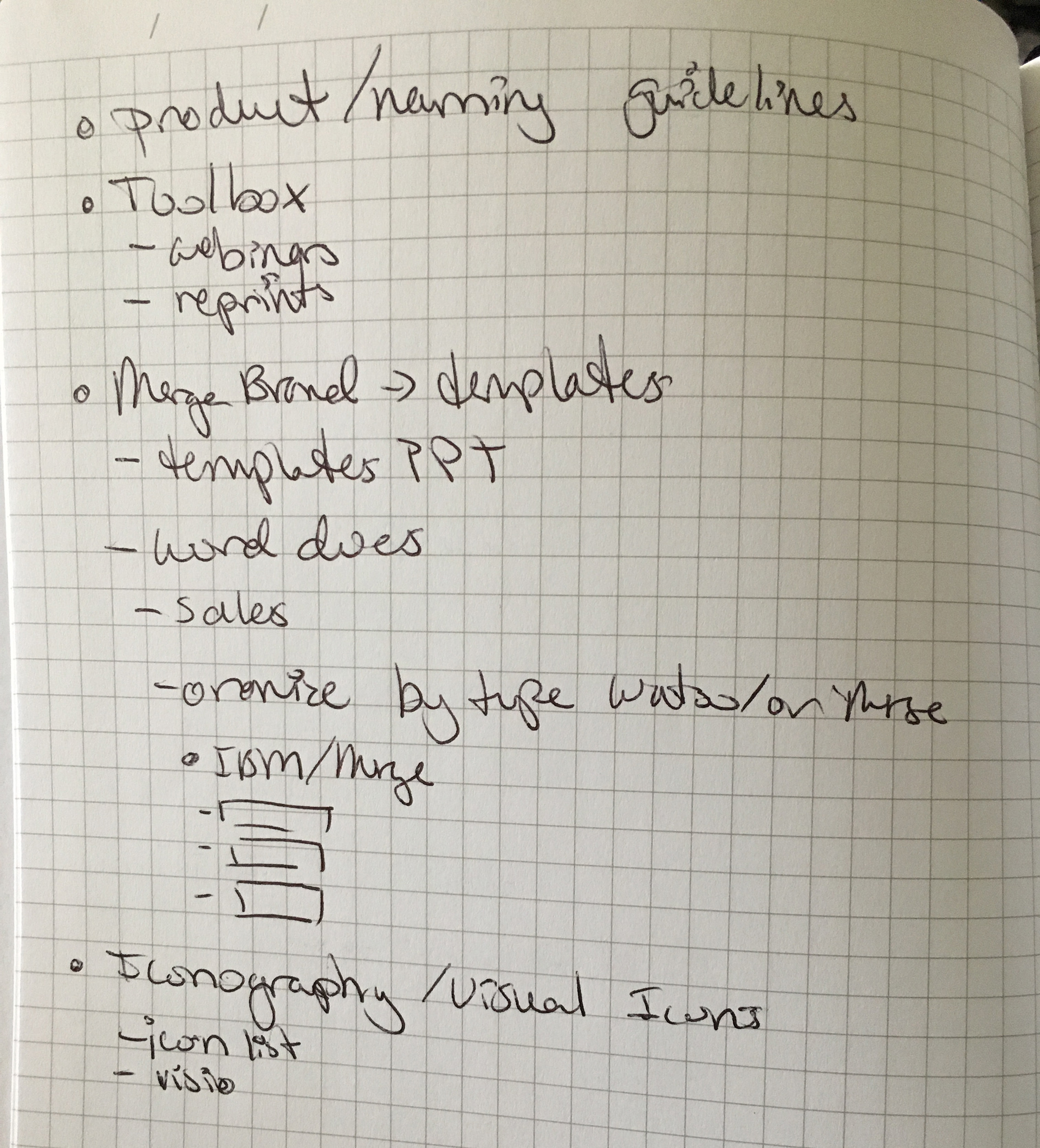
4) Where to access the Merge assets (via digital asset management tool).
5) Share information about Merge's partnership to Watson's Health Imaging.
6) How to share the Merge brand message on multiple social media platforms.
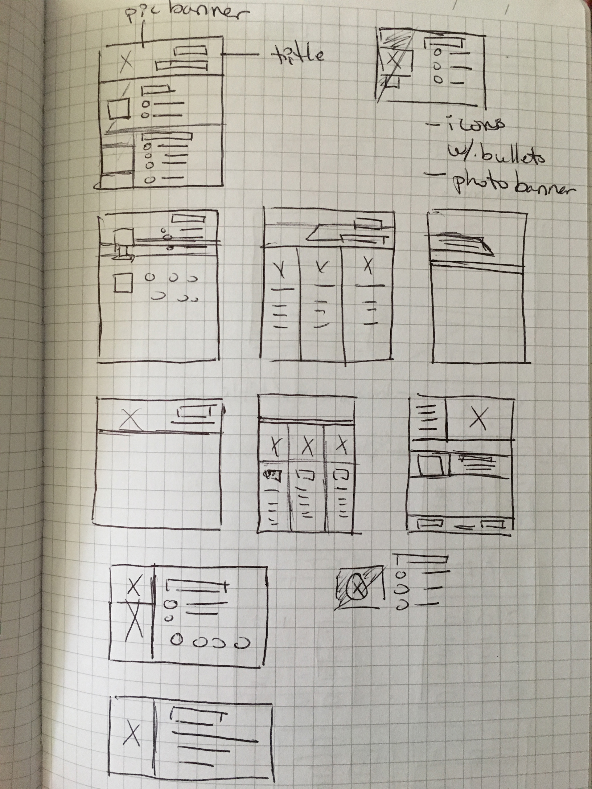
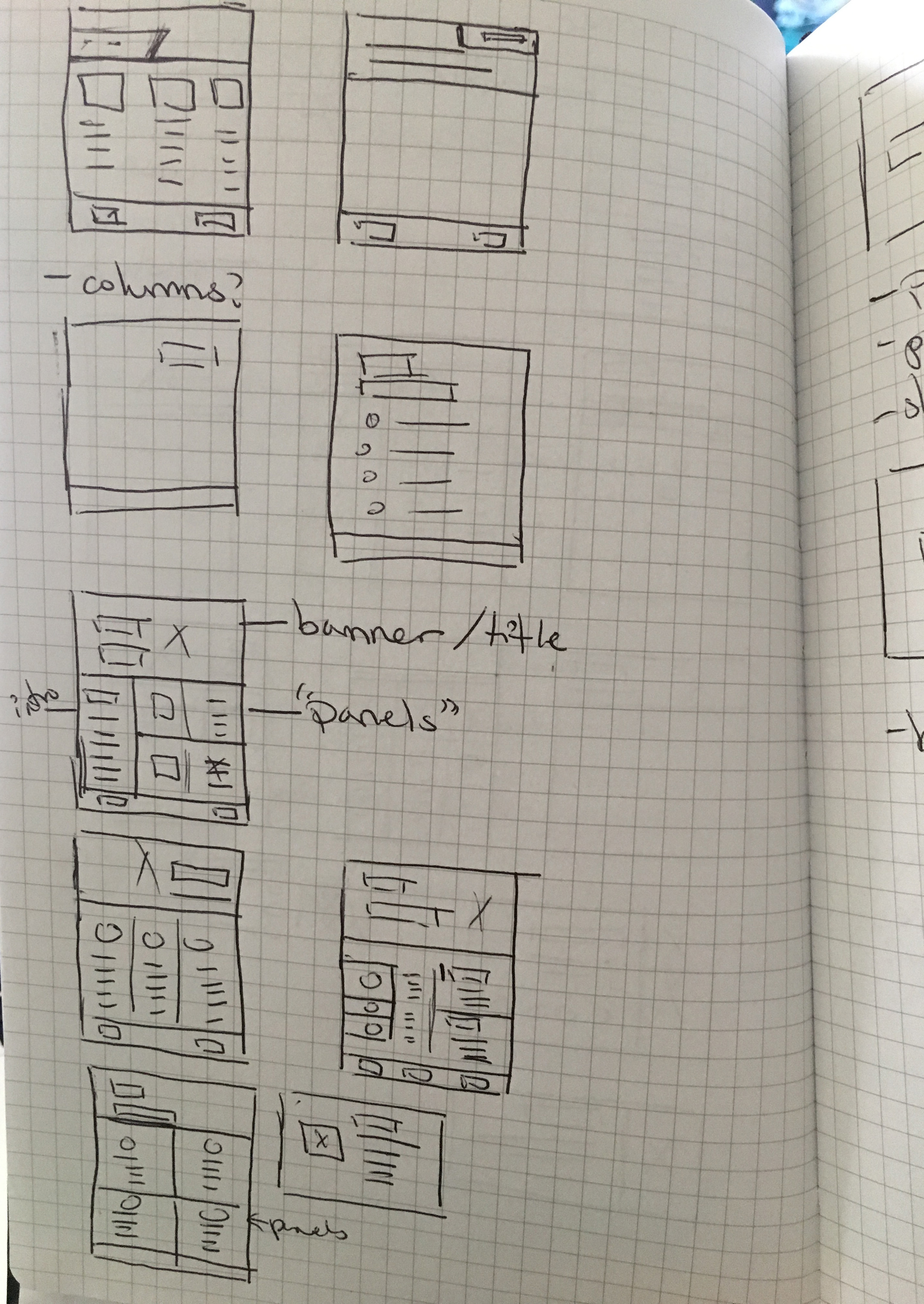
Using this foundation, I developed the wireframes and collaborated with the web designers in the creation of the final robust brand center's design to work seamlessly with the new digital asset management system.
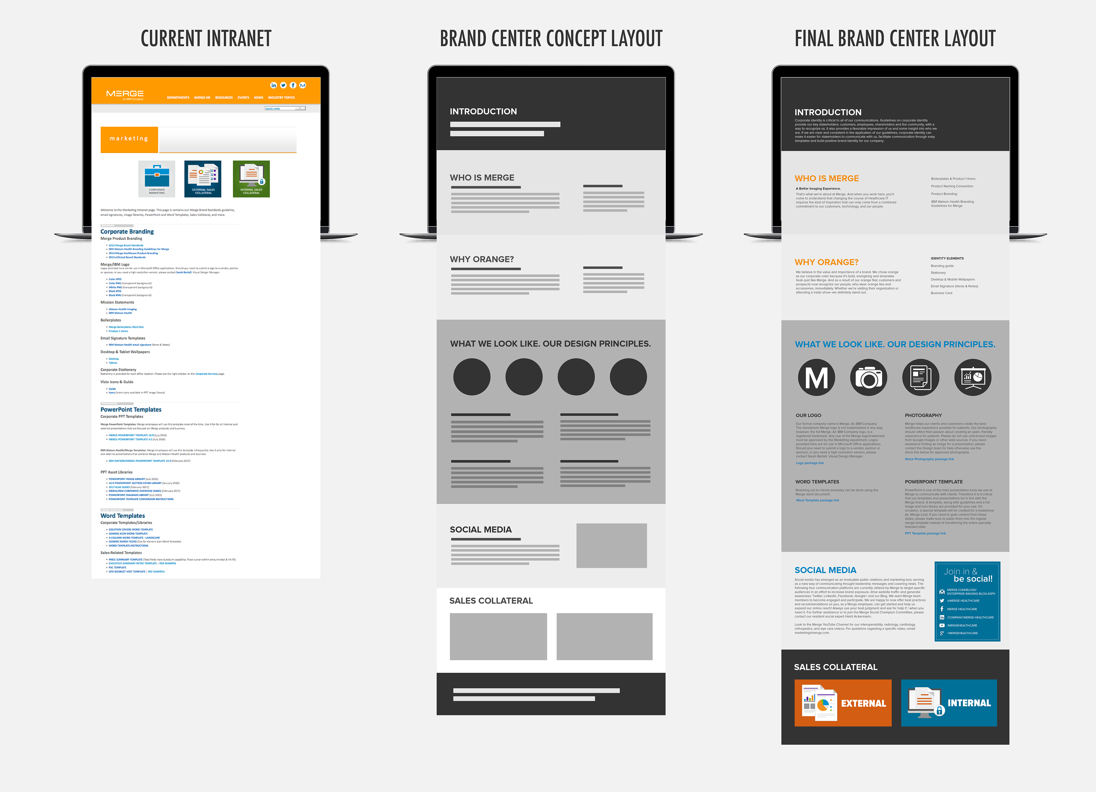
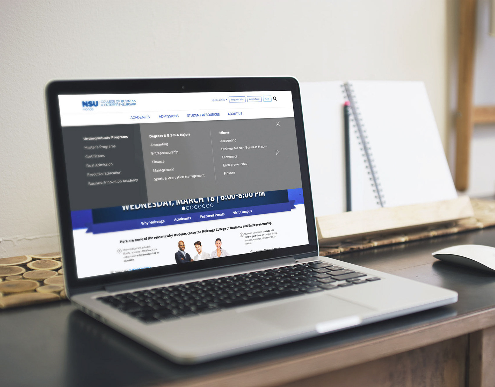
Mid-fidelity wireframes were used to show the brand center's conception
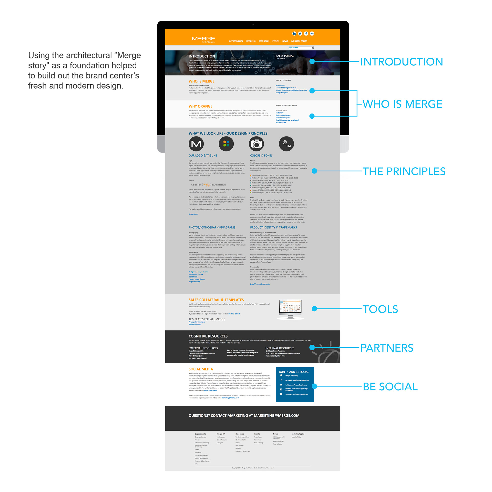
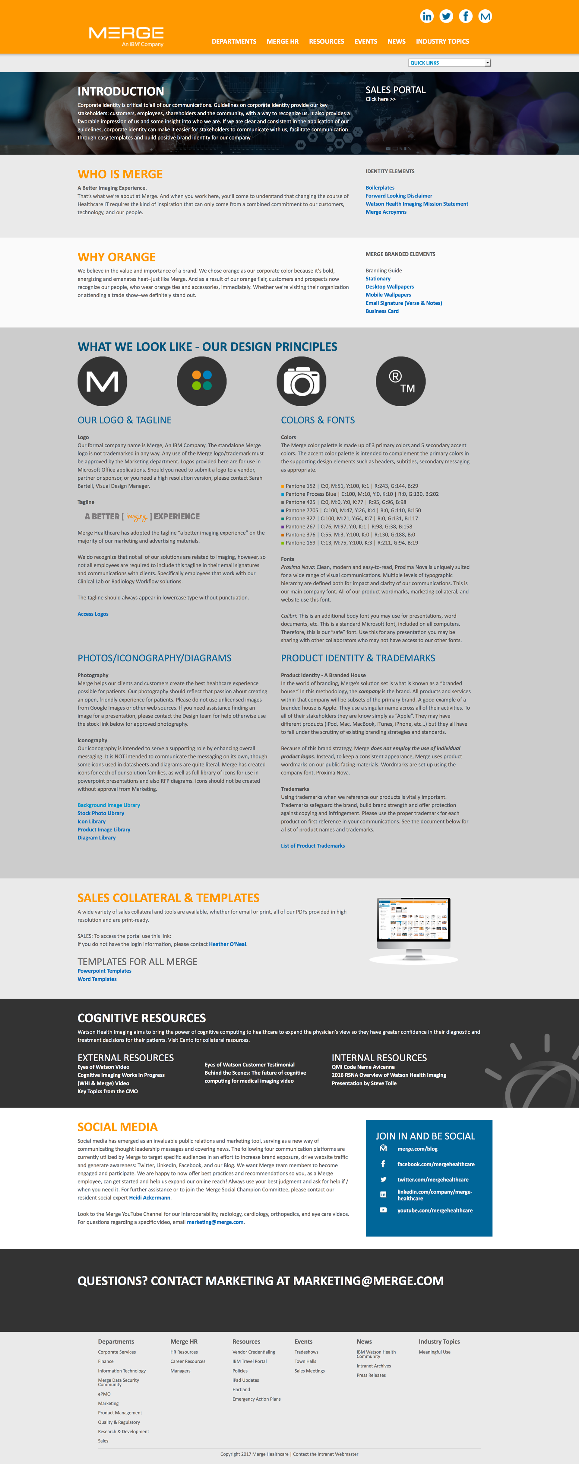
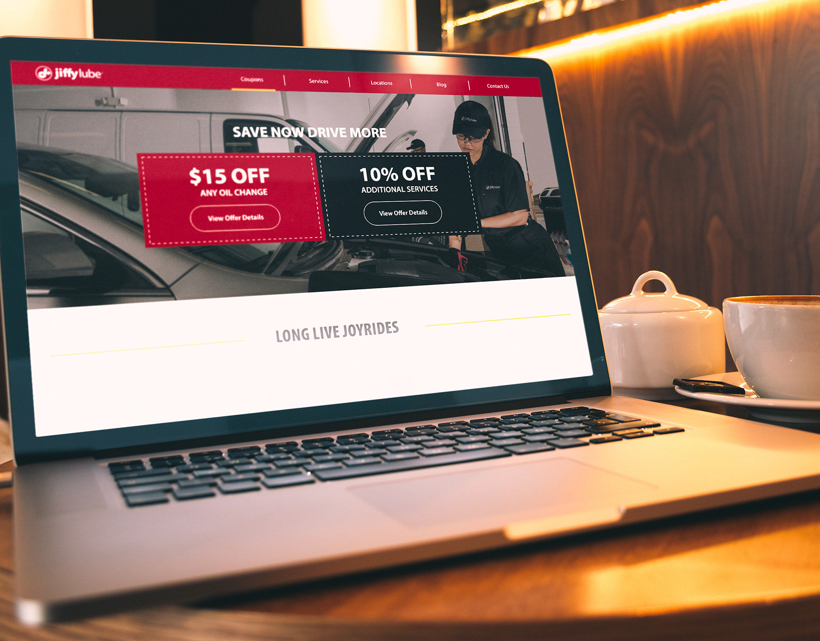
The final design of the Merge intranet brand center design accessible by internal employees and working with the new digital asset management system.