
PROJECT SUMMARY
Nova Southeastern University (NSU) was in the process of updating their College of Business website but were in need of a new navigation to implement with their new design. The main focus was to create a responsive navigation that would help users navigate throughout NSU's individual college pages along with utilizing a global navigation.
The goal was to design a new responsive navigation experience for college site pages that would be intuitive of users needs and visually clean for easier readability.
THE CHALLENGE WITH THE CURRENT FLOW
With this type of full screen navigation on desktop and mobile, users are unable to recognize clearly where they are within the site, how they got there, and where they should go next. Having two navigations within the same place can be confusing to navigate especially with university websites having highly complex infrastructures.
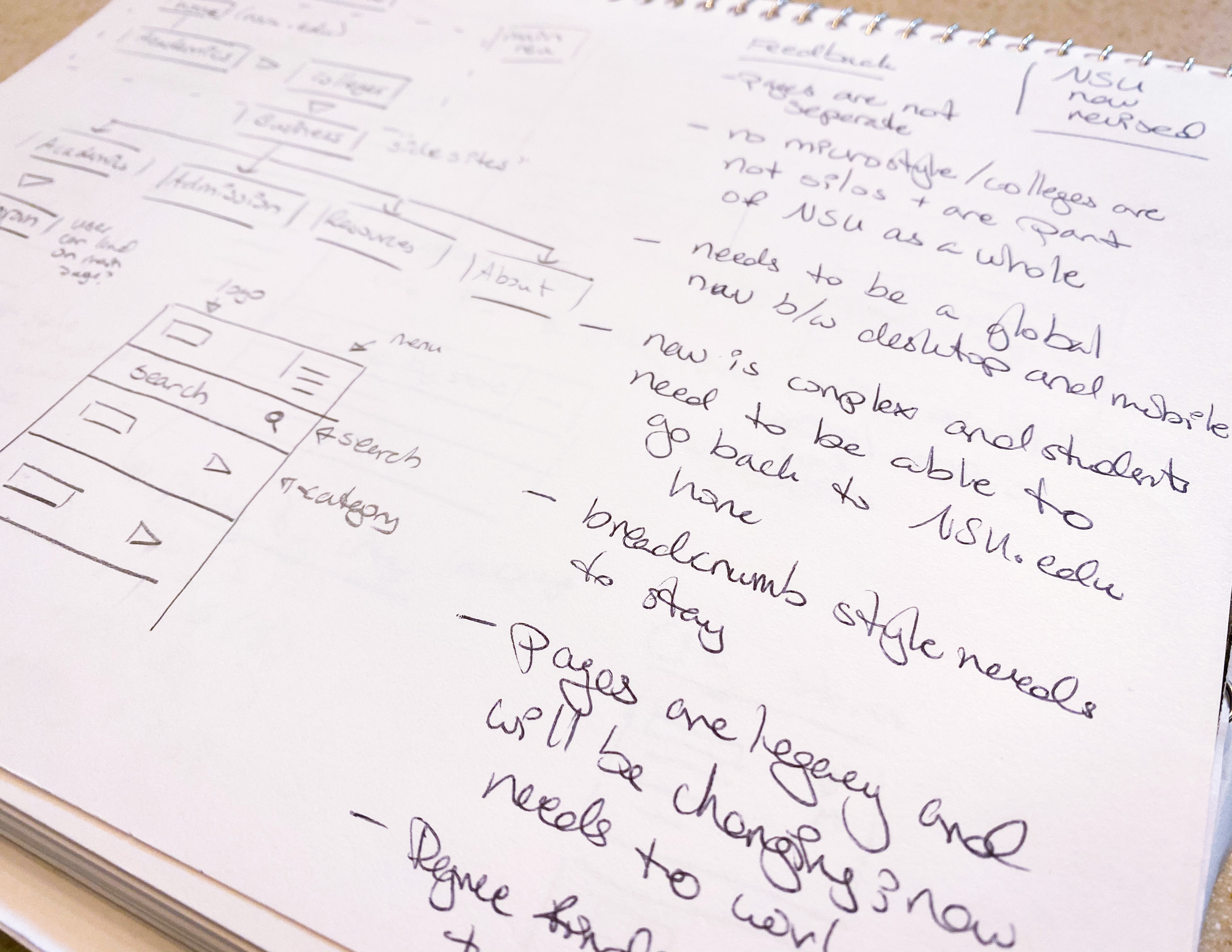
WHEN NAVIGATIONS COLLIDE
With this type of full screen navigation on desktop and mobile, users are unable to recognize clearly where they are within the site, how they got there, and where they should go next. Having two navigations within the same place can be confusing to navigate especially with university websites having highly complex infrastructures.
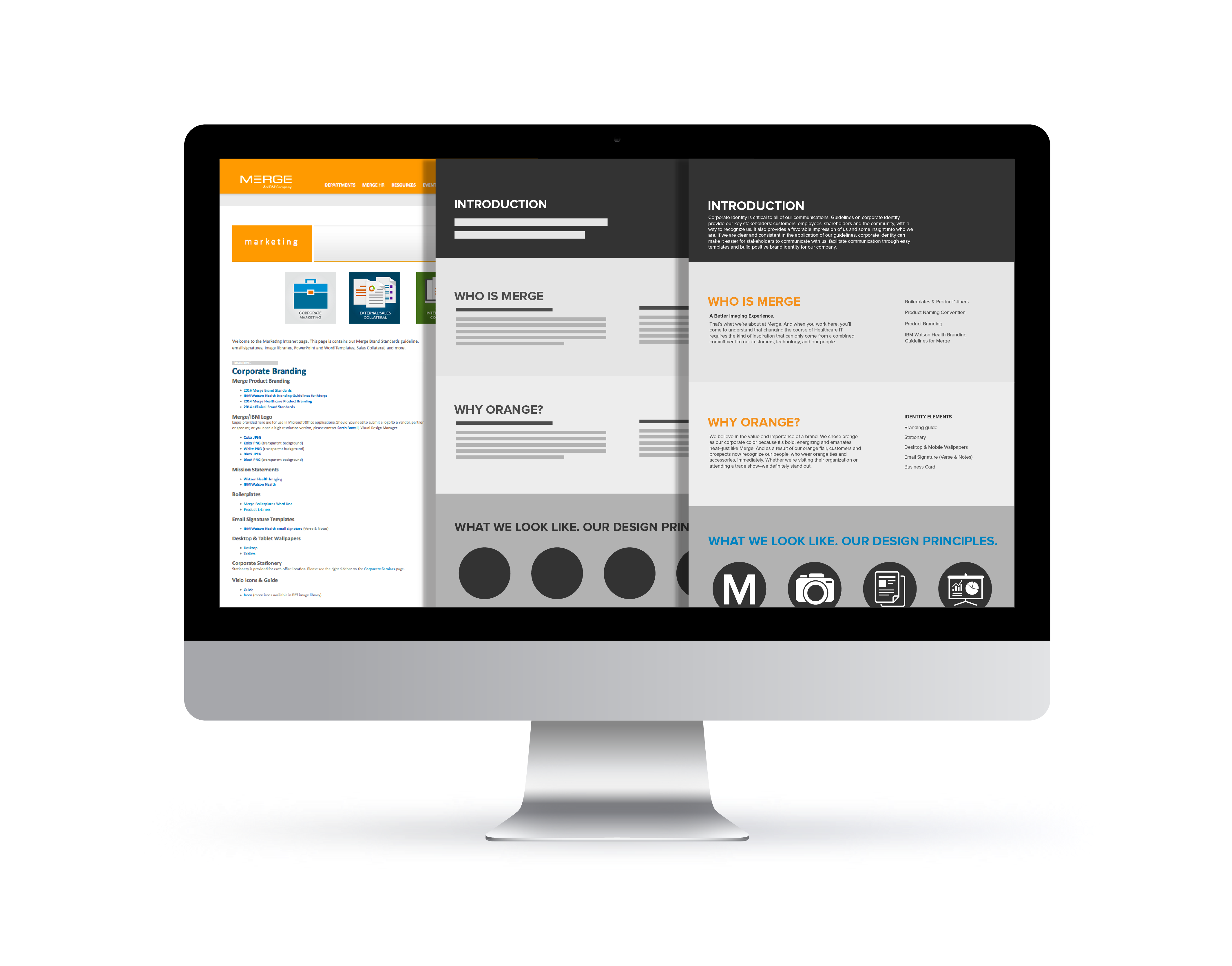
RESEARCHING HOW THE COMPETITORS DO IT
To help alleviate these complex infrastructures keeping the navigation highly organized and UI very clean makes easier to read to access those links resulting in a more pleasant experience for the user. Here are a few examples of navigations that are intuitive to the user's needs to reach their destination quickly whether through desktop or mobile.
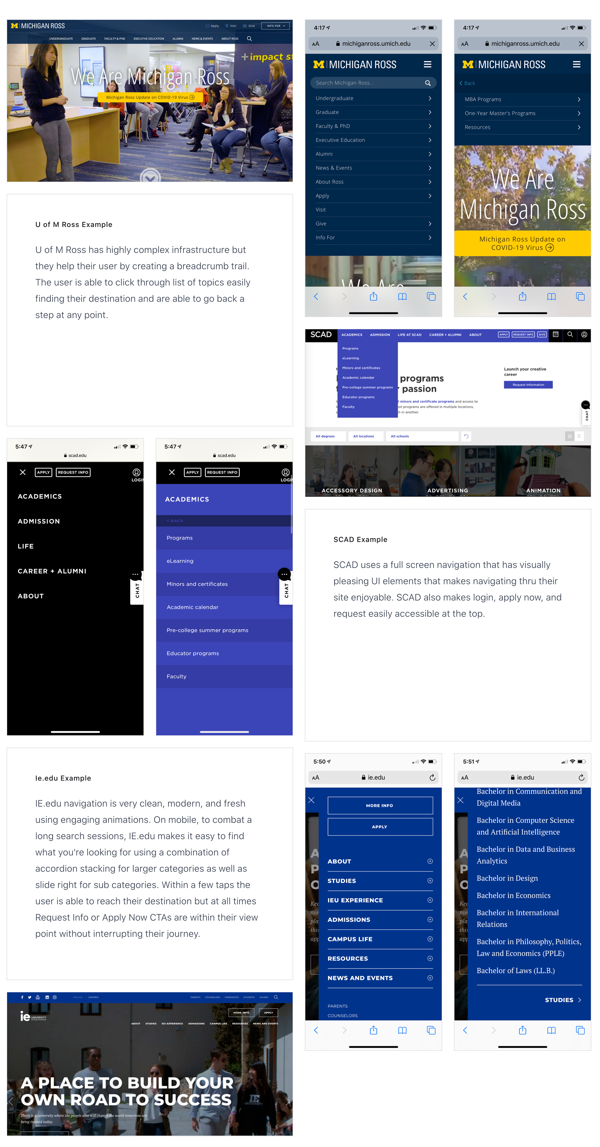
Revising the NSU NAVIGATION Infrastructure
Fundamentally university sites are highly complex in architecture and at times have multiple colleges under a university name with individualized websites. NSU was also in the process of pushing their legacy pages and micro-sites into one style however I found that a user could be confused recognizing where and which navigation to focus on either desktop or mobile as the navigations look the same and behave the same.
To change the navigation it needed to follow these rules:
• Be global in behavior for both desktop and mobile.
• Use a breadcrumb nav method to assist the user to recognize where they are and where they could go next.
• These college micro-sites are not silos and are part of NSU's main site as a whole.
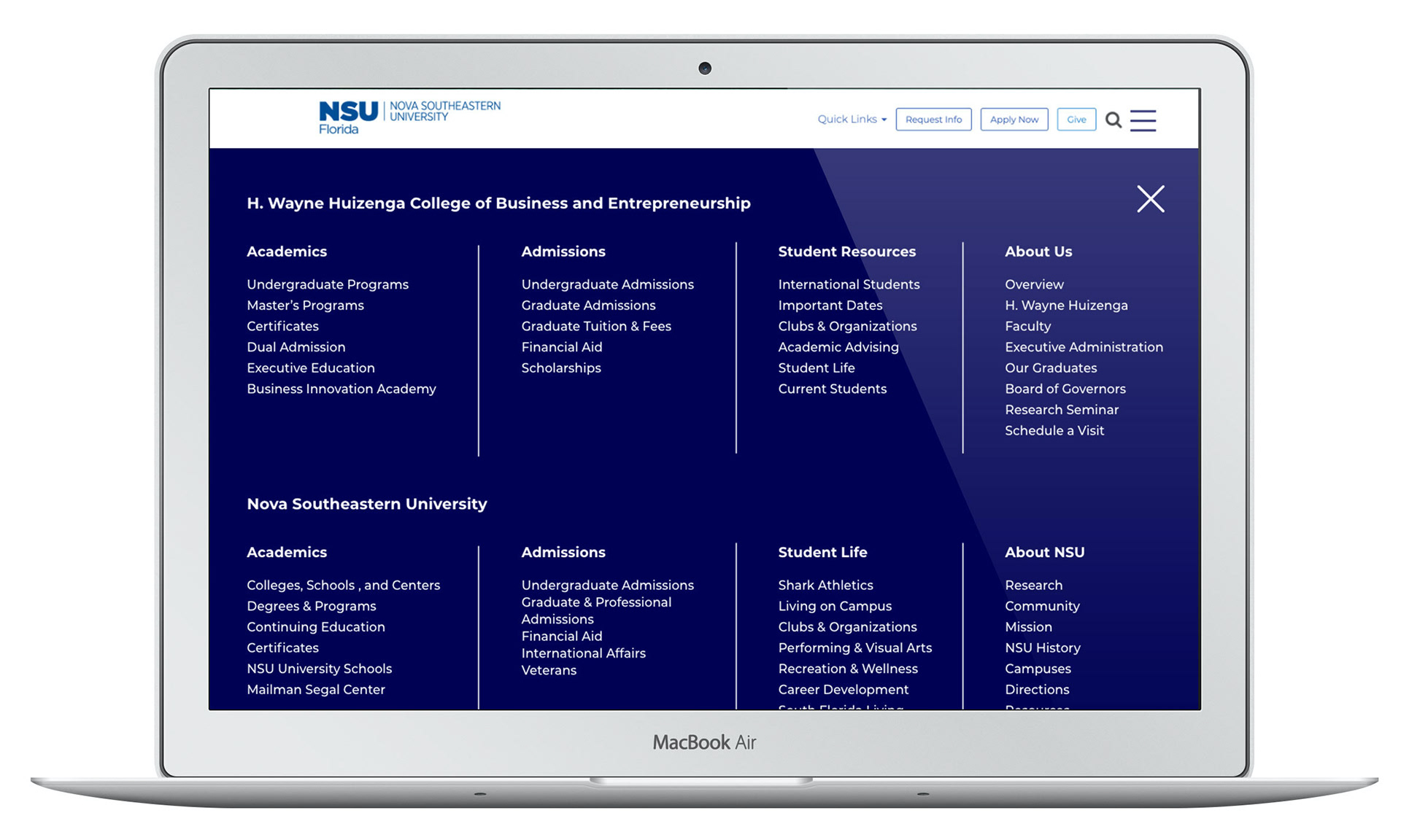
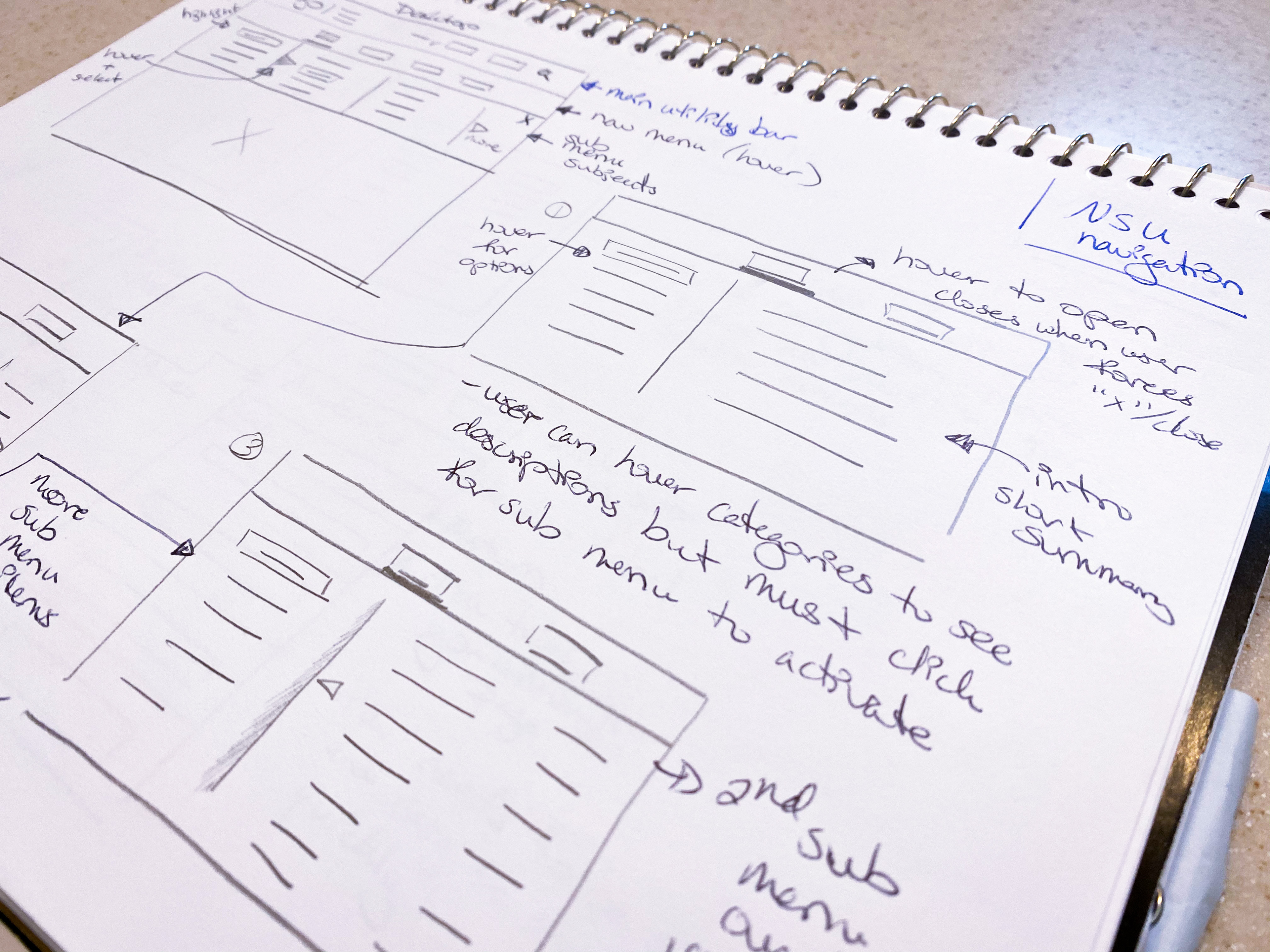
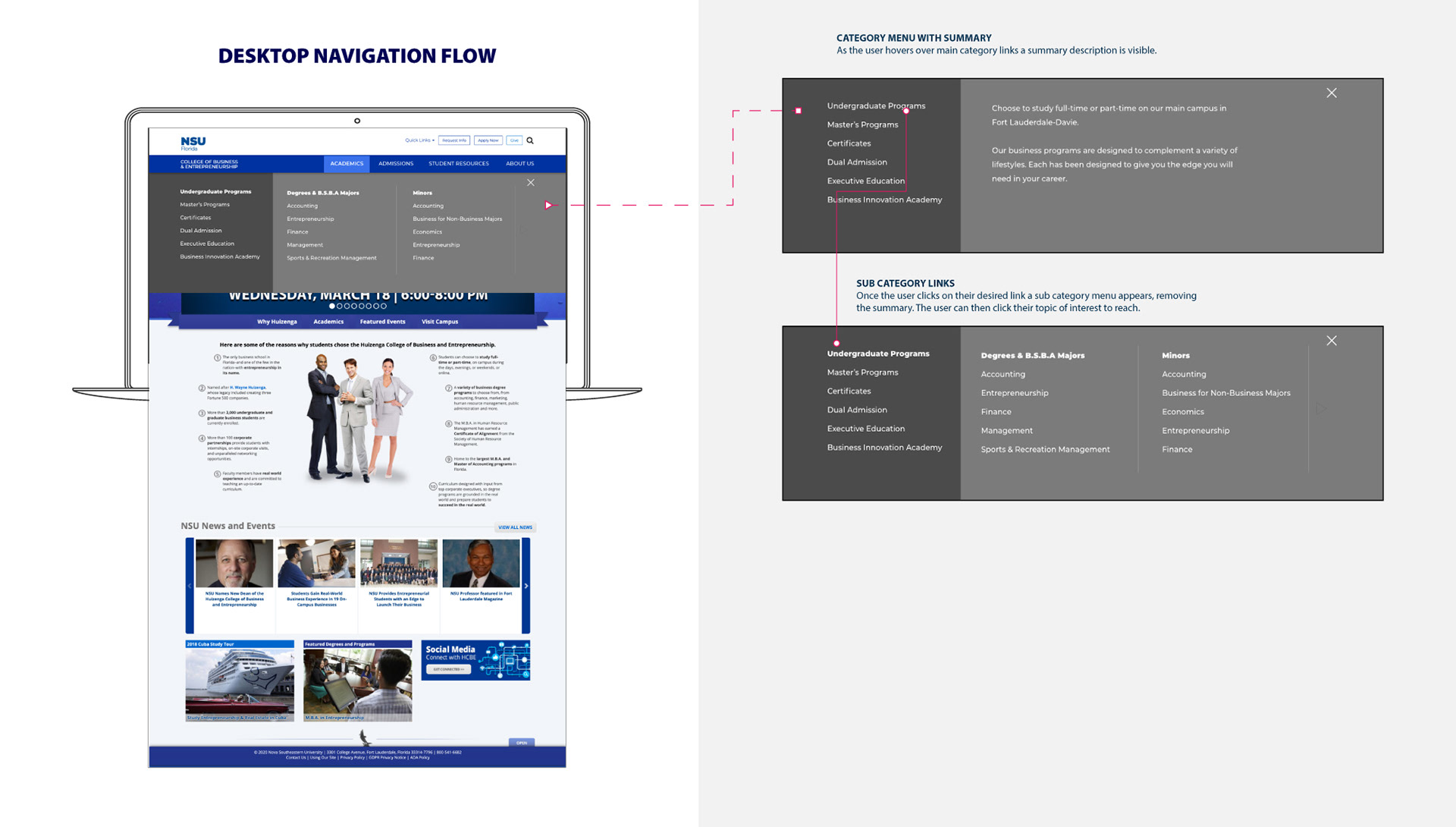
REVISING THE DESKTOP
• Rip away the extra introduction program pages and pulls those elements into the user’s view and this becomes the navigation. This also removes extra step for the user.
• The user hovers over the navigation to reveal the menu of main category links.
With a click the sub menu opens with page links.
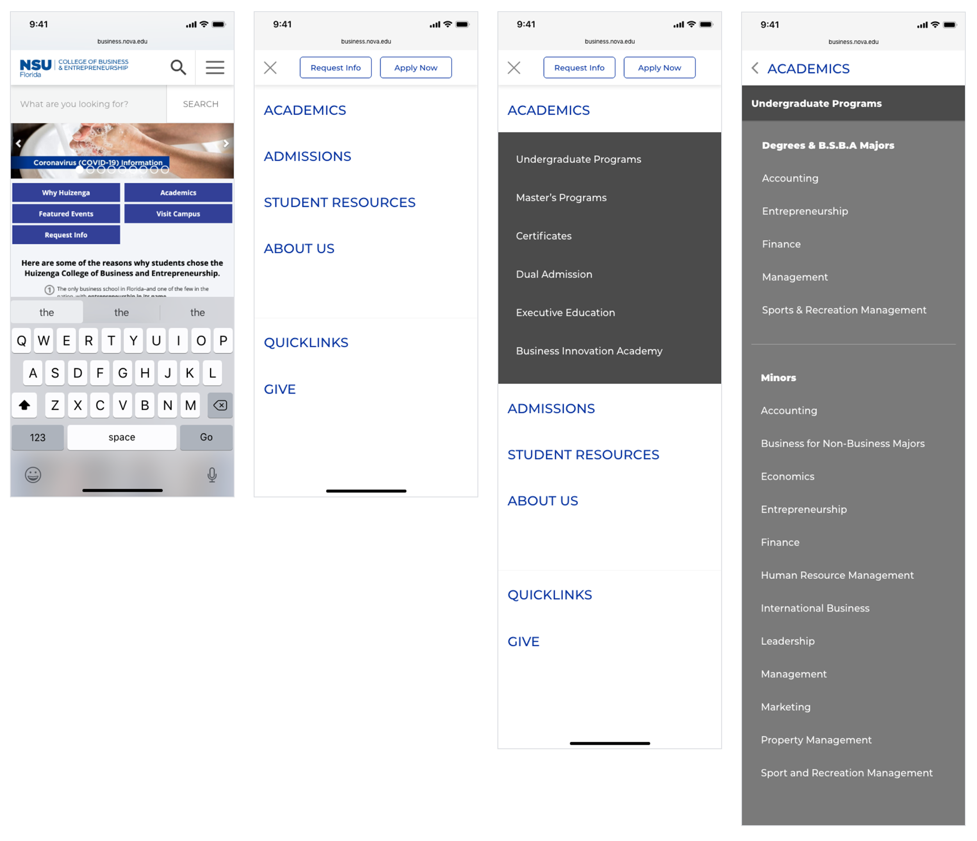
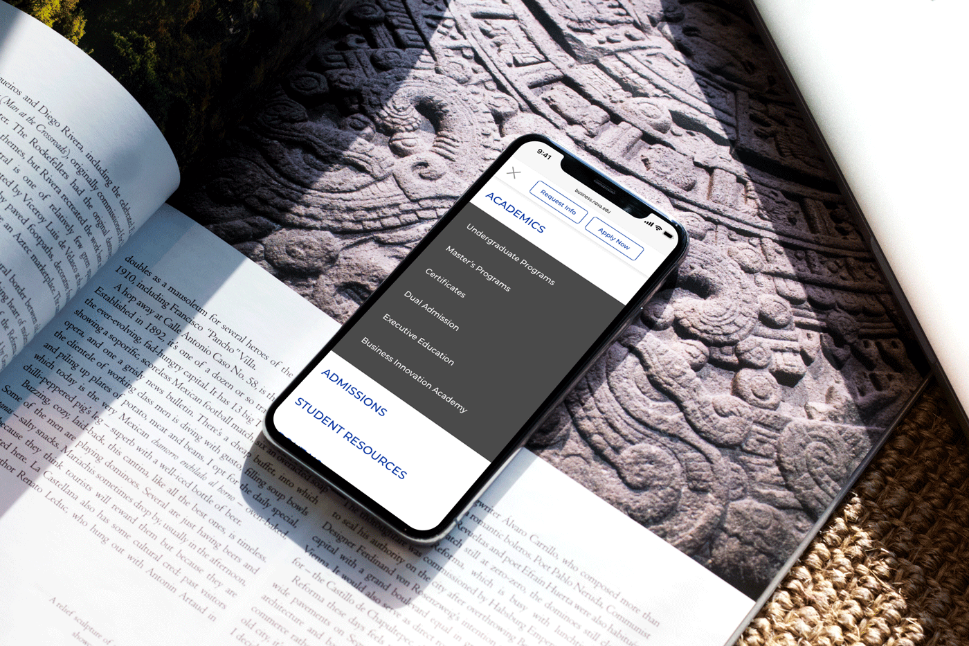
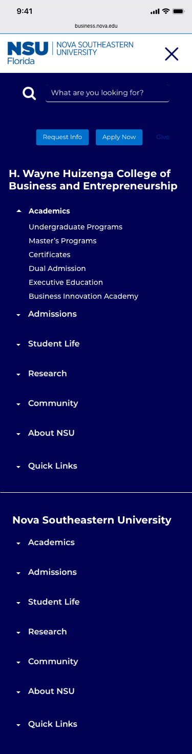
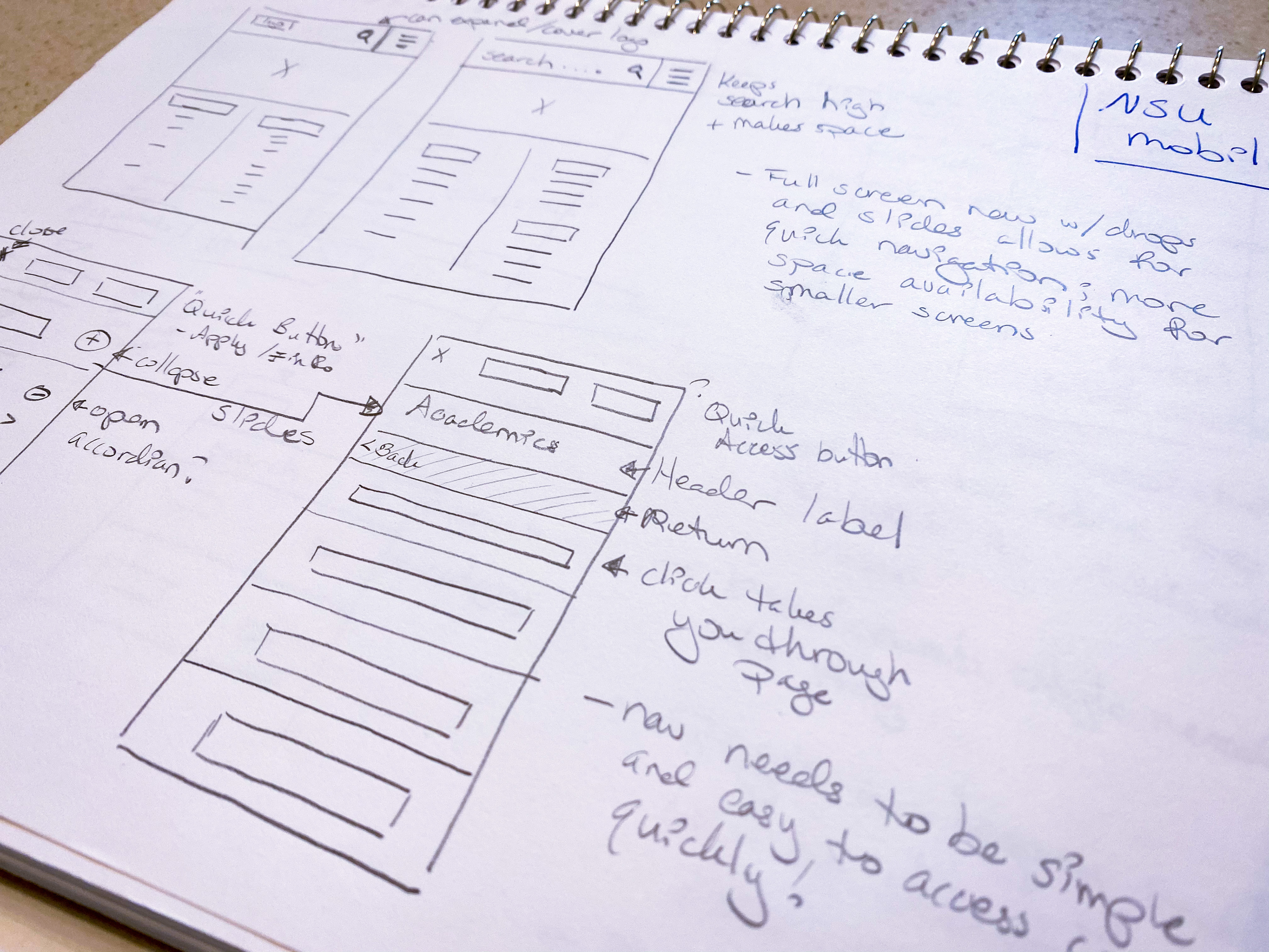
RevisING the Mobile
• Follow the anatomy of the desktop site.
• Some elements of the mobile nav have to be rearranged to help the user access content quicker. For instance, Request Info and Apply Now CTAs are available upon opening the menu but as the user begins to navigate, the navigation adjusts.
• The user clicks the main navigation topic and a list of categories drop down, then clicks a category to get a list of page links. The user can then scroll down to find their link of choice which will take them to that designated page.
• The user is able to see where they are in the navigation and how to return based on clearly labeled breadcrumbs or titles. Example: Academics to see a list of programs and Undergrad Programs and viewing the links from there.
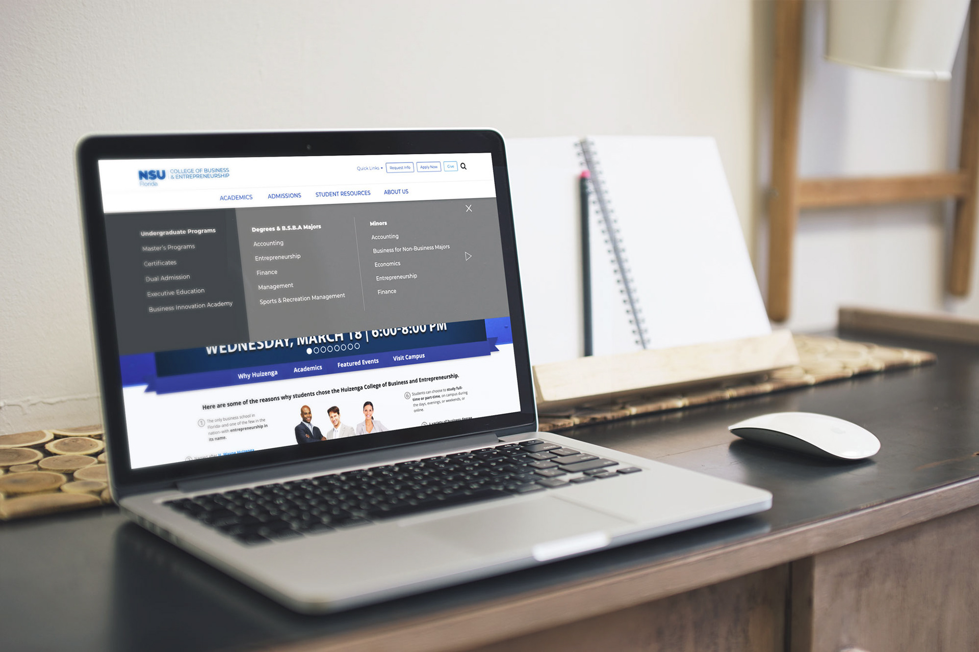
THE SOLUTION
Remove an extra step for the user. The main category pages become the navigation.
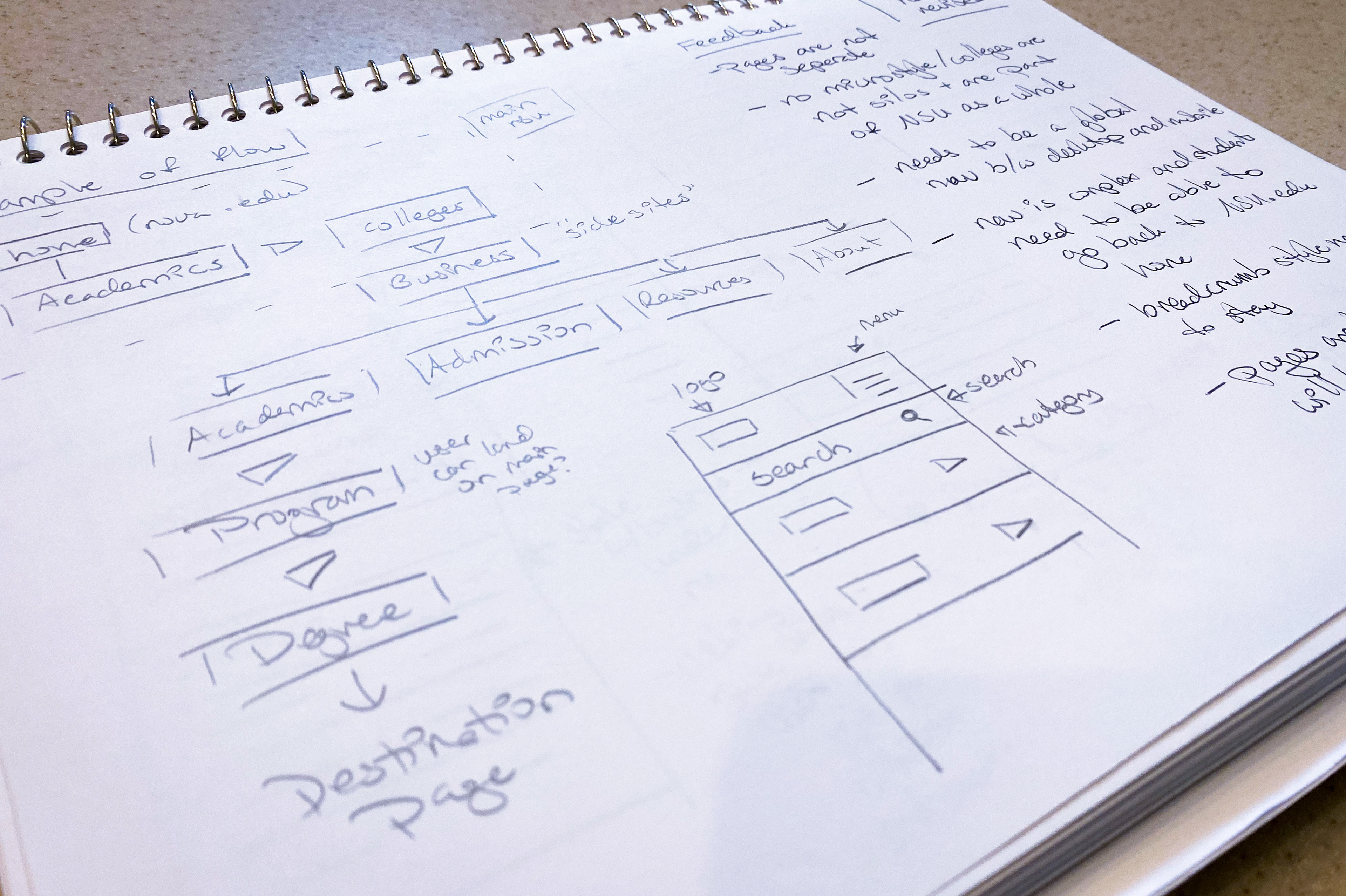
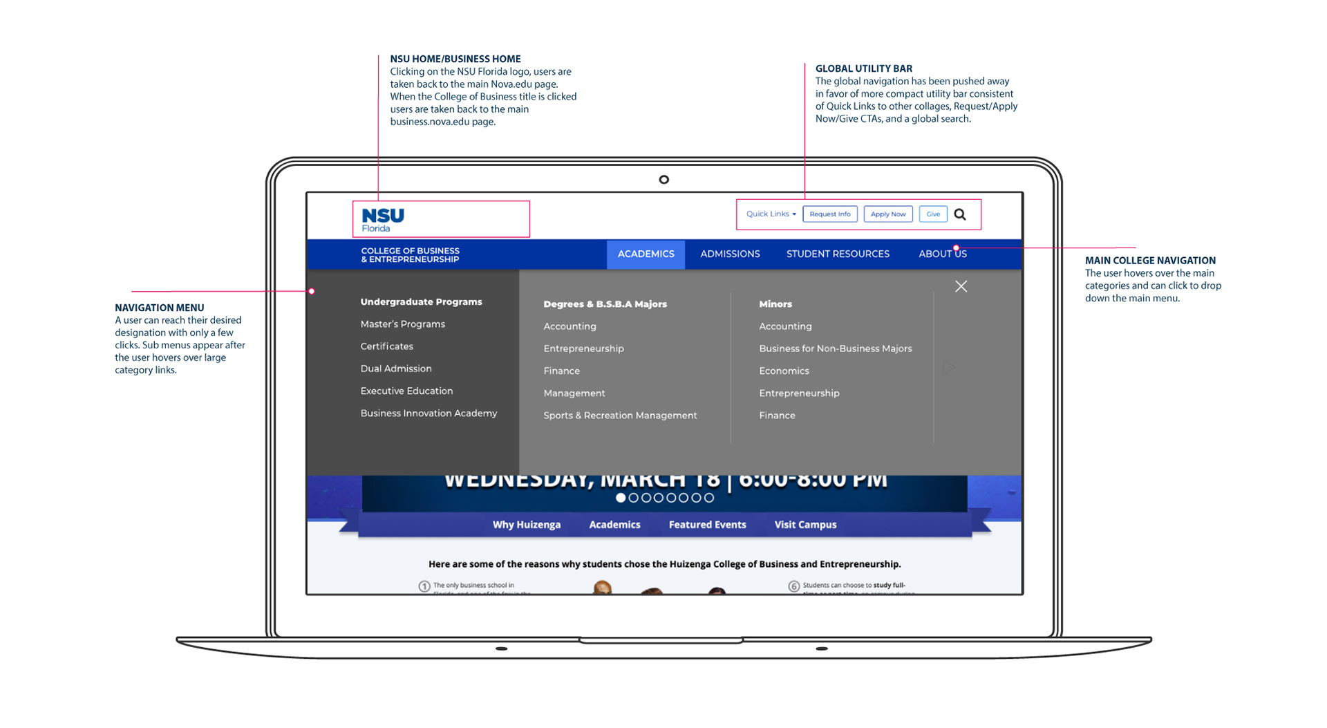
Desktop Breakdown
The navigation is more universal in function, and keeps to a cleaner UI resulting in better readability for all users. All NSU pages would have the global utility bar is visible at the top for quick access to search, locate other school links, start the application process, or request more information. On college micro-sites a secondary navigation bar appears revealing categories pertaining to that college.
Through a series of hovers and clicks the users are able to access where they want to go with relative ease with this anatomy in mind:
• Logos take you back to their designated home pages.
• The global utility bar for quick access to main NSU categories.
• Secondary navigation for micro-sites.
Mobile Breakdown
Compared to desktop, mobile has limitations due to a device's screen space however by using the main category page as the navigation and following the desktop’s anatomy the nav bar stays highly organized and consistent. The mobile navigation follows the clean UI style making it easy to read and by utilizing the natural scroll functions of the device, the user browses through different categories quickly. Request Info and Apply CTAs are always within the users reach when the menu first opens and the navigation adjusts as the user begins their journey.