
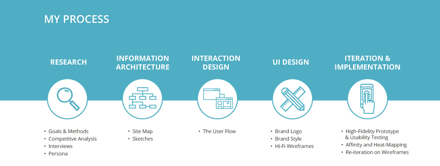
Project Summary
A portfolio project from Designlab's UX Academy. Using UX methodologies and practices the goal of this project was to develop an AR furniture app that would make shopping and purchasing furniture easy for a fictionally branded company. This project follows the steps in my process which include user research, information architecture, interaction design, UI and visual design, and usability testing.
Project Background
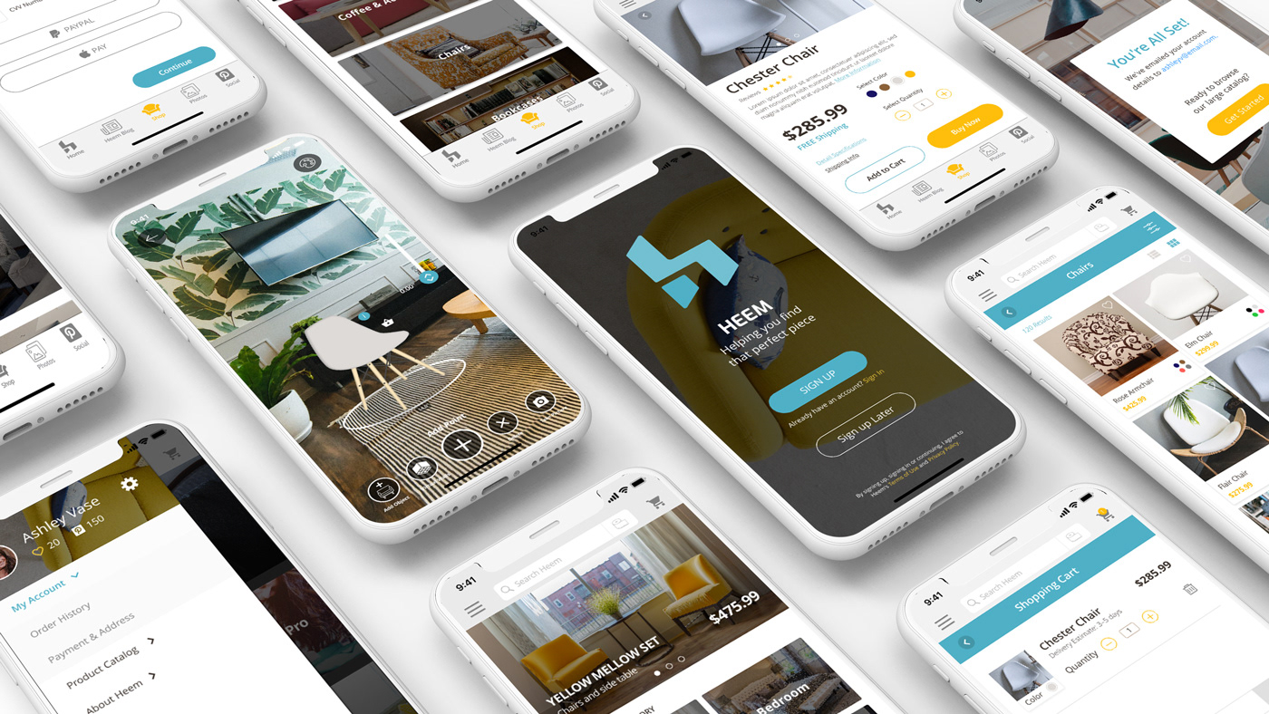
Heem is a new app for interior design and they have partnerships with a number of top 10 furniture stores in the U.S. Heem is currently scanning all the catalog items featured by these stores, as well as setting up processes to keep their catalogs updated for users of the app to select any type of furniture (e.g. small objects like boxes or up to something as complex as kitchens) and see it in augmented reality through their smartphone.
Heem is not the first at developing an AR furniture app. However, they aim to do it better, and bigger than its competitors and Heem believes that offering a truly big catalog makes a significant difference to the user experience, furniture shouldn’t come necessarily from only the same store.
With the help of their partners, Heem provide an app to customers, with links to each furniture item online and allows its users to add furniture to their spaces, not only visualizing them in AR but also in VR for a more realistic view.
The Challenge
Design an app that allows users to browse through Heem’s catalog, view their desired furniture selection in their home via augmented reality via their smartphones, and be able to purchase their selection right through the app.

Defining the Research Goals
• Learn the habits of how users may typically shop and purchase furniture items for a room.
• Understand the pain-points of shopping and purchasing furniture online (may include visiting a retail store and/or interacting with a personal interior decorator).
• Discover what mobile app features are attractive to users who are looking to purchase furniture items.
The Methodologies Used
Secondary Research: Learn how users may purchase furniture online through websites or apps to discover how a typical user may go about shopping and purchasing furniture online.
Competitive Analysis: Research and compile a list of other AR furniture apps that may offer features that help users find, visualize, and purchase furniture online.
Individual Interviews: Conduct one-on-one interviews to talk in detail about topics related to furniture purchasing along with probing an individual’s beliefs, attitudes, and experiences to get a better understanding of how a user goes about purchasing their furniture item.
Questionnaires/Surveys: Using a short survey, discover the demographic trends that may reveal who and how might shop for furniture. This may include data on age ranges, income status, location, family status, and more.
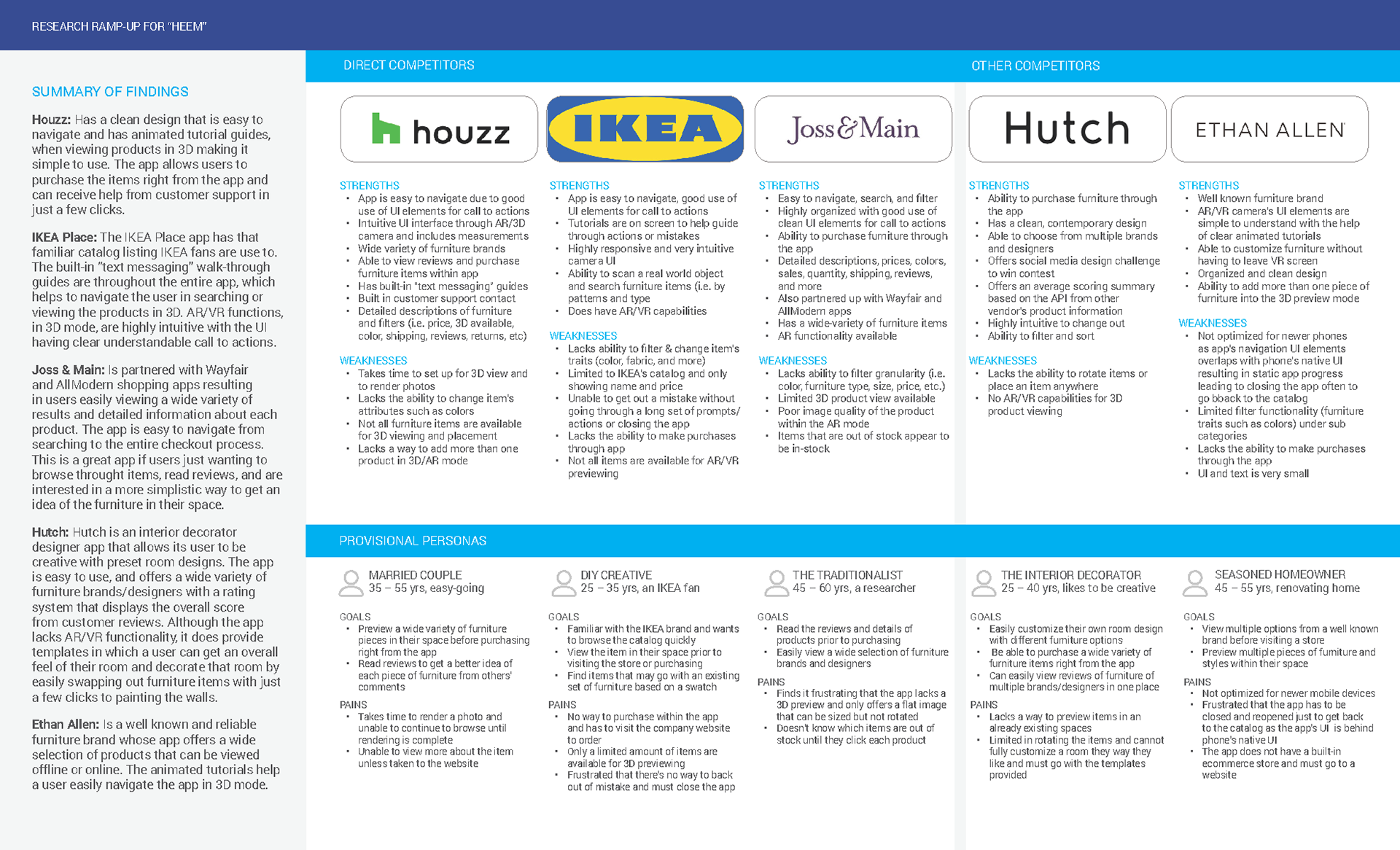
A Competitive Analysis
A competitive analysis comparison chart was used to learn what the strengths and weaknesses were between other AR furniture apps to find potential opportunities.
The User Research
Interview Summary
A total of 13 participants were asked to fill out a questionnaire survey or to do a 1-on-1 interview with the overall goal was to learn how user may typically shop and purchase furniture items for a room, understand the pain-points of shopping and purchasing furniture online, and learn what mobile app features are attractive to users who are looking to purchase furniture.
Demographics of Participants
• 9 females and 4 males ranging from the ages of 25-44, with incomes ranging from $25k to $75k.
• 30.8% of those participants were currently living with a significant other only (i.e. spouse or partner), 23.1% lived with family, 15.4% lived alone, and 30.7% ranged from living with a friends to living with family and significant others within the same home.
• When asked about what type of housing participants reside in: 30.8% live in apartments, 15.4% in condos, 15.4% in townhouses, and 38.5% in houses.
• 46.2% of the participants were surveyed to have purchased furniture within the last 6 months. 61.5% stating they prefer to shop in-store whereas 38.5% prefer to shop online. When it came to shopping for furniture online 69.2% would read through reviews before making a decision.
• The top 3 most important things users look for when shopping for furniture: (1) the style (30.8%), (2) the material quality/comfort (38.5%), and (3) the price (15.4%).
participants AR Experience
Participants were asked if they had ever used an app with AR capabilities (i.e. Pokemon GO or IKEA Place): 53.8% said yes, while 46.2% said no.
When asked how satisfied they are with AR or how their experience has been with using AR: 69.3% of those users either have never used AR before or found their experience with AR to be very poor.
And when asked which AR function they would prefer, (1) being the ability to place a virtual object into a real-world setting via a screen/camera, or (2) having the item’s physical attributes data displayed, over 69.2% of the users would prefer the ability to place a virtual object into their space.
Sample of Questions asked
• Demographic questions such as age, occupation, device preference.
• What have been some pain-points you come across when searching and purchasing furniture?
• How would you prefer to shop for furniture?
• If you purchase furniture online, would you…. purchase immediately after browsing or look for reviews?
What users want
• Real-time inventory stock available along with accurate delivery times and delivery options.
• A secure app that does not share their images due to privacy concerns.
• Improvements to the AR features to increase usage such as: high quality 3D renderings, clear directions and clean interface, zoom functionality, quickly view other styles/materials and change furniture options easily, and provide accurate measurements so users may test out furniture virtually in their homes before visiting a store.
• The ability to browse for furniture brands, stores, and designs efficiently and quickly that matches their style, need, and budget. “We are filling in the gaps of what we need; like the style and if the price is good; trust their style and quality; and trusting in their standards.”
Key Findings and Initial Key Takeaways
When it comes to shopping and purchasing furniture a common set of trends were found between participants: (1) users felt that finding stylish furniture for their budget is difficult, (2) the lack of real-time inventory stock numbers to be frustrating, (3) the quality/comfort of the materials does not match their expectations once they receive it, and (4) unable to find a piece of furniture that matches measurements accurately.
The Persona
After synthesizing the user research from the 13 participants, a Persona was developed to represent a typical user’s personality to understand their problems, motivations, personality, goals, frustrations and how Heem's app could fill in those pain-points.


The Site Map for the Heem App
A sitemap was created as a way to visually portray how the information architecture, of the app, would be organized.

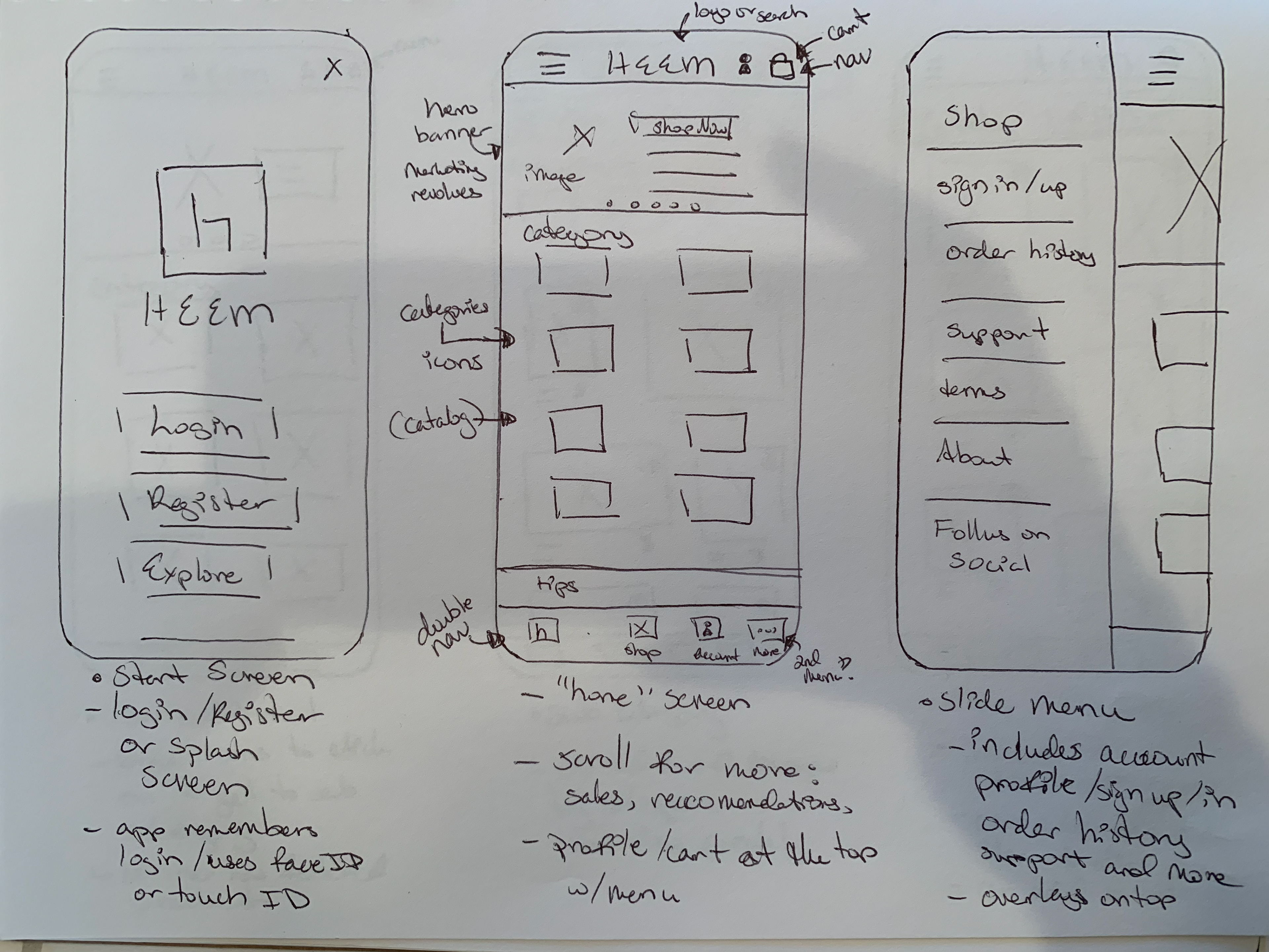
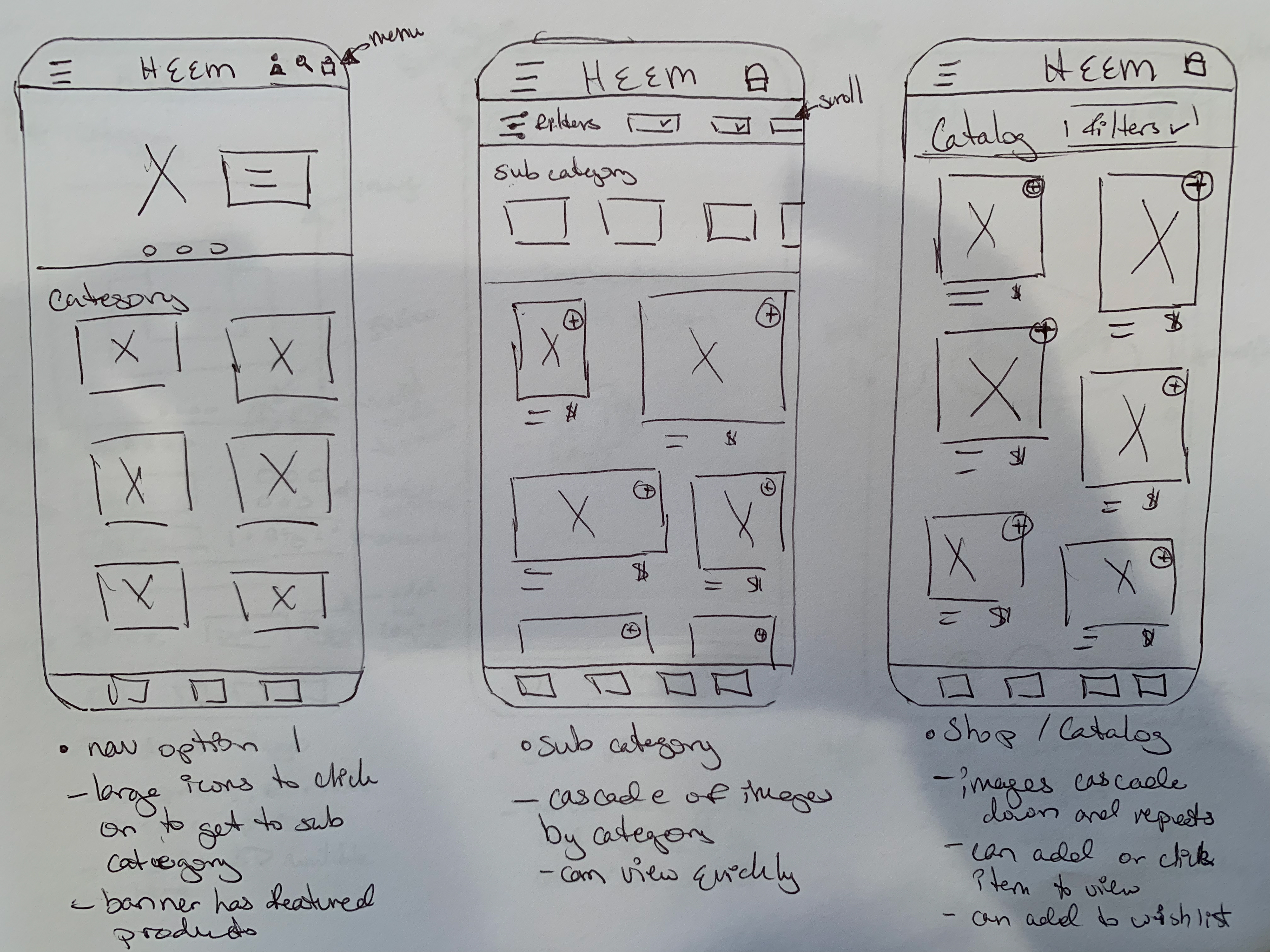
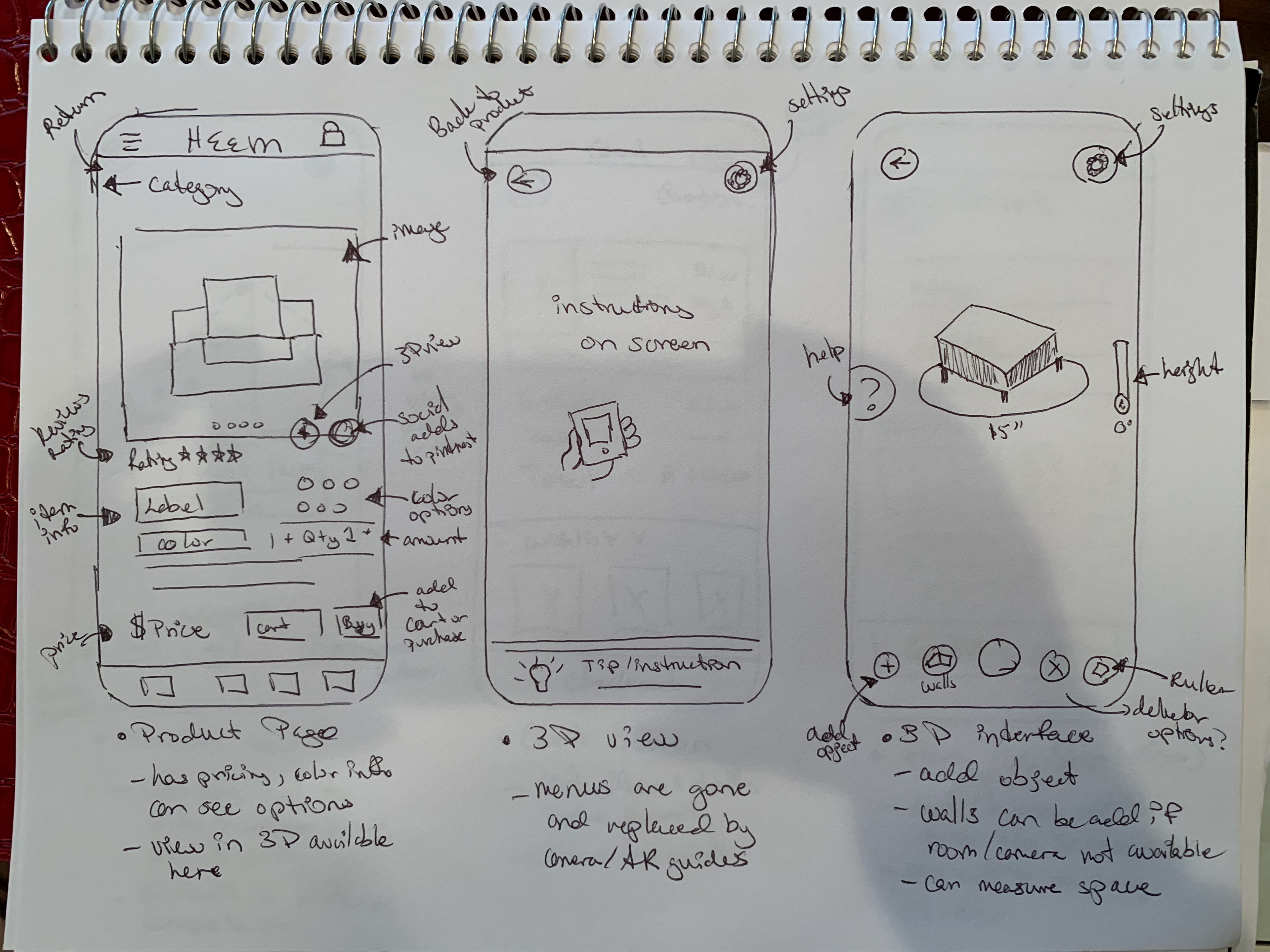
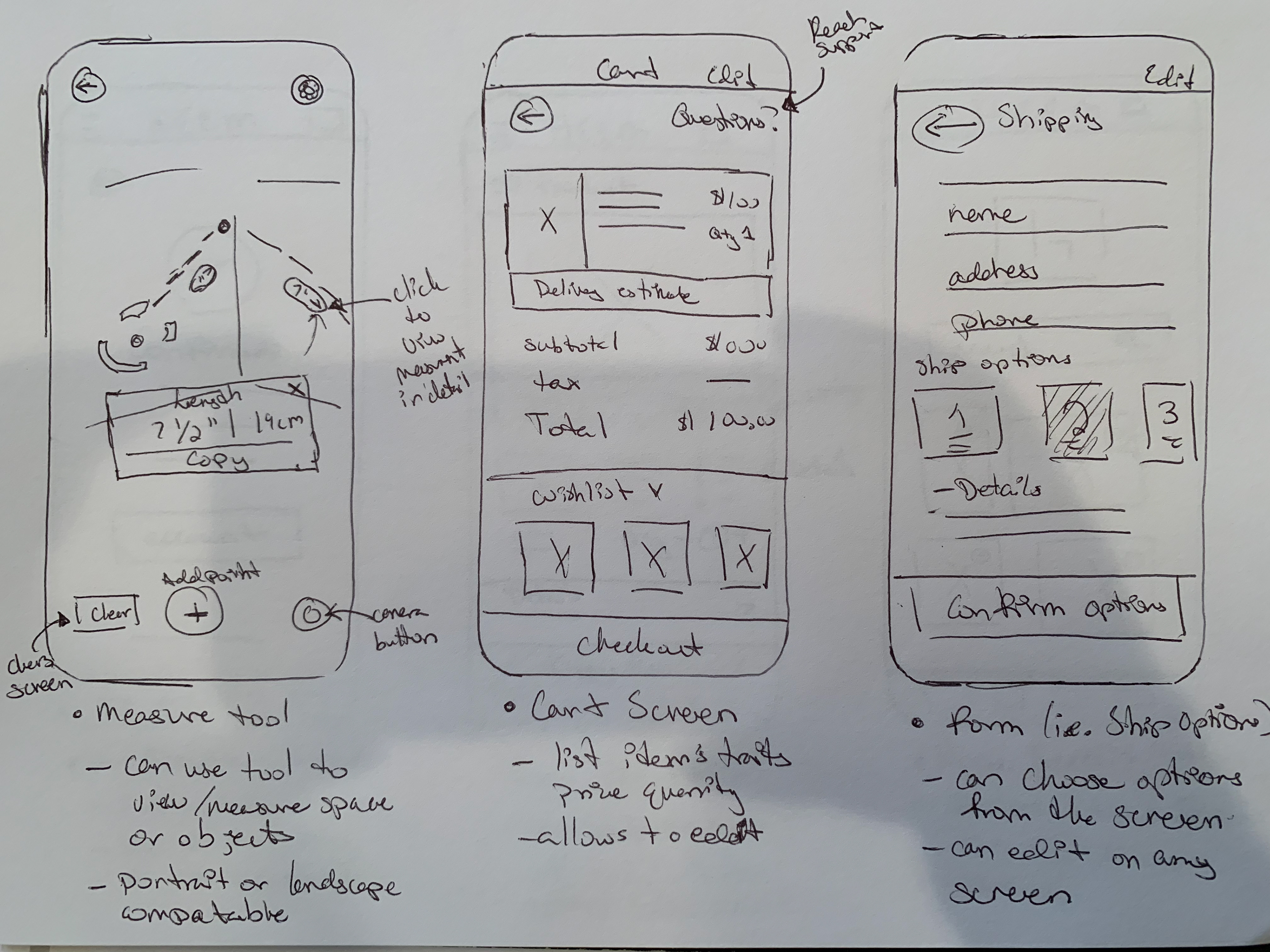
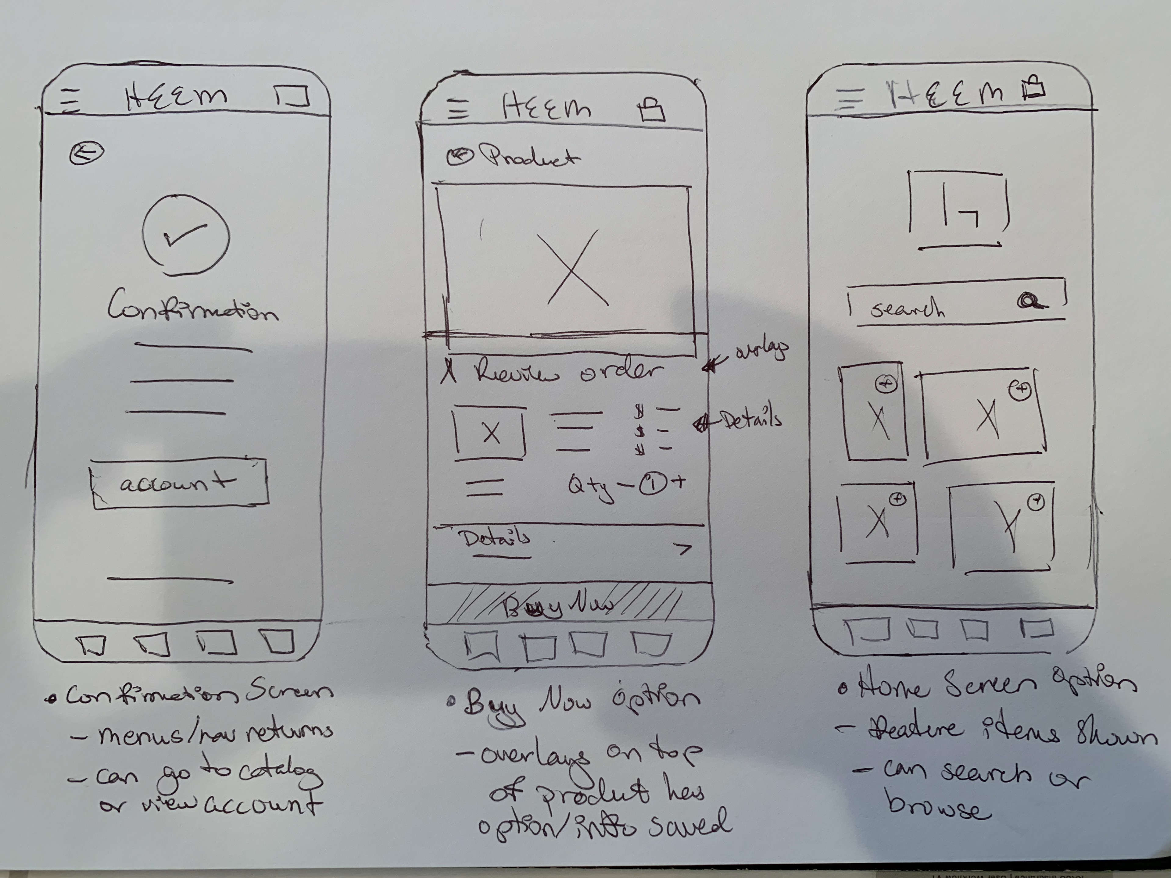
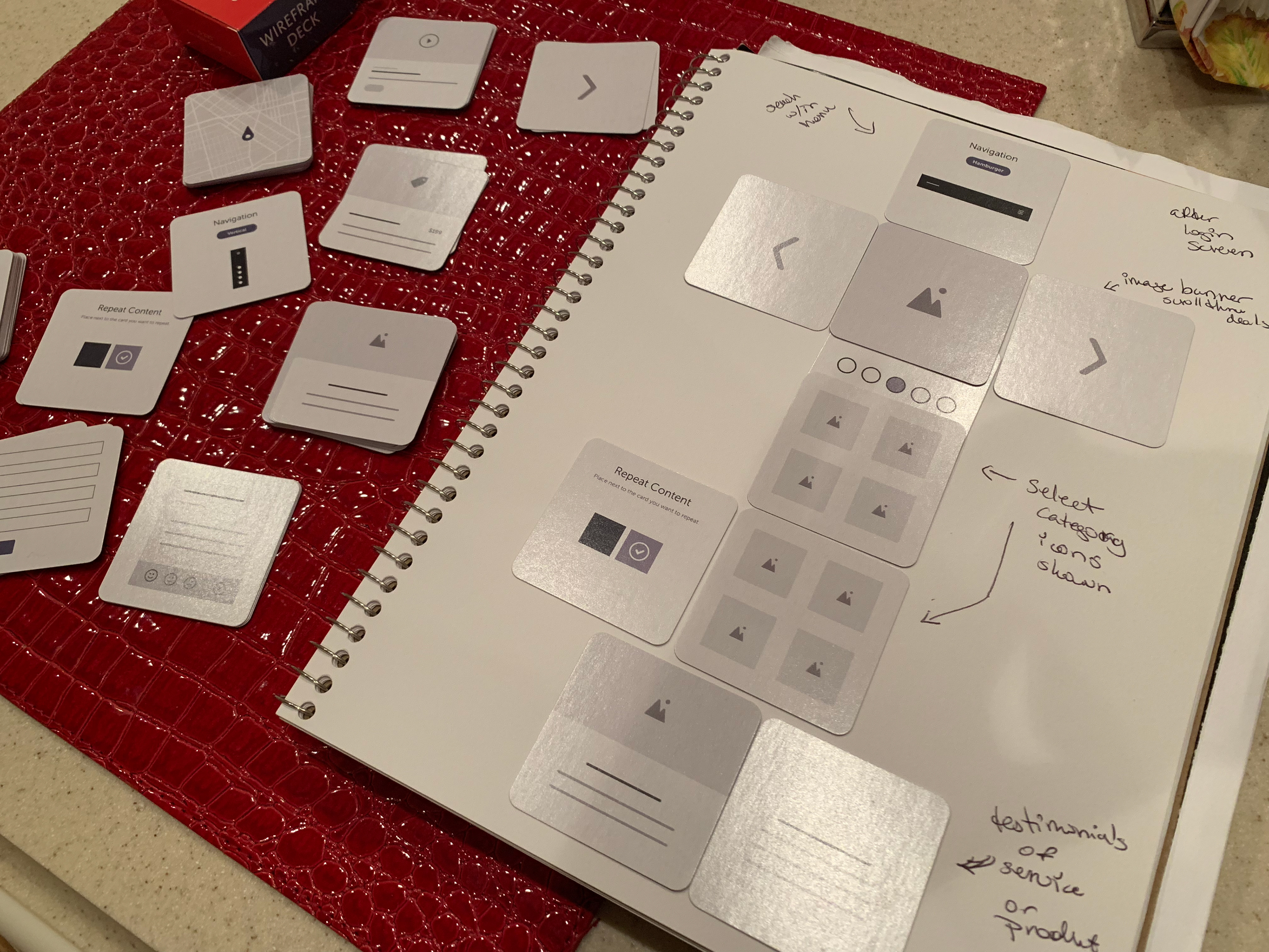
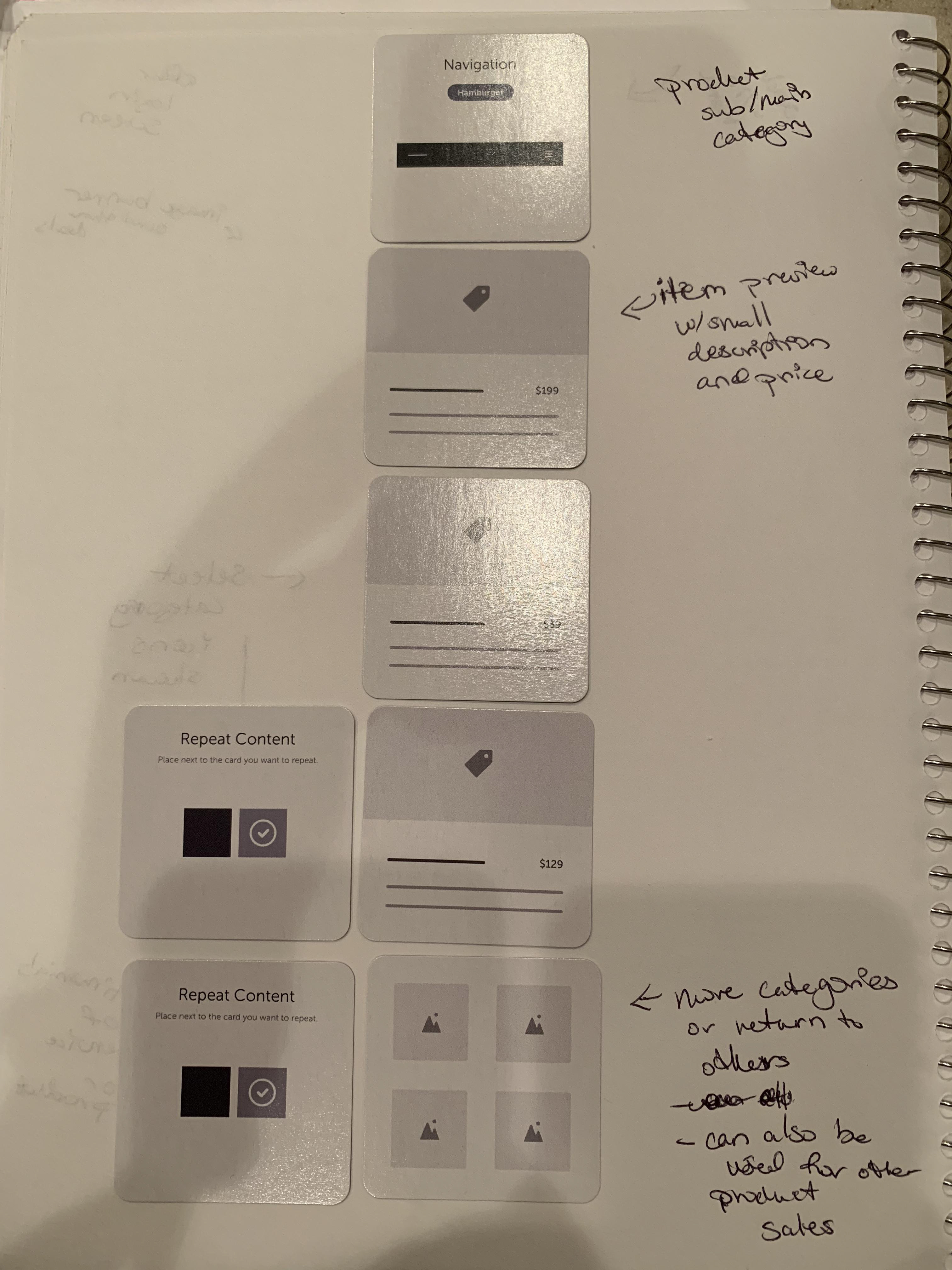
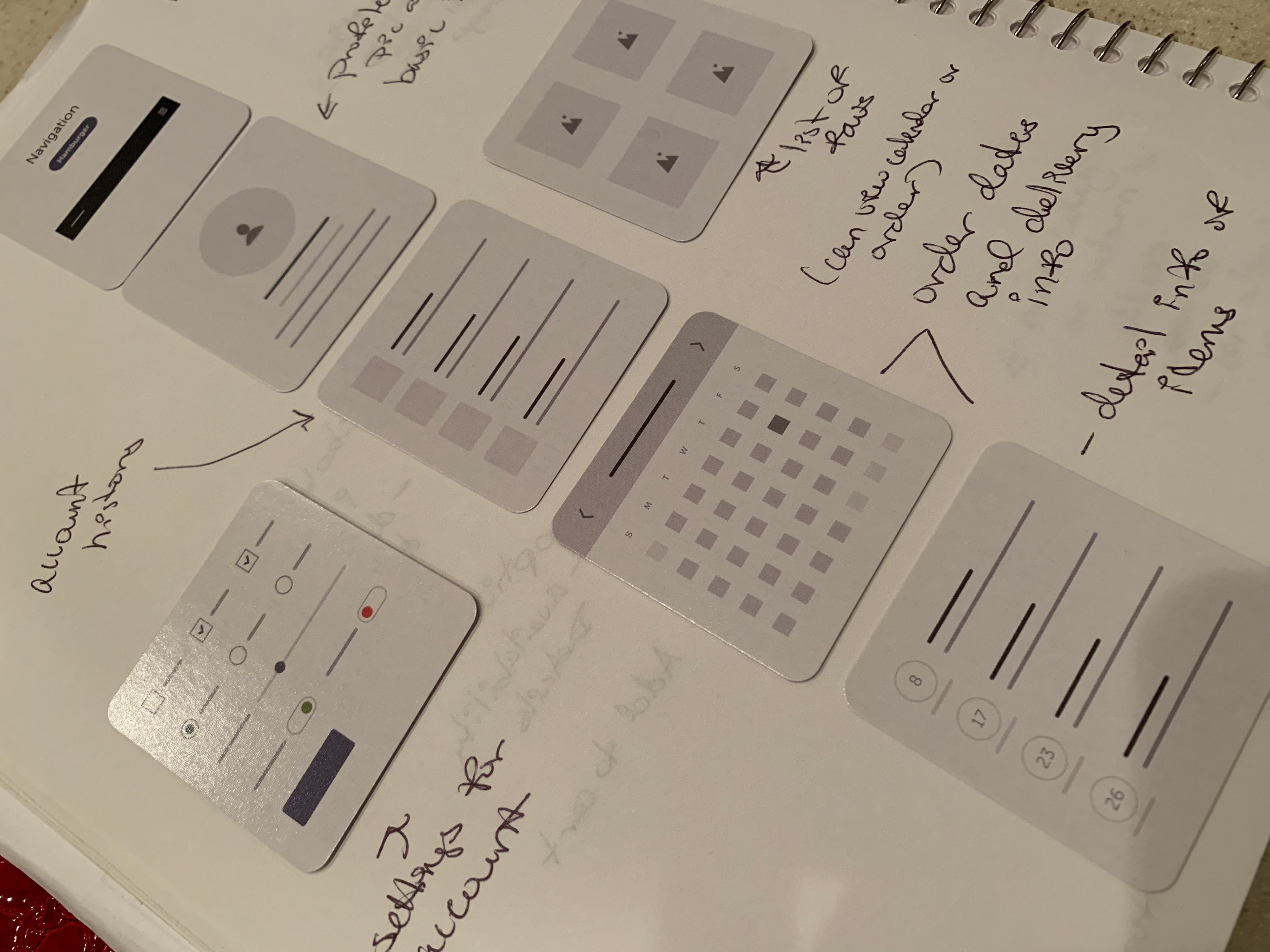
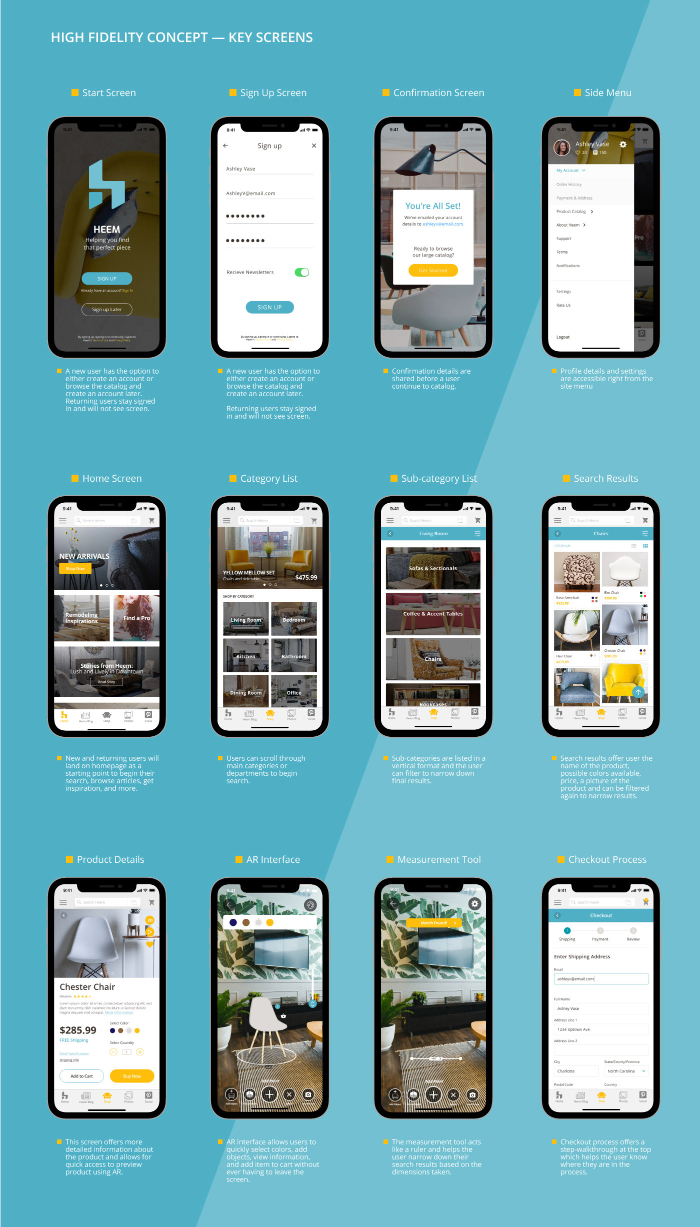
Sketches • Low Fidelity Wireframes
Sketching out the task flow app helped to establish the overall foundation on how the features would function between screens and I also use a combination of drawings a wireframe card deck to build out on how the screens may look with their features. To check if the flow(s) would be possible and would make sense to the user, I brought the sketches into the Marvel App for an initial test to the prototype's functionality.


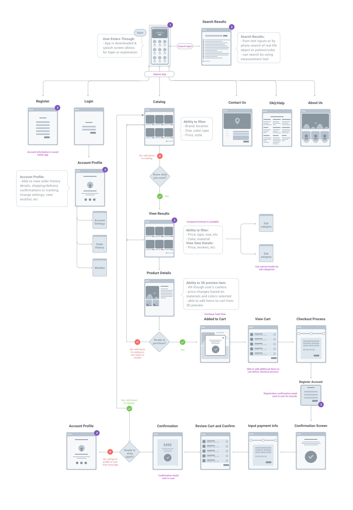
The User Workflow
From the initial sketches of the flow, I focused on flushing out a more detailed user workflow based on the Persona's wants and needs to help identify the potential issues and outcomes as a user moved throughout the app.

The Heem Logo
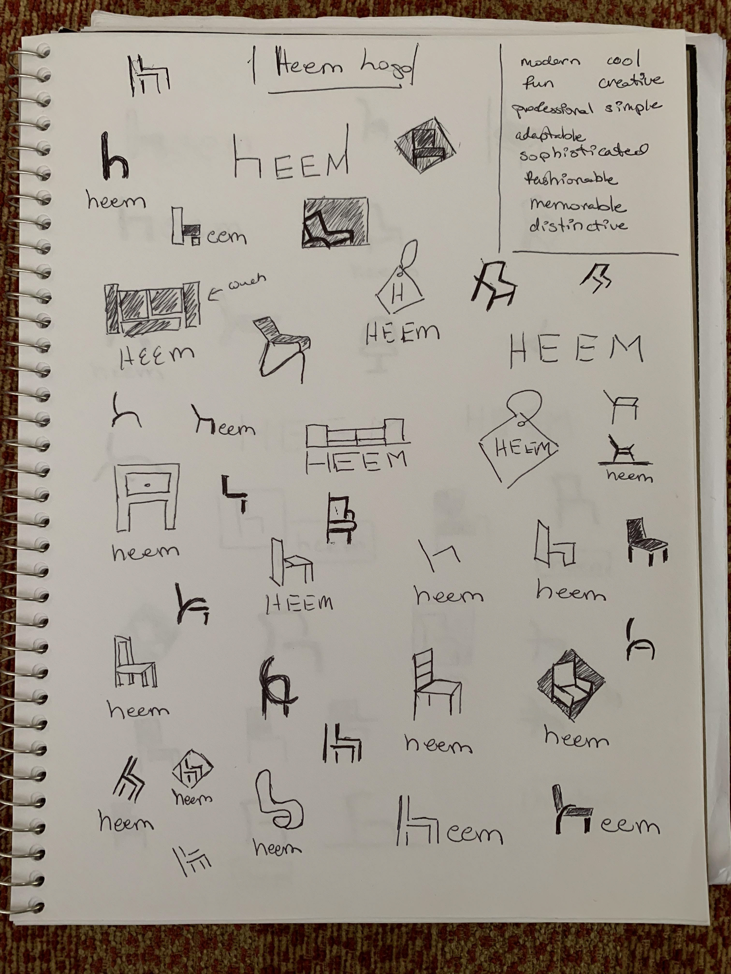
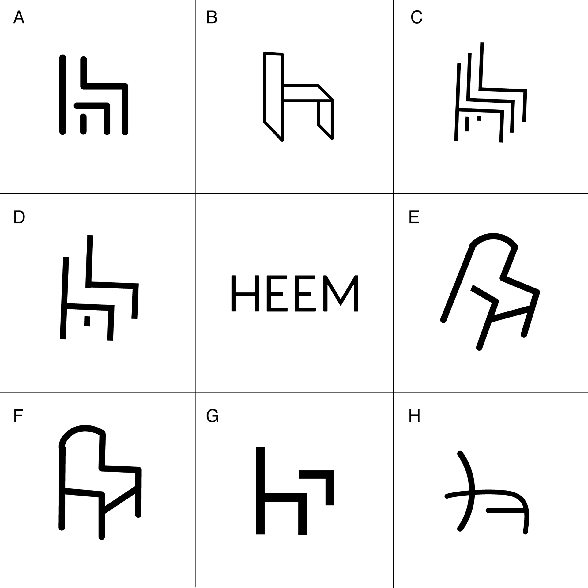
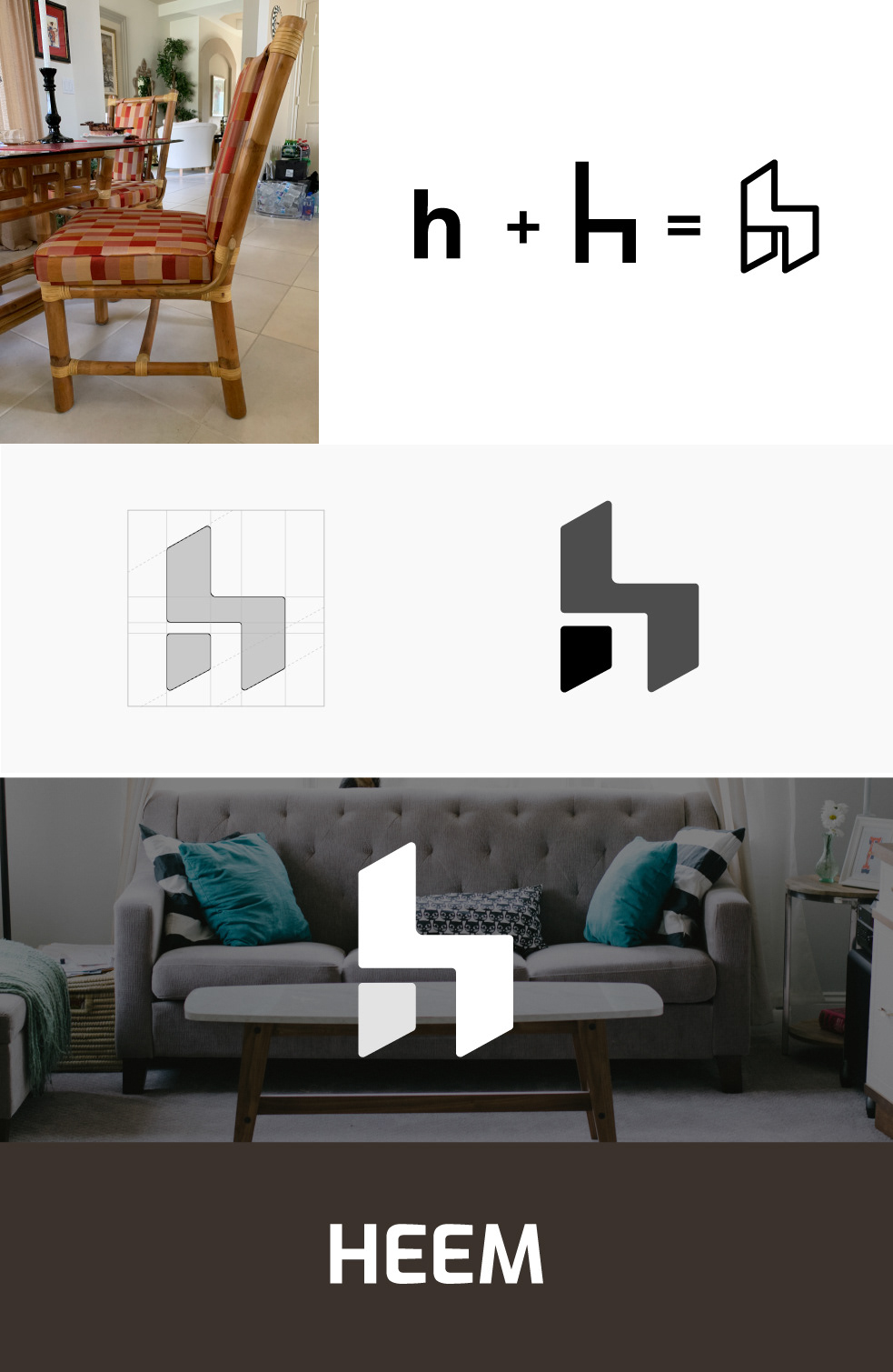
When I coming up with the design of the Heem logo, I was inspired by my kitchen chair as it shape was very similar to a lowercase "h" which was an appropriate match to a furniture app and Heem's company name. By referencing the Persona, the logo and brand needed fit some criteria: it needed be professional, simple, and modern, yet be sophisticated and universal.
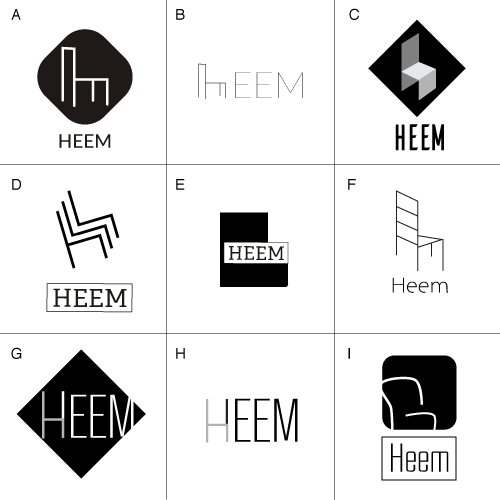
After sketching out may different ideas for the logo, I used Adobe Illustrator to render the logo's symbols and asked family, friends, and classmates on their opinion to which logo really fit the Heem's brand (following the criteria). Using negative space the final design the logo became a symbol that portrayed both a chair's signature shape in combination with the letter "h".


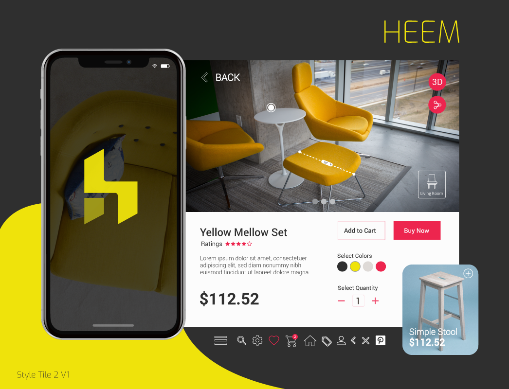
The Brand's Style and Design
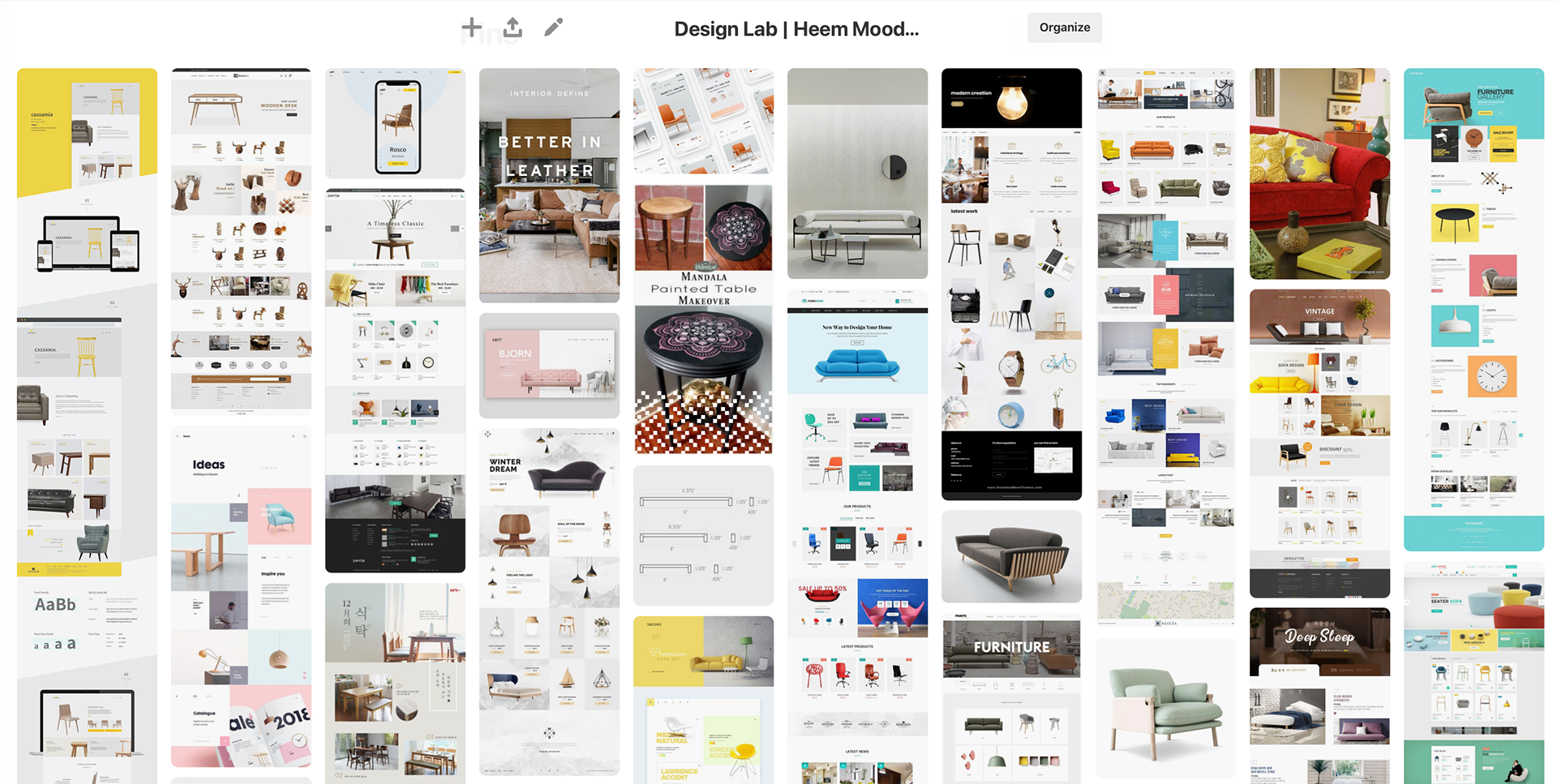
To create the brand's style, I started with Pinterest to create a mood board of various photos, color palettes, and other UI images as inspiration. Using this mood board I came up with three different style tiles to invoke a different emotion using a common set of design elements including the logo, photography standards, clean modern fonts, and primary brand colors. Based on users' feedback, one tile stood out as the clear winning for the Heem brand due to its cleaner UI and more universal color palette.
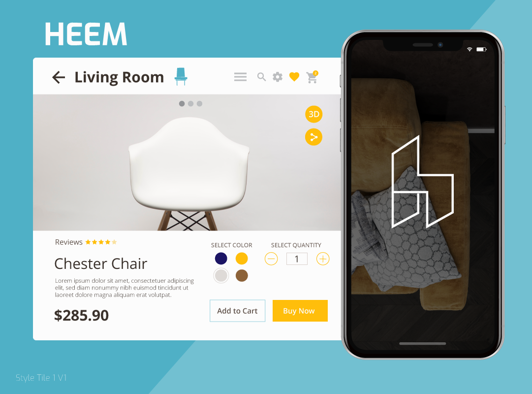


This teal-blue style was chosen for the Heem's final brand and design.


Usability Testing Summary
Participants
• 3 male users (ranging between the ages of 20 to 50 years old) were interviewed and were observed remotely tested the high-fidelity prototype using a combination of Discord, Slack, Zoom and InVision tools.
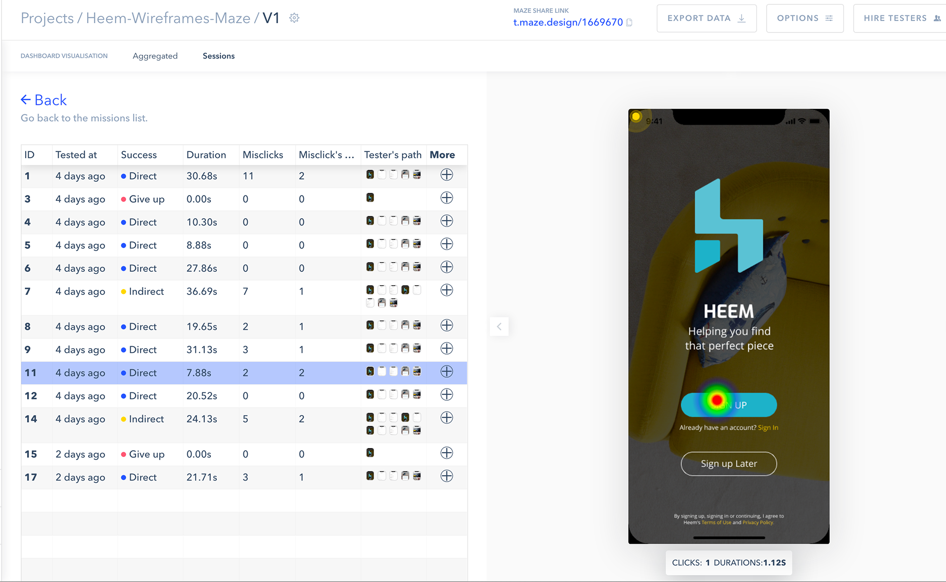
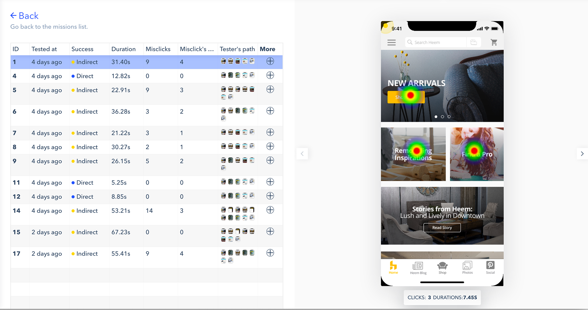
• A total of 17 users were surveyed to tested the high-fidelity prototype using Maze.Design and InVision.
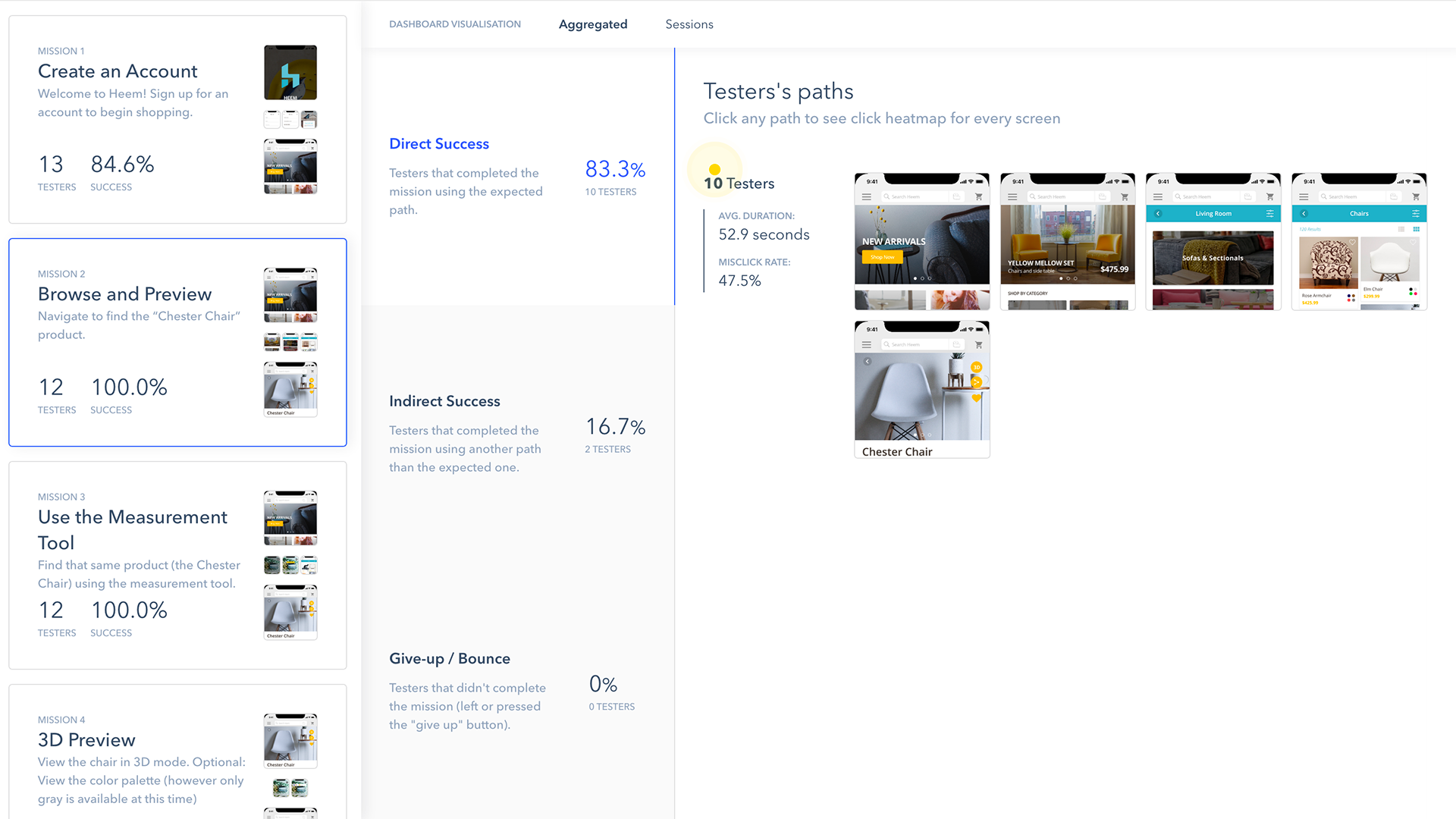
The Tasks
Participants were asked to follow this task list flow:
1. Sign up for an account.
2. Browse and navigate to find the “Chester Chair” product via product categories.
3. Find that same product using the measurement tool.
4. View the chair in 3D mode.
5. Purchase the selected “Chester Chair” and end their walkthrough via logout.
Test Goals
• Identify pain-points of the app’s features and task flow.
• Gather feedback ranging from users navigation through the app to ease of the application’s process to search and purchase.
• Observe how the user flows through the app to find and purchase the “Chester Chair”.
• Discover what interests the user about the app. (i.e. visuals, tasks, flow, etc.)
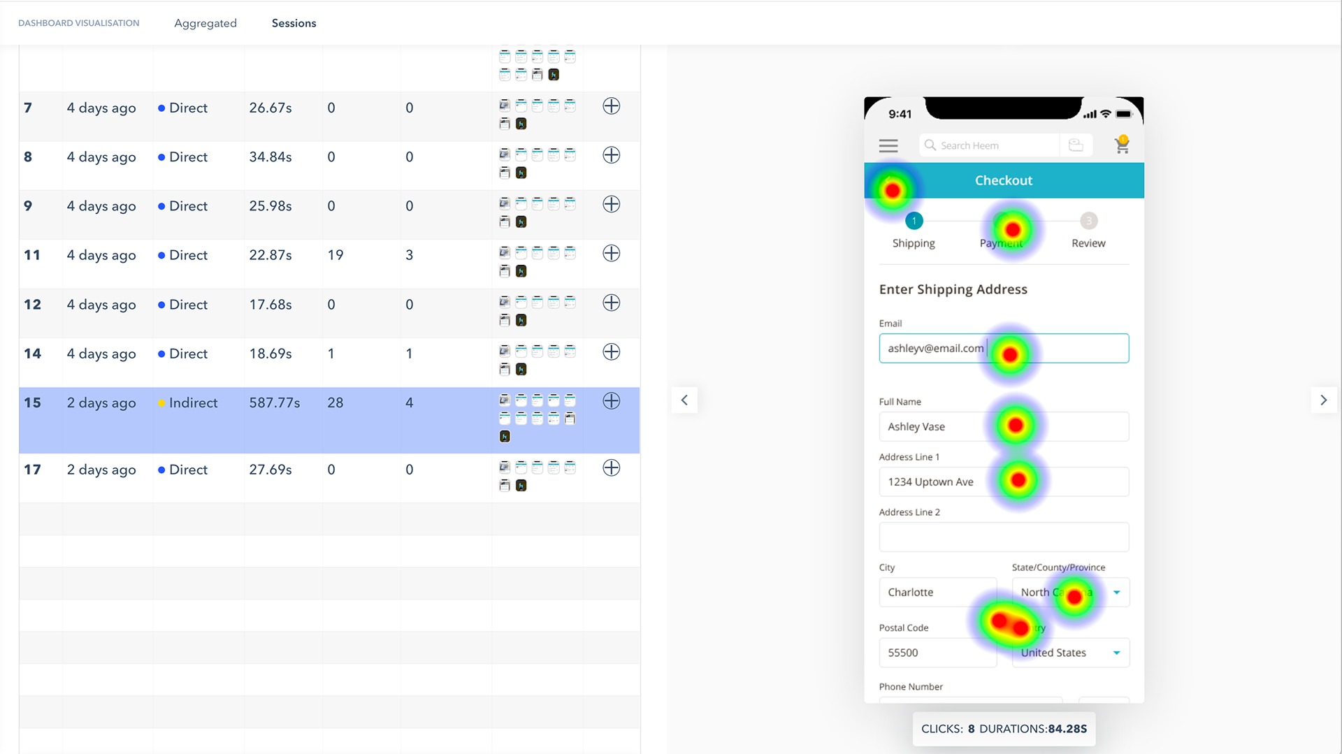
The Affinity and Heat Map Results
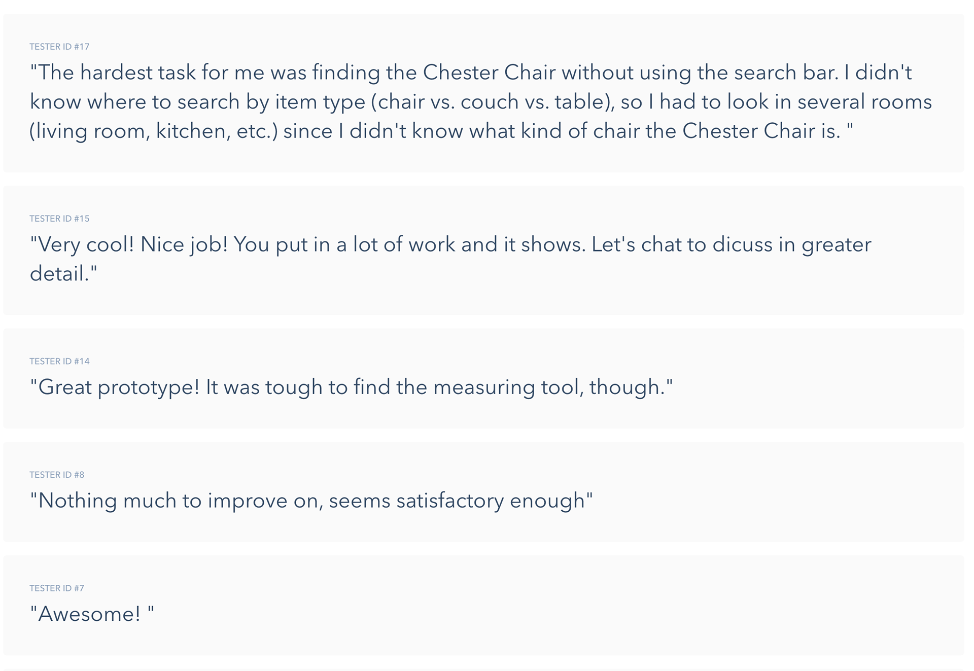
As with many of my projects, I used an affinity diagram to organize the results and responses from the usability test. From the three 1-on-1 interviews, participants overall had a pleasant experience using the app and really enjoyed its design, color palette, logo/symbol treatment, and features. One user sharing, "I really like the app’s design, it's really clean, simple to use, and refine."

I also utilized Maze.Design, with my InVision prototype, to help gather participants' responses. I shared this link with classmates along with friends, and asked them to complete those five tasks ranging from signing up to an account to completing their experience by purchasing the product and finally leaving an open ended question of how their experience was using the app. Overall users completed their tasks 85% error free and had a lot of positive feedback using the app. The results recored based their clicks were displayed as heat maps that helped to provide a visual summary on how users were navigating the app to accomplish their tasks.


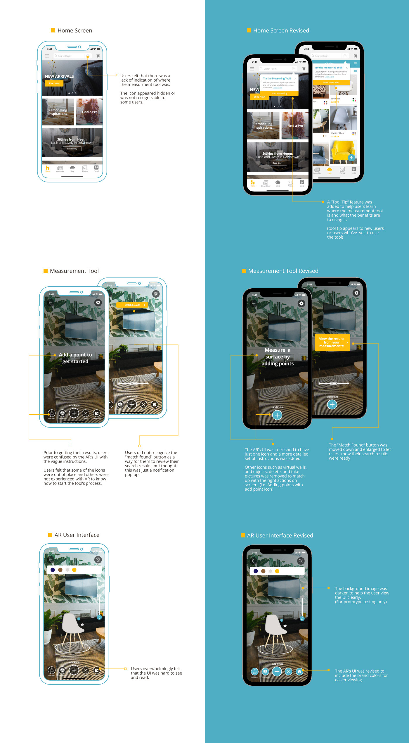
Re-iterating on Key Screens
Using the results from the affinity map and Maze.Design heat maps as a guide, participants were overwhelmingly requesting to have the measurement tool be not only more noticeable but also the AR's interface providing more in-depth instructions on how to use the tool. From this feedback, I focused on a few key screens that would need some type of instruction box and refining the AR's interface design along with its walkthrough.
A new "Tool Tip" pop-up was added and would assist new users (or users who've never clicked on the tool before) locate the measurement tool and offer a brief summary of its benefits to using it. The AR's interface was simplified to only show icons that corresponded to the walkthrough's instructions and these icons were refreshed to incorporate the brand's colors for better readability.
These redesigned screens were shown to participants and they offered very positive feedback to the new "Tool Tip" and cleaner AR interface. One users stating, "I love the small tutorial, that is realistic and is a common thing, so it's definitely believable; and the instructions of how to use the tool by adding points."